Landscape painting vs. landscape walking

Pinnacles National Park

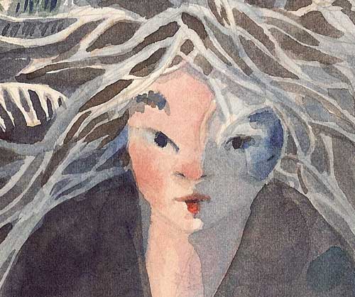
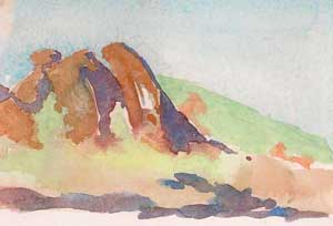
Rocks at Bear Gulch Resevoir, Pinnacles National Park
Watercolor

7.5″ x 9.5″
© 2013 by Margaret Sloan

I am still reading—and recommend—The Old Ways: A Journey on Foot by Robert MacFarlane. MacFarlane is a walker; he experiences the landscape through his feet, even walking barefoot through several pages. He travels at shanks-mare pace, slow enough to notice things as he walks over mountain, bog, or desert, passing landmarks, pathways, and people. Fair enough. Good writing has to keep moving to get anywhere.

I’m enjoying this book, as I’ve always loved walking, and fantasize regularly about a walkabout of my own. But since I’ve started landscape painting, my relationship with the landscape has changed.

As a landscape painter, I don’t so much move through a landscape as move into it. I build a temporary studio with tripod, pochade box, and backpack full of supplies and sandwiches (this army travels on her stomach). And there I stand at the easel, brush in hand, watching the landscape move around me.

Pinnacles National Park
Small watercolor sketch at Pinnacles National Park

Wind crackles through grass, and cloud shadows ripple and dimple the surface of the hills. Tides ebb and flow, birds fly by, eyeing my sack of sandwiches, and people stop, chat, then continue their own walk. When you stand still on the earth, the landscape moves like a flood around you, driven by the solar-storm of the sun as it rockets overhead.

Pinnacles National Park
Small watercolor sketch at Pinnacles National Park

And that is the landscape painter’s challenge, isn’t it? To try to capture a scene, to freeze a feeling, a smell or a taste of a moment that is constantly zooming past, on towards the next moment. The land is never, ever going to hold a pose long enough for me to capture a perfect likeness. In the field, all I can hope for are impressions: an idea of color, a gesture of form. In the studio, I can rely only on memory (and perhaps photographs).

Although I’m not walking across the land when I paint, I am making a slow sort of progress in tracking the world. I’m learning to notice things I don’t see when walking. Sometimes standing still is the best way to move.

“You do not need to leave your room. Remain sitting at your table and listen. Do not even listen, simply wait, be quiet, still and solitary. The world will freely offer itself to you to be unmasked, it has no choice, it will roll in ecstasy at your feet.” —Franz Kafka

Here’s a lecture by MacFarlane. It’s long, so get a cup of tea, pull out your sketchbook, and draw while you listen.

A Halloween sketch and a scary story

Painting
Watercolor painting after Reeling for the Empire by Karen Russell

Happy Halloween!

This is a watercolor sketch I made  while  listening to an audio version of Reeling for the Empire by Karen Russell (it’s part of her recent collection of short stories, Vampires in the Lemon Grove.) It’s one of the creepiest stories I’ve heard in ages, and I suggest you make a Samhain trip to your local bookstore (I hope you still have a local bookstore) and find this book, if only for this story.  I loved all of the stories, but this is the one that made my skin go all goose-fleshy, and so this makes it a perfect tale to read on Halloween.

I’ll not tell you what it’s about—there are plenty of spoilers in cyberspace—but I really think that, if you like unusual, odd and sometimes creepy stories, you’re going to like this book.

Painting of girl
Detail: Kitsune

Young girls in peril…

Silkworm moth
Detail: Silkworm moth

And bugs.

What could be scarier?


What does the landscape know of the painter?

Painting of hills
Oil sketch of bay and hills. 8″ x 10″

In The Old Ways: A Journey on Foot , Robert MacFarlane says:

“For some time now it has seemed to me that the two questions we should ask of any strong landscape are these: Firstly, what do I know when I am in this place that I can know nowhere else. And then, vainly, what does this place know of me that I cannot know of myself?”

As a landscape painter, I felt particularly pierced by this quote. I rolled it around in my head as I painted in Alviso Marina County Park this weekend. I recounted to myself what I knew of this landscape: it used to be rural and isolated from the hustle of Silicon Valley. It was, quite literally, the site of a dump, but now, with the invasion of tech dollars, it’s got that beginning shine of gentrification-creep.

But it hasn’t all been siliconized yet. The town and park are on the wild southern edge of the Bay, and across the water you can see the Diablo range. The tide was in, and the bay glowed sky blue in the slanting afternoon light. The color of the hills reddened as the sun burned through the late autumn haze and I scrambled to adjust my colors and capture the sweetness of the evening.

Every landscape I paint makes me know of myself that I do not paint enough; that I desire more than I can accomplish in the time allotted to me; and that I love being outside more than just about anything (except for playing music and painting). And when I paint in urban-edge areas, I learn, over and over again, that the earth, even while brutalized by humans, remains steadfast.

But does that landscape know anything of me? What does it even mean that the place might know of me something I cannot know of myself? Does it mean what I should know from the humans who come over to “meet a painter?” Or does it mean some sort of Gaia-like sentience on the part of the landscape, the dried mud that powders around my feet, the weeds that jump into my socks as I wade through them, the hills and water that stand silently in my view?

I don’t know. But I think for a while it will become my painting mantra, an addition to the usual litany of: is this the right color, right value, right chroma, and right stroke?

More about Alviso http://www.metroactive.com/papers/metro/08.20.98/cover/alviso-9833.html

Watercolor portrait

Watercolor portrait

Portrait of Norm
9″ x 12″
Watercolor on Arches #300 paper
© 2013 Margaret Sloan

This is the entire portrait—the face that belongs with the teeth in my tutorial.  (I’m posting this with permission from the client.)

This was a difficult portrait, but ultimately one that gave me great joy. The subject has been ill, and my job was to see through the illness to the warm, sparkling man underneath. Sometimes a painted portrait can capture something that the best camera can not. I was very pleased to present this to the family.

Watercolor portrait
Portrait of Norm detail
Click on picture for a larger version

Painting teeth, part 2

Last week I left this blog in a sort of a cliff hanger, with a painting of teeth that looked like the wicked smile of a television vampire. This week I want to show you how I repaired that purple smile.

Scrub out mistakes

I’ve heard many people say that watercolor is unforgiving. That’s not entirely true; you can scrub out all but the most persistently staining colors. It’s true that you’ll never get the same clarity that pristine paper under pigment will give you, so in some styles of painting (like Charles Ried‘s off-the-cuff splashy style) scrubbing isn’t really an option.

I paint  tonally, and I find I can work around the surface of the paper being slightly damaged. It also helps that I use a tough paper like Arches #300 that can, like Timex watches, take a licking and keep on ticking.

watercolor image
Erased mistake on watercolor image

I first tried scrubbing out the purple lips with my trusty ancient Winsor Newton Series 7 . There’s something about sable that will gently get into the paper and loosen the pigment.

But sometimes the sable can’t do much. That ghastly purple color on his lips was mineral violet, which is obviously a staining color. What to do?

Sandpaper! I used a very fine sandpaper (P800) to rub away the purple smile. I made sure the watercolor paper was absolutely dry to avoid tearing it apart. The sand paper removed  the color and made a smooth surface on the paper that will take paint almost as well as the original paper.

Redefine the teeth

watercolor image of teeth
Redefining teeth

Using a clean mixture of cadmium red light and quinacridone rose I restated the negative space that defines the shape of the teeth. Getting the shape of the teeth is important for finding a likeness; in this study I made the teeth just a bit too long, so I adjusted the shapes a bit. The brightness of the red is startling, but it’s important to get the right value of the color in the shadows. I lowered the chroma (the brightness and intensity of the color) later.

Why use red in this instance? Because the lips and mouth are areas that are filled with blood. Even if it looks dark, it’s going to be a warm dark. The red gives a base for this warm, bloody darkness; a cool wash will tone this down but still allow the life of the initial red paint to glow through.

Balance color

Painting teeth in watercolor
More refinement of teeth, and balancing of colors in image

I refined the teeth some more, and used a darker red to give the inside of the mouth a bit more color shift. At this point I also balanced the color on the rest of the face.

Final cool wash

Painting teeth
Final watercolor image with blue wash

Once I felt satisfied with  the values and shapes, I took the last scary step: a cool blue wash over the shadowed parts of the face. This is a step that’s difficult to recover from, so I really look closely at a painting, sometimes letting it sit for a few days before I make my move.

When everything was the way I wanted it, I mixed up a very clean, light puddle of cobalt blue and glazed over the shadows areas, paying close attention to the lost and found edges of the wash. This is what watercolors do best; the cobalt blue subdues the brightness of the colors, but allows them to glow through the blue pigment.

How to paint teeth in watercolor

I normally don’t paint portraits of smiling people. It just doesn’t have the weight of a more sober pose. And it’s darned difficult to pull off. If not well done, teeth tend to get all snaggly in a painting.

But for a recent portrait, I completely agreed with the client that, for a variety of reasons, a smiling portrait was the best possible choice.

I ALWAYS make a study (or two or three) before embarking on a painting. Since the smiling mouth presented the most difficult challenge, I did a small version of that. And for once in my painting/blogging life, I had the presence of mind to have my camera out and take photos of the process to share on this blog. So here we go. How to paint teeth in watercolor.

Start with a line drawing

Line drawing of teeth
Line drawing

For a portrait, I always start with a detailed line drawing. This is the most time-consuming stage, as this is where I do much of my thinking and planning. Here are some of the things  I think about:

  • Shapes and the rhythms of those shapes (getting the shape of the teeth is most important, but I don’t worry about all the details. I concentrate on the general outline.)
  • Lost and found edges
  • Value and color within the shapes

It’s kind of like mapping a journey and getting an overall picture in my  head of where I want to go, because I find that in watercolor, if I don’t know where I’m going, I’ll never get anywhere.

Adding the first light wash

On the day I met with the subject, I made some color studies. Using these studies for reference,  I lay in the first light wash, keeping the warmest colors and lightest values in the lit areas of the portrait, and the cooler and darker values in the shadows.

I don’t preserve a lot of whites on my paper. They seem too harsh once I get the darkest values down. I like to have a light value tone to begin with, and preserve that through out the process.

To make this first wash soft and flowy, I make sure I have plenty of pure color mixed up with lots of water on my palette, ready to go so there’s no chance for the wash to dry into a hard edge.

First light wash in watercolor
First light wash: Computer screens don’t give accurate color. This wash is about 3 steps lighter in value, and not as red.

Ack! It looks like Jabba the Hut! That’s why the next step is so important.

First dark values

The picture below is better, isn’t it? The dark green defines his face and neck. Whew.

Adding dark values
Adding dark values

I start adding color to build the forms and I start adding in the first of my darkest values. I use a dark red in the mouth, painting carefully around the teeth to preserve their shape. The red looks terrifically bright (it’s a little frightening at this stage!), but I know that I’m going to tone that down later with a blue or violet wash. A warm color like red or orange is a way to bring glowing light into the shadows.

Building form

Building form
Building form

I keep building form, continuing to think of hue, value, and those pesky edges. I love to paint into the shadows.  Forms in the mass shadow also have temperature, hue, and value.

Continuing to build form

Building form using darker values

If you deconstruct the face, you’ll find that it’s really a collection of spheres and cylinders. As I’m painting, I’m thinking about those shapes rather than thinking of the painting as a face.

I know this looks rather alarming, but I’ll keep adding light washes, and eventually it will come together.

Final image

Final Image
(Not-so) Final Image

Many layers of transparent paint, and a final light wash of ultramarine blue, it will come together—or not. The use of blue and violet on the lips was a mistake. It looks like Grampa Munster‘s smile. So I’ll leave this tutorial with a bit of a cliff hanger. Can I repair it? Stay tuned for the next episode of The Watercolorist in Fix-it Mode!

 Linkage:

Big time portrait painter John Howard Sanden has a good essay on the question of the smile.

How to draw a sphere

August red moon is also blue

August moon
Small watercolor sketch of August moon rising over corn field

The moon that rises tonight is the the red moon, the green corn moon, and the full sturgeon moon. Yesterday I made some watercolor sketches to try to capture the images floating through my mind. Those are often the hardest images to catch.

watercolor sketch of moon
Small watercolor sketch of red moon that is also a blue moon

The moon tonight is also a blue moon, which always sounds awfully romantic. That’s a tough color combination: the unearthly green-blue of a summer moon and the glowing red of an August moon (especially if you live in an area hard hit by wildfire).

Watercolor sketch of moon
Red moon 

But my favorite sketch is of the simple red orb floating over our heads in the blue-black sky. I don’t know why the moon holds such fascination, exacts such devotion, and provides such comfort to earthly denizens. Gravity? Magic? Or simply familiarity with a beautiful companion to our blue earth?

The penny-wise painter

A sudden enormous spike in our rent has led to a detailed examination of our budget, and—you knew it was coming—my art supply habit has got to be tamed (as in caged, bound, and sedated).

I love art supplies, especially papers and paints. Worse, I love the good stuff. Kolinsky sable brushes, Arches watercolor paper, belgian linen canvas. And to be perfectly honest, good materials really do make a difference.

But.

Once I chanced on an small  exhibit in Oaxaca of the drawings of David Alfero Siqueiros, one of Mexico’s most famous muralists.  And you know what? Many of those sketches were done in pencil on plain lined notebook paper. And they were wonderful. Genius can work in any medium.

A long time ago, Roz Stendahl wrote in a post, The Myth of Scarcity,

Creativity does not believe in scarcity. Creativity doesn’t believe in “perfect pages.” Creativity has only one great need: to make more stuff.

I’m learning to understand that creativity also doesn’t believe in “perfect supplies.” In fact, it may be possible to be hampered by those fine sketchbooks and art papers. So I’ve decided to begin a year-long exploration of affordable art materials. Aside from stretching my art supply budget, I think I’ll be stretching my creativity muscle, and I’m interested to see what happens to my work. (Don’t worry, I’ll still be splattering expensive paint on fine watercolor board with my deluxe brushes, but maybe not as much.)

I know that a lot of people are in the same budget zoo. I’ve been reading the digital reams written on budgeting blogs like Mr. Mustache and Cash Cow Couple (evidently words are rarely budgeted) about how to squeeze a nickel  so I’m going to share my experiences in artistic downsizing in a new semi-regular posting called the penny-wise painter.

What about you, dear reader? Do you have an art-supply beastie living in your budget?

A portrait painter comes to town

Portrait by Kevin McEvoy
Oil portrait by Kevin McEvoy

Caveat: I did not paint the above portrait. It was painted by a friend, Kevin McEvoy.

Last week one of my favorite painter/bloggers, Kevin McEvoy, came to town.

I’ve been following his blog for a while, enchanted by his writing about his deep spiritual commitment to painting, his family, and to life. Plus, he plays Irish fiddle.

So when he blogged that he was coming to California, I was eager to meet the person who was at the other end of the keyboard.

Yes, I know,  contacting someone off blog and meeting them in person can be a scary thing. But so far the few other bloggers I’ve met have been wonderful.  And Kevin’s words and his paintings had an authentic ring to them; after reading  this post and seeing this painting, I couldn’t believe he’d be a bad guy.

And he wasn’t! He and his wife and their friends were delightful. It was such a pleasure to meet them, see his paintings in person (they’re wonderful) and have some tunes with Kevin.  And then, best of all, he asked the fiddler to pose for a demonstration painting. And he gave us the painting!