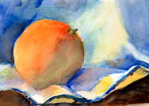
Orange with cloth 5″ x 7″ watercolor on #140 Canson cold press
I’ve been working hard on the CandledEgg painting, and I’m almost finished with it. After working on it for the last 4 mornings, I was tired of painting in such a restricted fashion (choosing colors carefully, debating about shapes and brush strokes, trying for realism), so today I gave myself an hour to paint this cheeky little orange on a dish cloth.
I’ll post about the Candled Egg soon, but that might be a series of very long posts, and I need to attend to business offline.
Happy Monday, everybody!
If you think this blog might be of comfort to someone, please share it
I woke up this morning all fired up to paint another egg. After reading my friend’s email, and studying Jean Dobie’s book Making Color Sing and Exploring Color by Nita Leland, I had a plan.
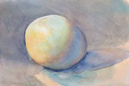
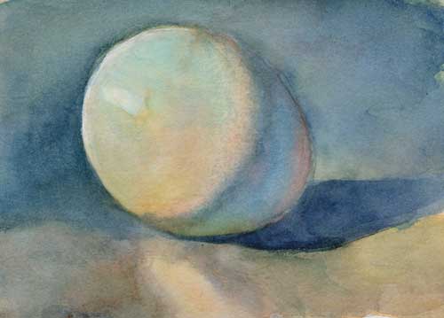
Egg 5 Watercolor on #300 Arches hot press
1. Make sure the whole egg had tone Without paint on the paper, it’s hard to show the hotspot of the highlight.
2. Up planes are cool, down planes are warm I can see this on the egg in the shadow box. Now that I’m thinking to look for it. Funny how you can look and look and look at thing, and not really see it until it’s pointed out to you.
This little practice egg shows my plan perfectly. It took less than five minutes to make this.
3. Have a plan Cerulean blue would be the midtone on the top of the egg, with a dash of ultramarine blue at the part closest to me. An orange-yellow on the bottom of the lit side, and a grayed-down purple for the “bed-bug” line where the shaded side of the egg meets the lit side. And a nice pink color for the reflected light on the bottom of the shaded side.
4. Use grays to pop colors Jean Dobie suggests mixing grays from complimentary colors to help pop the pure colors. I spent a lot of time thinking about grays, and about which grays should be adjacent to which colors.
5. Don’t over work Yeah. Right.
What am I looking for with all these eggs? Last night I spent a lot of time thinking about where I’m going with this. I am looking for the freshness of these little splashes of color you see here, but with the depth of an old-master style still life. Is that even possible? I’m not sure, but evidently I will obsess about it until I figure it out.
Reader, how do you solve your obsessions?
If you think this blog might be of comfort to someone, please share it
Dear reader, are you getting tired of eggs? I know I am.
But it’s not just eggs I’m painting, I’m trying to get the hang of painting a sphere. I have to admit, I’m frustrated. These eggs are not coming out like the pictures in my head. Today I emailed a friend of mine, Doreen Barton, who is a wonderful painter (really, go look at her work). She sent me a list of color temperature “rules” to think about and some suggestions; this one helped me the most:
“But attack it another way – how would you “model” the form with pencil/graphite, i.e., the only area where you didn’t apply graphite would be the highlight? In that case only the highlight could be white because you wanted the viewer not to understand that the egg is white, but to clearly see the form with all of its imperfections. It’s another way of defining the light/shadow values.”
Funny how advice you’ve heard a million times takes further repetition to make you listen. That bit of advise—the only area where you didn’t apply graphite would be the highlight—freed me to put more tone on the lit side of the egg. I had to scrub and sand away some of the dark value, because I belatedly realized that my drawing, done in a hurry, was way off.
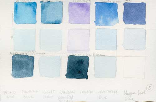
I also pulled out a stack of blue paints that I’ve had in a drawer. I’ve been using Ted Nuttall’s palette since last March, and I finally realized that it was too high key for what I wanted.
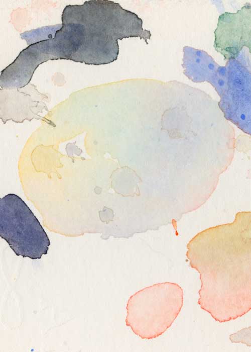
Color chart
This batch of blues has pthalo blue (top left) and my favorite dark blue, Maya dark blue (bottom middle) from Daniel Smith, the two colors I went to for this egg. It’s beginning to look like what I’m after, but it’s still not there. You know what that means.
Another egg.
If you think this blog might be of comfort to someone, please share it
Creamer and Eggs Watercolor on #300 Arches hot press
I’m still painting eggs this January, but I decided to add another element.
I know I’m not handling these white subjects in a traditional watercolor fashion that’s light and delicate and high-key. I’m trying to find a way to make a low-key painting with watercolor because A. The high-contrast Dutch and Flemish genre style master paintings (think Vermeer and Rembrandt) set my brain on fire, and B. I’m trying to push my watercolors to be more.
I like the work in the pitcher spout and the eggs.
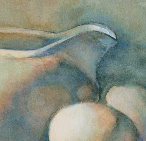
Milk Creamer and Eggs (close up)
But there’s still not enough contrast between the pitcher and the background. So after I scanned this painting, I went back for a quick, devil-may-care splash at the easel. What the heck. I wasn’t happy with the painting anyway.
Milk Creamer and Eggs (State 2) Watercolor on #300 Arches hot press
After washing the background with several layer of ultramarine blue, terra rosa, and some dark greeny-blue that has no name in my palette, the contrast is working better. And now I’m starting to get a more textured background, which I also like. I’ve sanded the background twice with a rough grit sand paper, and applied multiple layers of paint, but it wasn’t until I started to put more paint on the paper that things started happening.
Sometimes it pays to have courage with watercolor.
This is part of a series exploring one 1-hour painting (nearly) every day in January as part of Leslie Saeta’s series, Thirty Paintings in Thirty Days. To see my experience with the entire series, click on the category, 30 in 30, at right.
If you think this blog might be of comfort to someone, please share it
Today was the life drawing session (Yay!) at Town Hall Arts Galerie Copper in Copperopolis. It’s a nice small-town art store with a gallery and a studio for art classes. Our models there have been very good, especially considering we are in such a remote area. If you live in Calaveras County, you should check out their classes, as well as their art supplies and gallery full of locally produced art. Maybe I’ll see you there!
I met a friend at the figure drawing session in Copperopolis; she hadn’t done much figure drawing, and since it’s hard to shut me up when it comes to drawing, I volunteered to coach her through the session. After the session I couldn’t stop thinking about how I’d teach figure drawing if I were ever able to get a class together. I thought that on the blog I’d pass along a few tips to help make your figure drawing (heck, all your drawing) more accurate, and hopefully less frustrating and more fun.
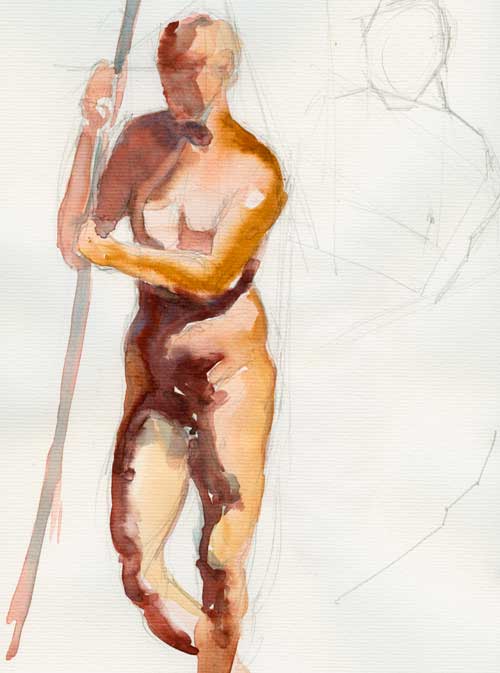
Standing figure: 15-minute pose Watercolor on Biggie watercolor paper
Measure
Yes, I know it’s awkward to stick your out your hand and sight down you arm to your pencil. It’s like you think you’re some kind of *ahem* artist or something. But trust me on this, your drawing will be more accurate, and it will come together more quickly once you get the hang of measuring and comparing length and width, and calculating angles. In the example above you can see some of my block-in lines. Those angles help with the placement of not just all the body parts, but the placement of the figure in space as well.
Sadie Valerie in San Francisco has a great video demonstration (click here) about using angles to block in shapes.
It’s hard to draw accurate proportions, but if you compare the length, width, and height of all the different parts of the figure (okay, use that part if you must) it will help keep your drawing under control.
I know there are good artists who don’t measure, and you know what? Good for them. I measure. Lots of artists measure. And the the more you measure, ultimately the less often you’ll need to measure as you develop and train your eye and hand.
Leave the extremities for later
Reclining figure: 15-minute pose watercolor and graphite on #300 Arches hot press
Hands and feet are hard to draw, so leave them for later, or for a longer session. Concentrate on drawing the torso before you start detailing the hands and feet. If you get the gesture and pose of the torso on your paper, often the viewer will fill in the hands and feet with their mind. After all, we know they’re supposed to be there.
Think in terms of shape, not line
Figure: 10-minute pose Watercolor on #140 Arches paper
Squint to see the large masses of shadow and light and draw those shapes. They describe form, and when you hit those shapes correctly, BAM! Your image will pop. Check the angles, measure those shapes. And sometimes it helps to divorce your mind from the object you’re drawing and ask yourself, what does that shape look like by itself? Maybe it looks like Michigan, or a gorilla, or a sloth sleeping upside down. Draw that shape.
My working method for these watercolors
Since I’m working on the Thirty Paintings in Thirty Days project, I took my watercolors with me for this session. For these poses I drew the figure first with pencil, making sure that I had correct shapes for the shadows. After so many life sessions, I have a sort of inner clock that alerts me to the time left for a particular pose, so I’m able to put down my pencil and pick up the paintbrush with enough time to lay in a few blocks of color. Then I go home and fiddle with them some more, trying to remember the pose and the way the light fell across the form.
If you think this blog might be of comfort to someone, please share it
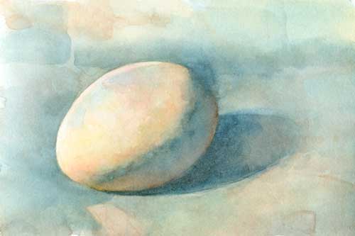
When I finished with my post yesterday, I found my Thomas Aquinas Daly book, Painting Nature’s Quiet Places (it was still packed away from our summertime move). I studied it deep into the night, revisiting his spare words and beautiful paintings. (And I must mention the wonderful smell of this book. I don’t know why it smells so good: like fresh ink, plaster, paper; that odor has become part of the way I perceive his work. I want my paintings to smell like this book.)
Today, while his work was still ricocheting around my brain, I decided to paint another egg, using a limited palette that was more subdued than the bright colors I usually use (a hold over from Ted Nuttall and Steve Curl, two big influences on my watercolor painting).
Again I worked far to long on this painting, using more time than I really have, but I was searching for something.
Egg 2 (First state) Watercolor on Arches #300 hot press
The first time I thought I was “finished” (after two hours) I really wasn’t, but I didn’t realize that until I scanned the painting and saw the thumbnail. Kind of blah.
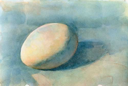
One of the big strengths of Daly’s paintings is his exquisite sense of composition. I realized that I had just been painting an egg, not a picture. So I tried to find some composition in what I’d started.
Egg 2 (Second state) Watercolor on Arches #300 hot press
I painted some more, trying to build up values and saturation. I strengthened the composition by adding more value and creating stronger, more interesting shapes, and I increased the value in the darks. It helped, but still, as you can see in the second scan, no cigar.
Egg 2 (Third state) Watercolor on Arches #300 hot press
This is the third pass I made at this painting. (Ah, making a pass is such a loaded phrase, isn’t it? So redolent of the kind of heated desire that keeps an artist working in the midst of frustration.) When I started painting this morning, I decided that I would skip my go-to color, ultramarine blue. But in the end I found that I needed that particular shade of reddish blue to push the background behind the egg, as well as help me define the shapes better. I also realized that it needed more saturated colors to bring it out of its monochromatic doldrums, so I added that glow of cerulean blue and a red splotch on the egg itself (remember, warm colors, if they’re the right value, come forward). It’s better, and I’ve learned many lessons.
Daly says, “My purest creative energy comes to fruition in the puddles, flecks, and patches of paint on the paper’s surface rather than in what they represent. The internal dynamics of watercolor as a medium and the rich, sensual surfaces that can be created with it are the very qualities the keep me enthused abut my work.”
Indeed.
If you think this blog might be of comfort to someone, please share it
Despite my best intentions to control my time, this painting of a little tea pot got away from me. I spent far more than one hour on it and it’s only beginning to be what I want it to be.
I worked hard on the initial drawing. I wanted it to be correct before I began splashing paint around, as pencil is easier to change than watercolor. But I could have worked on it longer; man made objects are hard to draw accurately.
Now the question is, should I work on it a few more hours, or should I give up and start over with a fresh drawing of a better composition? One of my favorite painters, Thomas Aquinas Daly, might simply scrub out parts of the painting. Sometimes I think we give up too soon on paintings, so I’ll keep hacking at this one until it’s destroyed or becomes a better painting.
Plus I’ll start something new tomorrow.
Teapot Close up Watercolor on Arches #300 hot press
Thought it might be interesting to see some of the brush strokes.
If you think this blog might be of comfort to someone, please share it
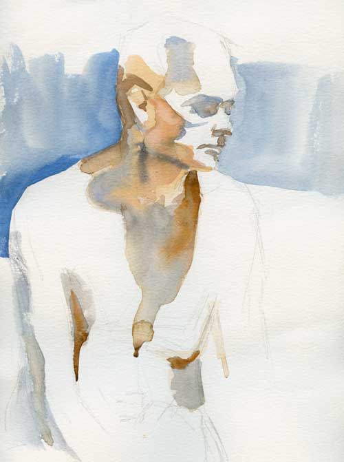
People often ask if I paint portraits from life. Yes, I do, and I prefer it actually. But no one wants to sit still for that as many hours as it takes me to paint a portrait.
But as part of my 30 in 30 challenge (30 days of painting for at least an hour a day from life only), I persuaded a visiting friend to sit for me for about 2 hours. We were listening to my fiddler and her banjo-player have some major old-time tunes, and she was itching to dance (she’s an avid and talented dancer). Between the wiggles and the occasional clogging break, I managed to get this quick portrait of her.
By the way, if you’re looking for a journal that will take watercolor, I suggest the Strathmore 500 Series Mixed Media Hardbound Art Journal. It will take several sloppy washes and a lot of pigment with only a minimal amount of buckling. And the image doesn’t bleed through to the other side too much, which makes it useful for journaling. And the binding is a sort of fake leathery-looking material, so it feels a bit rich and special, which we all need sometimes.
You can hear the music here:
If you think this blog might be of comfort to someone, please share it
Why, oh why do I always gravitate towards the complex, the difficult, the ornate?
This antler (naturally shed, I’ve been assured) was just given to me. How exciting! I’ve wanted to make some antler images for a long time, but deer aren’t just dropping their horns all over the place in the Bay Area. This antler was actually the reason I finally got myself together to make a shadow box for still lives.
I will admit, this painting took me longer than the hour I’ve allowed for the 30-in-30 challenge; I worked on it for about 2.5 hours. So much for my day. But I love the shadow box!
What’s wrong with this painting
When I complain to the fiddler about my paintings, his question to me is always, what’s wrong with it and how can you fix it? So I thought I’d publicly pick this one apart a little.
Part of the problem is the placement of the antler in the space. The paper is 8″ x 10″. You can see that, while the shape of the antler is interesting, it’s not really filling the space.
The solution
With our friend Photoshop, I cropped the painting.
Antler (cropped) Watercolor on Arches #300 hot press
That is much better. Now the beautiful spaces between the horns are more noticeable, and the shapes the object makes against the background are more interesting. The antler fills the space, and gives the eye a shorter distance to move to the edges of the paper, which helps lead the viewer around the painting.
Another problem is that I didn’t take time to draw the antler carefully, and pay attention to the form shadows. I’ll be revisiting this subject in charcoal, so seek a better understanding of how it takes up space.
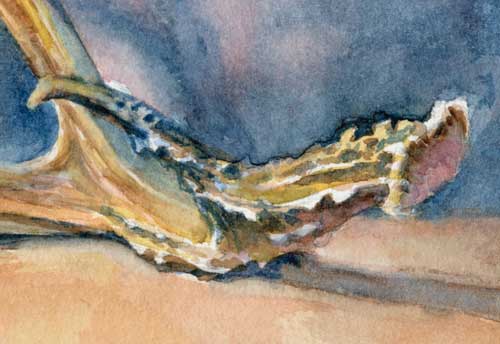
Antler (close up) Watercolor on Arches #300 hot press
Here’s a close up. I tried to simplify the bumpy parts of the horn, while still wrapping my mind around all the patterns of the littler forms.
Next painting? Maybe something simple. An egg?
If you think this blog might be of comfort to someone, please share it