When I finished with my post yesterday, I found my Thomas Aquinas Daly book, Painting Nature’s Quiet Places (it was still packed away from our summertime move). I studied it deep into the night, revisiting his spare words and beautiful paintings. (And I must mention the wonderful smell of this book. I don’t know why it smells so good: like fresh ink, plaster, paper; that odor has become part of the way I perceive his work. I want my paintings to smell like this book.)
Today, while his work was still ricocheting around my brain, I decided to paint another egg, using a limited palette that was more subdued than the bright colors I usually use (a hold over from Ted Nuttall and Steve Curl, two big influences on my watercolor painting).
Again I worked far to long on this painting, using more time than I really have, but I was searching for something.

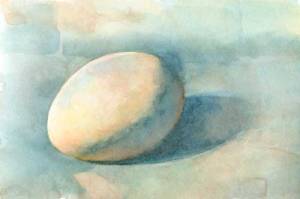
Watercolor on Arches #300 hot press
The first time I thought I was “finished” (after two hours) I really wasn’t, but I didn’t realize that until I scanned the painting and saw the thumbnail. Kind of blah.
One of the big strengths of Daly’s paintings is his exquisite sense of composition. I realized that I had just been painting an egg, not a picture. So I tried to find some composition in what I’d started.

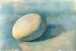
Watercolor on Arches #300 hot press
I painted some more, trying to build up values and saturation. I strengthened the composition by adding more value and creating stronger, more interesting shapes, and I increased the value in the darks. It helped, but still, as you can see in the second scan, no cigar.

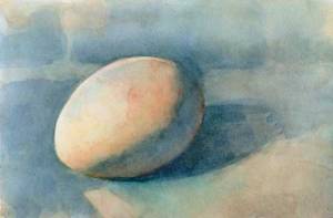
Watercolor on Arches #300 hot press
This is the third pass I made at this painting. (Ah, making a pass is such a loaded phrase, isn’t it? So redolent of the kind of heated desire that keeps an artist working in the midst of frustration.) When I started painting this morning, I decided that I would skip my go-to color, ultramarine blue. But in the end I found that I needed that particular shade of reddish blue to push the background behind the egg, as well as help me define the shapes better. I also realized that it needed more saturated colors to bring it out of its monochromatic doldrums, so I added that glow of cerulean blue and a red splotch on the egg itself (remember, warm colors, if they’re the right value, come forward). It’s better, and I’ve learned many lessons.
Daly says, “My purest creative energy comes to fruition in the puddles, flecks, and patches of paint on the paper’s surface rather than in what they represent. The internal dynamics of watercolor as a medium and the rich, sensual surfaces that can be created with it are the very qualities the keep me enthused abut my work.”
Indeed.


I love the delicate and luminous colors!
Thanks. I have to work really hard to keep a light touch.
Lovely, and thanks for the detailed explanation as well. It’s so nice to see your progression in the three photos. Nice work.
Lovely egg painting. All the colors dance!
Thank you!