30-in-30: How to paint a snow storm

snow storm
White out study
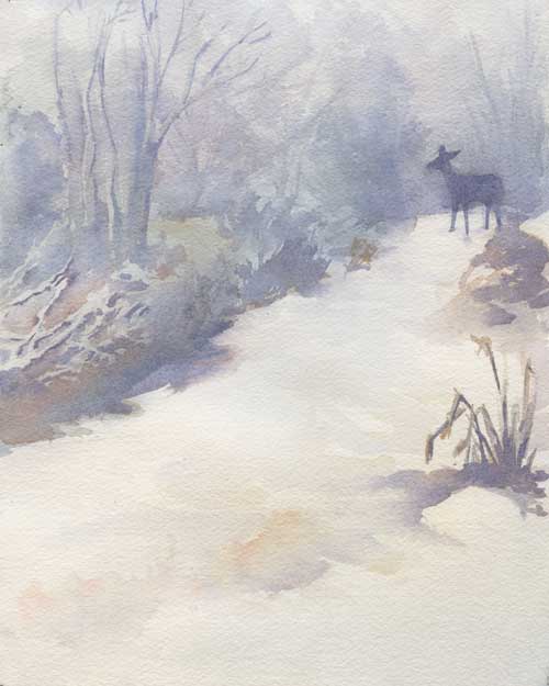
8″ x 10″ watercolor on Arches 140# block paper

A recent photo of a white-out blizzard in the East posted by my cousin intrigued me. A study in high-key values, it called out to me to be painted. Permission to use her photo was granted and here you can see the first pass of the results. (Although deer do roam her property, this little doe is from my own head.)

I love snow. Granted, until this year I’ve never lived where there’s been too much (meaning any) snow, but I live in the mountains now, and this December we had a couple unusually heavy snowstorms. The snow was magical; the cold air made me tingle, the cool light reflecting the sky made my heart sing. But alas, I was too busy to do any plein air painting while there was snow on the ground, but there’s a snow storm promised for next week, so I’m hoping…

The hardest thing for me was keeping my values light. I normally paint with a pretty heavily loaded brush. I also realize that I want to mess with the composition a bit. And it really didn’t turn out the way I saw it in my head, so I think it deserves a couple more attempts, with more time in the planning.

pencil drawing
Pencil study for White Out

30-in-30: Watercolor selfie

Self portrait 8" x 10" watercolor on Arches 140# hot press
Self portrait
8″ x 10″ watercolor on Arches 140# hot press

This is pretty much what I look like, dear readers, although I might have smoothed out the bags under my eyes, and neglected to paint the complete truth about hair color. I come from a red-face family, and my cheeks are often nearly that crimson, although in this painting they might have been exaggerated just a bit by the new tube of Daniel Smith quinacridone rose. Awesome color. I’m afraid to do a light test on it…

I love to draw, almost more than anything else (except maybe eat), but I spent all this morning with a pencil in my hand, and by this afternoon, I was just tired of it. This little painting was done with only two pencil marks, one to mark the top of the head and one to mark the angle of the chin. Everything else was by brush alone.

And after 2 weeks of arguing with Aquabord, I decided to do my daily painting on PAPER! Although it wasn’t my beloved 300# hot press, it was still Arches, cotton rag torn out of a block. Ah, back home again.

Although I tried to limit myself to 1 hour, when the ringer went off, I had to mess with it just a half hour more to bring it into some sort of completion.


30-in-30: Painting in pink

Sisters
Sisters
Watercolor on 6″ x 6″ Aquabord

I’ve been wanting to paint this image for a while. I snapped this photo at Columbia Historic State Park last year.

It reminds me of two of my cousins. I’m not going to say they were sweet little girls, although they were. But they were also holy terrors, and a super amount of fun to visit.

30-in-30:Time behind the brush


Deer painting
Deer in landscape study
Watercolor on Ampersand Aquabord

Lately I’ve been working on Ampersand Aquabord. I don’t totally love it the way I love Arches #300 hot press, but I’m fond of the idea that I don’t have to frame it behind glass. That makes it far cheaper, even considering the cost of the board. And I also like that I can rub the paint away more easily to correct mistakes (although it’s surprisingly simple to blot out errors on the Arches).

For today’s painting, I experimented on this 9″ x 12″ Aquabord with some tried and true watercolor cheats techniques: Salt, alcohol, and masking fluid.


watercolor with salt on aquaboard
Detail: Watercolor with salt on Aquabord

Paint doesn’t really soak into the Aquabord, so it was difficult to rub off the salt without rubbing off the paint. But it does make an interesting dark texture.

Watercolor with masking fluid
Detail: Watercolor with masking fluid on Aquabord

I don’t normally use masking fluid, but occasionally I find a use for it. The texture of the board makes it hard to apply the mastic in an even stroke, and the rubber cement pickup picked up the paint too.


Watercolor with alcohol on Aquaboard
Detail: Watercolor with alcohol on Aquabord

I’ve never been happy with spraying alcohol on paper, but on the board I liked the random, irregular marks it made in the paint. It bears more experimentation.


I like these quick little studies. I try not to think about the end result, but rather try many different things. If you’re participating in Leslie Saeta’s daily paint project in January, I hope on some days you’ll just have a fling with your paint. Who knows what you’ll discover?


30-in-30: Farmer’s market musicians


Guitar player
Guitar player at the Farmers Market
Pen and watercolor in Stillman and Birn Delta Series Sketchbook

I had great fund making this sketch. Musicians stay in one position long enough that it’s possible to capture their images—but unfortunately, not their music—in the sketchbook.


Yes, it’s time again for another 30 paintings in 30 days. I’m a little late for this one, and am playing catch up.

30 Paintings in 30 Days is hosted by Leslie Saeta at http://lesliesaeta.blogspot.com/. It’s fun to look at other artists’ work. The last time I participated, I made a couple new internet friends, and that was the best part.

However, the last time I participated, I felt the need to write buckets about what I was doing. This month I’m a bit too busy, so I will try to contain myself.


30-in-30: It’s all over now but the singing

Collage of 30-in-30 paintings made with PicMonkey

Today is the last of my 30-in-30 paintings as part of Leslie Saeta’s Thirty Paintings in Thirty Days. I want to thank her for challenging the paint-o-sphere to take up brushes and post their results everyday of January. I also want to thank her for hosting all of us on her blog. It’s been fun; I’ve found some amazing and dedicated artists this way, and met some lovely people.

My goal at the start of January was to make 30 paintings strictly from life. I love the way that it made me see differently; made me see more clearly; and made color even more flavorful than it usually is to me. I’m excited to paint from life more often. I’m curious to see how it will affect my work from photos.

But just because it’s no longer February doesn’t mean that I’ve got to put down my brushes. Onward and upward! More eggs!


30-in-30: Watercolor portrait from life


Watercolor portrait
15-minute portrait
Watercolor on really terrible paper

I began this painting in the life drawing session on Thursday. But since the models (us!) only posed for 10 to 15 minutes, I didn’t have time to A. Catch a good likeness and B. apply much paint. So I brought it home and played with it in my studio. I admit, I cheated a little bit. I started it on Thursday, but finished it today. (I didn’t have time to start a personal painting today, as commercial work fell in my lap, and you know how freelancing goes: work when you’ve got it and starve when you don’t.)

This is paper that, even though it wasn’t cheap (although not at the top of the food chain either),  is even more unsatisfactory than the really cheap stuff. I was sorely disappointed in this paper, and have never really used it for anything much at all. It looks like it should be a wonderful paper, but when you start applying washes, it gets very strange speckles all over it. And you can’t take any of the paint off; scrubbing gets you nowhere. I won’t tell you the brand in public (I don’t like to kiss and tell), but if you really want to know, I can tell you privately.

Maybe I haven’t learned how to coax the best from this paper. Eventually I guess I’ll learn as I still have a whole pad of it.


30-in-30: Drapery in watercolor, with orange

Watercolor painting of dishcloth and orange
Dishcloth with orange
Watercolor on #140 Arches cold press

I really want to title this, “It’s a dishcloth, fella. Orange you glad you asked?” But I thought I’d be kind.

Here are the thoughts I had about painting drapery in the aftermath of a frustrating morning:

  • Take time setting up the subject. You want an interesting composition, with large shapes that are easy to see.
  • Plan the color scheme carefully. Remember what Jeanne Dobie says about “mouse power.” Those rodent-grays will make the saturated color glow.
  • Before you start slopping paint around, plan the highlight patterns. They will lead the eye and give shape to the drapery.
  • Draw the shapes of  the darkest shadows, and figure out how you can simplify them and connect them. This helps keep the painting from looking splotchy.
  • Then figure out your large shapes. Think of them as zones. Which zone will you use as the focal part of the painting? That should have the most contrast, the brightest colors. Which zone is closest to the light? Furthest? Paint accordingly.
  • Don’t get too dark too fast. It doesn’t give you any room to play.
  • Think more about the edges. For instance, figure out which side of a fold has soft edges (and maybe both sides of the fold have soft edges).
  • When painting the soft edges, don’t get all blendy. It looks mushy. If you look closely, there are some hard and soft edges in the rounded folds. They might be low contrast, but they are there.
  • Think more about reflected light.
  • Remember what Ted Nuttall says about shapes. Each shape should be it’s own tiny abstract painting.

It’s important to learn how to paint draped cloth for many reasons (like if you want to put clothing on your live model!). But as I was painting this, I realized how similar the folds in cloth are to the folds of hills and valleys in the landscape.

Drapery. More interesting but not as hard as eggs.


30-in-30: Painting a white dishcloth in watercolor is better than doing the dishes

White dishcloth with orange Watercolor on #140 Canson cold press
White dishcloth with orange
Watercolor on #140 Canson cold press

I swore that I’d give myself only one hour for this little painting. Honestly, I did.

But after about three brush strokes into this piece I knew that the kind of detailed work I love to do wasn’t going to be possible. I tried to tackle too much information in a short period of time and a small space.

The best thing to do in that situation is to work on just the large masses, so I concentrated on the dark and light patterns to strengthen the composition. And I tried to limit my time on it, in order to make big decisions rapidly.

It’s been a long time since I drew value studies of drapery. As you well know, drawing is the foundation of painting. I see a month of drawing in my future.