30-in-30: Drapery in watercolor, with orange

Watercolor painting of dishcloth and orange
Dishcloth with orange
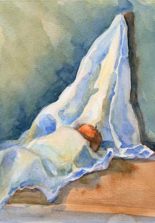
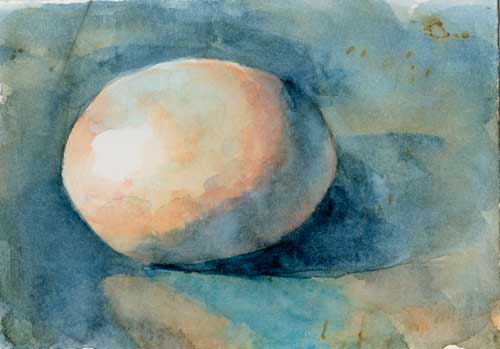
Watercolor on #140 Arches cold press

I really want to title this, “It’s a dishcloth, fella. Orange you glad you asked?” But I thought I’d be kind.

Here are the thoughts I had about painting drapery in the aftermath of a frustrating morning:

  • Take time setting up the subject. You want an interesting composition, with large shapes that are easy to see.
  • Plan the color scheme carefully. Remember what Jeanne Dobie says about “mouse power.” Those rodent-grays will make the saturated color glow.
  • Before you start slopping paint around, plan the highlight patterns. They will lead the eye and give shape to the drapery.
  • Draw the shapes of  the darkest shadows, and figure out how you can simplify them and connect them. This helps keep the painting from looking splotchy.
  • Then figure out your large shapes. Think of them as zones. Which zone will you use as the focal part of the painting? That should have the most contrast, the brightest colors. Which zone is closest to the light? Furthest? Paint accordingly.
  • Don’t get too dark too fast. It doesn’t give you any room to play.
  • Think more about the edges. For instance, figure out which side of a fold has soft edges (and maybe both sides of the fold have soft edges).
  • When painting the soft edges, don’t get all blendy. It looks mushy. If you look closely, there are some hard and soft edges in the rounded folds. They might be low contrast, but they are there.
  • Think more about reflected light.
  • Remember what Ted Nuttall says about shapes. Each shape should be it’s own tiny abstract painting.

It’s important to learn how to paint draped cloth for many reasons (like if you want to put clothing on your live model!). But as I was painting this, I realized how similar the folds in cloth are to the folds of hills and valleys in the landscape.

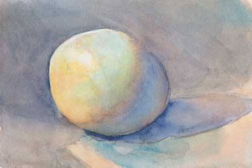
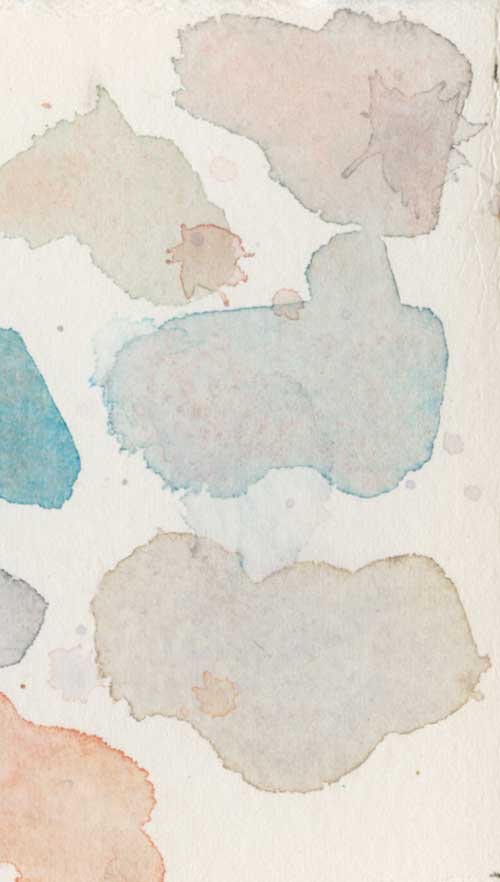
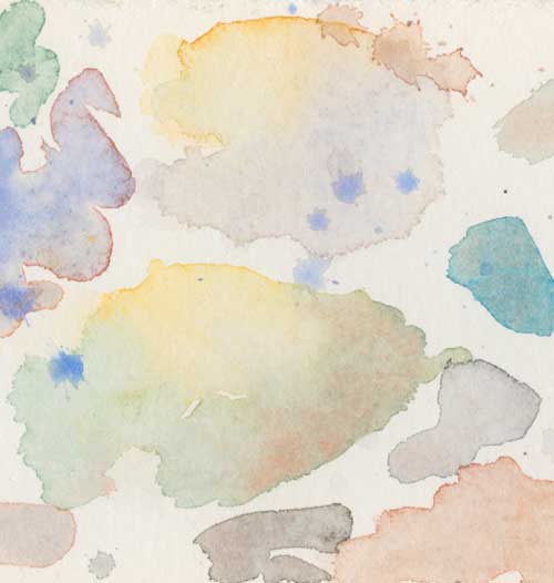
Drapery. More interesting but not as hard as eggs.


30-in-30: Painting a white dishcloth in watercolor is better than doing the dishes

White dishcloth with orange Watercolor on #140 Canson cold press
White dishcloth with orange
Watercolor on #140 Canson cold press

I swore that I’d give myself only one hour for this little painting. Honestly, I did.

But after about three brush strokes into this piece I knew that the kind of detailed work I love to do wasn’t going to be possible. I tried to tackle too much information in a short period of time and a small space.

The best thing to do in that situation is to work on just the large masses, so I concentrated on the dark and light patterns to strengthen the composition. And I tried to limit my time on it, in order to make big decisions rapidly.

It’s been a long time since I drew value studies of drapery. As you well know, drawing is the foundation of painting. I see a month of drawing in my future.

30-in-30: Painting an orange in watercolor is sweeter than painting an egg

Orange with cloth 5" x 7" watercolor on #140 Canson cold press
Orange with cloth
5″ x 7″ watercolor on #140 Canson cold press

I’ve been working hard on the Candled Egg painting, and I’m almost finished with it. After working on it for the last 4 mornings, I was tired of painting in such a restricted fashion (choosing colors carefully, debating about shapes and brush strokes, trying for realism), so today I gave myself an hour to paint this cheeky little orange on a dish cloth.

I’ll post about the Candled Egg soon, but that might be a series of very long posts, and I need to attend to business offline.

Happy Monday, everybody!

Watercolor car kit travels small but paints big

TravelWatercolorKitMy last post about painting in the car got a lot of interest. I’ve been doing this for a long time, so I’ve got my system down pretty well. This is my kit for painting while in the passenger seat.

  1. A Windsor Newton travel paint box. You want something small, something that will fit on your lap, or on the verso of your journal. I use an old Windsor Newton travel palette; unfortunately the little paint holders don’t come out of the box. This set came with Cotman Student Grade paints, which are okay as far as they go. Over the years I’ve used them up (or scraped them out) and filled the pans with higher grade paints in colors that I use more often. I wish it were easier to change out the paint. If I were to buy a new one, I’d buy an empty watercolor tin, and fill it with my own paints. Or something slightly larger: the Guerrilla Painter Backpacker Watercolor Palette. I’ve tried to make my own using old Altoid tins, but they’ve never worked quite like I thought they should.
  2. A Windsor Newton travel bag. You can still buy these, fully equipped, but you’ll pay through your pierced little nose. I bought mine at a deep-discount sale years ago when I had more money than sense. It’s great, but I think a quick trip to a few thrift stores might have yielded something almost as good at a fraction of the price.
  3. 6-inch ruler. It really comes in handy when you want to make boxes of a certain size, make straight lines, or scratch your back.
  4. Micron pen. For making notes, drawing cartoons, etc. I don’t use it that often, as it requires far too much looking down, which would make my stomach do the hootchy-kootchy in the car. Not a pretty site for heavage.
  5. Aquash watercolor brush. No, it’s not like painting with fine sable brushes, or even not-so-fine synthetic brushes, but it keeps the water contained in the handle until you squeeze the soft plastic. I’ve gotten pretty good at regulating the flow of water.
  6. Pencils. These are fancy art pencils. One is a 2h and the other is a 2b. I don’t do much drawing in the car, other than a few lines to mark the big shapes that I’m going to fill with paint. My favorite pencils for car painting are the Sakura Sumo Grip mechanical pencils, with big, soft .9 mm lead. But they’re the fiddler’s favorite pencils too, so they tend to—ahem—disappear.
  7. Pencil sharpener and kneaded eraser. I don’t really need these when I can find my the Sakura Sumo Grip, but, um, fiddlers…
  8. Eye dropper for filling the watercolor brush. Before I had the eyedropper, filling the brush was exciting, especially when the fiddler was navigating badly maintained state highways.
  9. Small container of water (that doesn’t leak). Coffee will work, in a pinch, if you don’t use sugar and cream, but your colors will suffer for it. Don’t use soft drinks.
  10. Spice jar. To store the eye dropper. This keeps the inside of your kit dry.
  11. A Strathmore 500 Series Mixed Media soft cover journal. I love these. The paper takes watercolor really well, the binding really does lay flat as advertised, and the cover makes me feel like I’ve got a special book.

30-in-30: Plein air watercolor painting at 60 miles-per-hour

Distant water 3.5" x 2.5"  watercolor in Strathmore Mixed Media Journal
Distant water
3.5″ x 2.5″ watercolor in Strathmore Mixed Media Journal

This week I had to make a sojourn to the Bay Area. The fiddler likes to drive, so while the fiddler steered the infernal combustion machine, I painted.

I love passenger-seat painting. Give me a wide enough view and a straight enough road (I suffer from motion sickness), and I can paint for miles.

In the studio, it’s easy to get in that zone of hyper-focus where thought takes a backseat to conscious action. If you’re a painter, you know what I mean. Pick up some color with the brush, dab it on—ooo pretty—dab some more—ooo pretty pretty—dab, dab, dab—pretty pretty pretty—dab, no, wait, dang it, arggh! What have I done? If you don’t pause and move back, pretty soon you’ve created a muddy mess.

Green Hill 3.5" x 2.5"  watercolor in Strathmore Mixed Media Journal
Green Hill
3.5″ x 2.5″ watercolor in Strathmore Mixed Media Journal

Painting landscape studies in the car (while someone else is driving—duh!) is a good way to break that kind of zen-zoned out paint daubing. You can’t focus for very long on one scene, because the scene changes minute-by-minute. So you have to make your decisions rapidly and correctly.

Fallow field 3.5" x 2.5"  watercolor in Strathmore Mixed Media Journal
Fallow field
3.5″ x 2.5″ watercolor in Strathmore Mixed Media Journal

All you have time to do in the car is decide on a quick composition, draw the big shapes, get the right color and value on the palette, and paint the shapes. I start with the sky first usually, the brightest and lightest shape. The jiggling of the car prohibits any attention to detail; it’s all about composition, color and shape.

I love these little watercolors. The challenge is to bring this freshness and life into larger studio paintings.

Winter trees 3" x 6" watercolor in Strathmore Mixed Media Journal
Winter trees
3″ x 6″ watercolor in Strathmore Mixed Media Journal

Drawing a candle holder for beginning a watercolor painting

Jan22_CandeledEgg_SetUp

After all those eggs, it feels good to be painting something else besides eggs. Well, and eggs too.

Graphite on paper underdrawing for beginning a painting

This is how I start a drawing; by measuring the angles, horizontal lines, and vertical lines. It’s kind of like using a grid. For subjects that aren’t so man-made as this candle holder, I can often hold the grid and the lines in my head, but for this I needed to make sure that my horizontals were level (I tend to drift down when I draw horizontal lines), and that my verticals were really straight up and down. Before I start to paint, I’ll erase many of these lines, and lighten the rest. I’ll also erase lines that need to be soft edges, so that I don’t forget when I’m in the heat of applying pigment.

I’m not quite done with this drawing. There are a few area I want to perfect. But it’s pretty close. It’s been for this image that I’ve painted all those darn eggs.

Now I’m going to get to paint something else, and I’m eggs-cited.


30-in-30: One more egg in watercolor before I crack

I woke up this morning all fired up to paint another egg. After reading my friend’s email, and studying Jean Dobie’s book Making Color Sing and Exploring Color by Nita Leland, I had a plan.

Egg 5 Watercolor on #300 Arches hot press
Egg 5
Watercolor on #300 Arches hot press

1. Make sure the whole egg had tone Without paint on the paper, it’s hard to show the hotspot of the highlight.

2. Up planes are cool, down planes are warm I can see this on the egg in the shadow box. Now that I’m thinking to look for it. Funny how you can look and look and look at thing, and not really see it until it’s pointed out to you.

Jan21_EggColorChart1
This little practice egg shows my plan perfectly. It took less than five minutes to make this.


3. Have a plan Cerulean blue would be the midtone on the top of the egg, with a dash of ultramarine blue at the part closest to me. An orange-yellow on the bottom of the lit side, and a grayed-down purple for the “bed-bug” line where the shaded side of the egg meets the lit side. And a nice pink color for the reflected light on the bottom of the shaded side.

Jan21_EggColorChart3

4. Use grays to pop colors  Jean Dobie suggests mixing grays from complimentary colors to help pop the pure colors. I spent a lot of time thinking about grays, and about which grays should be adjacent to which colors.

Jan21_EggColorChart2

5. Don’t over work  Yeah. Right.

What am I looking for with all these eggs? Last night I spent a lot of time thinking about where I’m going with this. I am looking for the freshness of these little splashes of color you see here, but with the depth of an old-master style still life. Is that even possible? I’m not sure, but evidently I will obsess about it until I figure it out.

Reader, how do you solve your obsessions?


30-in-30: Painting another darn watercolor egg

Egg 3 Watercolor on #300 Arches hot press
Egg 3
Watercolor on #300 Arches hot press

Yes, it’s another egg. I guess you could say I have a series of eggs now. It’s a good exercise to paint an egg. I’ll probably paint more of them.

This was a business day for me, so I really only had an hour to paint this egg. I wanted to see if I could paint something like Egg 2, only paint it in a shorter amount of time.

30-in-30: Watercolor painting is not a cup of tea

Teapot Watercolor on Arches #300 hot press
Teapot
Watercolor on Arches #300 hot press

Despite my best intentions to control my time, this painting of a little tea pot got away from me. I spent far more than one hour on it and it’s only beginning to be what I want it to be.

I worked hard on the initial drawing. I wanted it to be correct before I began splashing paint around, as pencil is easier to change than watercolor. But I could have worked on it longer; man made objects are hard to draw accurately.

Now the question is, should I work on it a few more hours, or should I give up and start over with a fresh drawing of a better composition? One of my favorite painters, Thomas Aquinas Daly, might simply scrub out parts of the painting. Sometimes I think we give up too soon on paintings, so I’ll keep hacking at this one until it’s destroyed or becomes a better painting.

Plus I’ll start something new tomorrow.

Teapot Close up Watercolor on Arches #300 hot press
Teapot Close up
Watercolor on Arches #300 hot press

Thought it might be interesting to see some of the brush strokes.