How to draw figures by drawing a stick man

StickmanWalkingYou drew them when you were a child: stick people that lept, danced, fought, or just stood around in the landscape of your childhood art. And if you learn how to draw them again, they’ll help you enormously when you are sketching in public places.


Things to look for when drawing a stick man

  • Angle for position Pay attention to the angle of the head, shoulders, and the hips. I often draw those lines first, lightly, to help me capture the pose. I also make quick lines for the angles of the feet so that I know how they are positioned and if I have time, I add the knees and elbows using little circles. Getting these landmarks down on paper will help you remember the position of your subject, even after they’ve moved. Everything after that becomes a connect-the-dots game.
  • Measure! Stick your pencil out and verify that your brain is really seeing what’s there. I can’t stress that enough. You don’t have to get too detailed; if you’re rapidly sketching kids on a soccer field, or people in a park, you don’t have time for a lot of measurements. I look for the vertical halfway point and mark that quickly so I can go on to the torso. When I draw the torso, I eyeball the center line so that I can get the right perspective.
  • Torso comes first My life drawing teacher, Rob Anderson, used to say, “if you can draw the torso correctly, you can hang the rest of the body from it.” I always try to get the torso and hips first; they are the structure. All the rest is decoration. If you add lobes to represent the rib cage, it can help you see the center line.
  • Draw cubicley Think of the upper body as a box with two lobes (the ribs). The tummy is a soft ball; how much of that do you see? The pelvis/hips can be a tube, although some people use a box for the hips. I like using a butterfly shaped tube because I can see how the ball of the tummy fits into the pelvis area.
  • Transparent thinking Try to imaging the shoulder blades on the back, which will give you the correct position of the arms. Draw your stickman as though he were a ghost so you can see your construction lines.


Stickman2

Once you have the stickman posed correctly, you can start adding flesh to him. In the figure below, I drew him in black ink, then built his form up using blue lines. When I’m sketching in the field, I draw the construction lines lightly, and often don’t erase them when I’m finished because they can make the figure more solid and dimensional. They are also great for later reference when I’m trying to construct a new drawing, because all this public sketching, besides being fun, is fodder for future work. Stickmanslouching

Drawing exercise Get thee to a public place and draw the people in it. Concentrate on drawing only stickmen. Afterwards at home, draw other stickmen (from your imagination) interacting with the first drawings. Challenge yourself by drawing them in overlapping positions, some farther away, some closer to the picture plane. Then let me know how it goes. I’d love to see your drawing.

Painting a watercolor portrait from life when you only have a few minutes to collect yourself

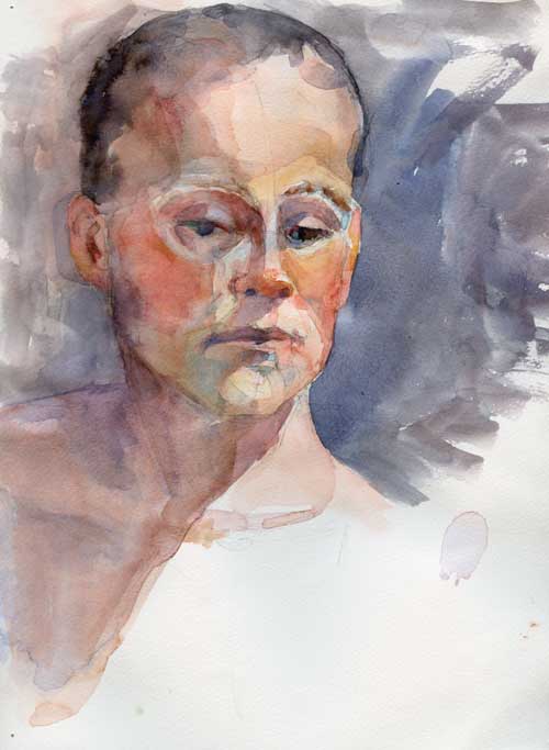
Watercolor portrait
Watercolor portrait from 15-minute life pose at a life drawing session

The painting above was the result of a 15-minute pose at the local life drawing session. 15 minutes isn’t long time. Fruit flies live longer. All I could manage was a quick pencil sketch to capture the model’s likeness and a few brush strokes to remind myself of his overall skin tone (his local color). And one of those brushstrokes—the red stripe on the shadowed side of his cheek—was as awkward as a quarterback in toeshoes.

Oh well. Ted Nuttall once said in a class that sometimes he makes big mistakes just so he has a problem to solve. It keeps him from getting bored.

Watercolor portrait
Watercolor portrait after working on it at home for another 45-minutes.

I haven’t been painting much the last week. I’ve been busy with a few illustration commissions which I was doing in digital space, and haven’t been real-world painting. But Friday morning the call of the paintbox was too strong, that desire to sling pigment and water an unbearable pain in my heart. What could I do? I gave myself an hour behind the brush to play with this painting, setting the alarm for 45 minutes, which would give me 15 minutes to wrap it all up.

During that 45 minutes, the painting began to take shape. But even 45 minutes is not long enough for me to make thoughtful decisions about a painting. More bad brush strokes. Questionable color choices. And unstretched watercolor paper that warps under washes until it’s like painting on a wrinkled wet towel.

watercolor portrait
Watercolor portrait with dark gouache background and ultramarine blue shadows

When the alarm went off, it was time to dry the wrinkly paper with a blast of air from the blow dryer (I’ve heard some folks use a blow dryer to dry their hair. Curious, isn’t it?) and make a couple of large decisions that would finish (or ruin) the portrait.

A dark background of gouache helped ease the brilliance of the colors in the face, and a light wash of ultramarine watercolor over the shadowed side of the face helped unify the shapes and blur the weird red brush stroke that had stumbled across the cheek in the initial 15 minute painting. I had to restate the eye, which wandered a bit. Oh well, we all have a bit of a wandering eye at some point in our lives.

Drawing a candle holder for beginning a watercolor painting

Jan22_CandeledEgg_SetUp

After all those eggs, it feels good to be painting something else besides eggs. Well, and eggs too.

Graphite on paper underdrawing for beginning a painting

This is how I start a drawing; by measuring the angles, horizontal lines, and vertical lines. It’s kind of like using a grid. For subjects that aren’t so man-made as this candle holder, I can often hold the grid and the lines in my head, but for this I needed to make sure that my horizontals were level (I tend to drift down when I draw horizontal lines), and that my verticals were really straight up and down. Before I start to paint, I’ll erase many of these lines, and lighten the rest. I’ll also erase lines that need to be soft edges, so that I don’t forget when I’m in the heat of applying pigment.

I’m not quite done with this drawing. There are a few area I want to perfect. But it’s pretty close. It’s been for this image that I’ve painted all those darn eggs.

Now I’m going to get to paint something else, and I’m eggs-cited.


30-in-30: Eggs, eggs, eggs, all eggs, all the time

Egg 4 Watercolor on #300 Arches hot press
Egg 4
Watercolor on #300 Arches hot press

Dear reader, are you getting tired of eggs? I know I am.

But it’s not just eggs I’m painting, I’m trying to get the hang of painting a sphere. I have to admit, I’m frustrated. These eggs are not coming out like the pictures in my head. Today I emailed a friend of mine, Doreen Barton, who is a wonderful painter (really, go look at her work). She sent me a list of color temperature “rules” to think about and some suggestions; this one helped me the most:

But attack it another way – how would you “model” the form with pencil/graphite, i.e., the only area where you didn’t apply graphite would be the highlight?  In that case only the highlight could be white because you wanted the viewer not to understand that the egg is white, but to clearly see the form with all of its imperfections.  It’s another way of defining the light/shadow values.”

Funny how advice you’ve heard a million times takes further repetition to make you listen. That bit of advise—the only area where you didn’t apply graphite would be the highlight—freed me to put more tone on the lit side of the egg. I had to scrub and sand away some of the dark value, because I belatedly realized that my drawing, done in a hurry, was way off.

I also pulled out a stack of blue paints that I’ve had in a drawer. I’ve been using Ted Nuttall’s palette since last March, and I finally realized that it was too high key for what I wanted.

Color chart
Color chart

This batch of blues has pthalo blue (top left) and my favorite dark blue, Maya dark blue (bottom middle) from Daniel Smith, the two colors I went to for this egg. It’s beginning to look like what I’m after, but it’s still not there. You know what that means.

Another egg.

Biting back at the tyranny of perfectionism

Frustrated artist
Portrait of the artist seeking perfection
Watercolor on Yupo

Blogger Drew at the Skinny Artist recently posted about the perils and paralysis of perfectionism. The kind of perfectionism that keeps painters from painting, writers from writing, and musicians from musicking. You probably have felt it: the need to make sure everything is just so before beginning, working on, or finishing a piece of work. It can be a problem for creatives. It can keep us from accomplishing our goals, telling our stories, meeting deadlines, and making our dreams come true.

I know, I know, it’s hard to let go of the tyranny of perfectionism. I work at freeing myself from it constantly. But it’s possible to break those chains. Here 8 simple bullet point items that work for me.

1. Just start. Fear of failure can derail my creative train before it ever gets out of the station. But come on. It’s art, not mass transportation; if I go off the artistic tracks, nobody dies. Truly. So I chug ahead by doing something. Anything. I copy a Bargue plate; study how to draw a particular body part (right now I’m doing knees); make some color charts; even—when I’m least inspired—drag a brush or pen across a piece of paper just to make some marks. It often sparks an idea and stokes that creative choo-choo.
2. Do a lot of work. Everyday. With plenty of work going on, I don’t end up hunched over one painting hissing “my precioussss”. I’ve got other fish to fry. If a particular painting isn’t working, I move on to something else for a while.
3. Make a mistake early in the process. I work in watercolor, and we all know how hard it can be to correct an errant  . Rather than live in fear that I’ll ruin my perfect piece, I often deliberately make a mistake, just to get it over with so I can paint in peace.
4. Forge ahead and find those mistakes. As an artist, I’m an explorer. I’m seeking the fountain of eternal personal vision, but along the way I’m sure get stuck in the bog of bad brushstrokes, or lost in the desert of dumb ideas. My job is to find those places too; while slogging through them, I’m also mapping them. Who knows? There might be something there I’ll need in the future.
5. When the inner critic starts blathering, change the station. Sometimes there’s a reason to listen to that gremlin, but usually there’s not. When mine starts to cackle in glee at a mistake, I shut him out by thinking of my past teachers, and imagining that they’re standing at my shoulder helping me out of a sticky situation (fortunately I’ve only ever had wonderful, supportive teachers).
6. Let it go. Take a breath. Turn the work to the wall. Go eat some cookies. When you come back to the work, you might discover the fix for any mistakes that have been bugging you. Or you might just discover that you are, in fact, finished, and ready to take what you’ve learned from this work on to the next.
7. Embrace rejection. I once asked a magazine editor friend how she dealt with the constant rejection of her ideas at story meetings. She laughed. “Ideas are cheap. I come up with a hundred of them everyday. Most of them get rejected; I don’t take it personally.” So, go back to #2 in this list. Or move on to #8.
8. Did I say work? Yeah. Work some more. Sleep. Then get back to work. Over the years I’ve noticed that many of the successful artists I admire don’t really have time for existential angst over perfectionism. They don’t have time to, well, spend a lot of time obsessing. Painters pick up the brush and paint; writers sit down at the computer and write. My fiddler takes up his fiddle and plays. There might be angst contained in the process, and they always try to do their best, but the work? It gets done.

**Disclaimer: Understand that I’m just whistling in the dark here. But the thin tune I’m singing can bolster my courage and gumption to get over that fear of failure. Because really, the game may be a foot, but still, it’s all in the mind. 

Get to work.

Painting from a fast sketch


The holiday bazaar last Saturday was lovely, with beautiful artwork and Irish music provided by my own fiddler and our friends from the Irish music community (if there’s any reason—other than sheer joy—to learn to play Irish music, old time, or any folk music, it would be the wonderful groups of friends you’ll make doing so).

The day started a bit slowly, so I took the opportunity from my seat inside the circle of musicians (in between firing off the tunes I knew on the whistle) to sketch the dulcimer player with the intention of later making a painting solely from my sketch after the dulcimer player left to go to another gig.

Sometimes I can’t take photos for reference. Sometimes I just don’t want a camera intruding on the moment. And I like the practice of trying to find a painting from my initial sketch.


pencil sketch
Quick pencil sketch

I payed particular attention to these elements as I gathered information for a painting:

  1. The shapes of the features that made a likeness. She has strong features, making it easier to draw them.
  2. The shapes of the shadow forms. There wasn’t a clear single-light source, so I had to choose the shadows as best I could to show form.
  3. Lost and found edges. Frankly, I was pressed for time, so I didn’t give as much thought to edges as I should have.
  4. Color notes. Okay, in all honesty, I didn’t make any color notes on anything other than her hair and her jacket. But I should have. They would have noted things like skin color in the highlights, midtones, and shadows, room color, light quality. Next time!

I had about half an hour (give or take a tune or two) to make this sketch, so some areas, like the far eye and hairline, were left a bit hazy.  These omissions would later bite me in the butt as I tried to recreate this sketch in color.

Then, while the hall bustled around me with holiday shoppers, I painted.

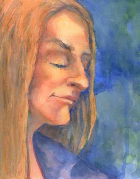
Watercolor painting
Watercolor painting using pencil sketch as resource

After a day of painting between customers, I ended up with a sort of half sketched painting that was almost a likeness, but not quite.

The prevailing wisdom about watercolor is that you can’t erase it. Nonsense! While you can never get down to the beautiful pristine paper again, you can certainly lift much of the color. I didn’t like the purply-red I’d put in her hair, so when I got home, I scrubbed it off with a toothbrush and a spray of water. Then I let it dry completely and repainted.

The mouth also didn’t match the sketch, and so lost much of her character, so I lifted the paint using an old sable brush (I don’t know why this is, but nothing lifts watercolor as well as sable), let it dry, redrew it, and repainted it. The nose got a little surgery and lost its bottom edge. I adjusted the angle of the far cheek and the perspective of the eyes.

watercolor
Watercolor from fast sketch

This almost captures the likeness of the dulcimer player, and I’m pretty pleased to have done it without a photo-aid. To be fair, I’ve known her for years, so that when my brush drove past the likeness, I knew I’d arrived.

How’s your art practice?

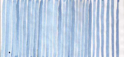
Blue Lines
Breathing lines practice from Creative Triggers

Oh, November! Internet meme month of get-on-the-stick- and-get-started challenges. Write a novel in a month! Post a drawing a day for 30 days! Draw 30 characters in 30 days! Write, design, and ink a manga comic page every day! Make a masterpiece in November!

Exhausting.

We all know that artistic and creative success doesn’t happen in a month (don’t we?). That do accomplish goals, we need a sustainable rate of practice every day of the year. But it’s hard to do, especially in the vacuum of those empty rooms in which we’re supposed to work.

Enter painter and blogger Paul Foxton. Riffing off the book Composition, by Arthur Wesley Dow, and tapping his own knowledge of drawing (Paul is a lovely painter) he created a series of exercises to help build skills, as well as sensitivity to design and artistic ability. Then he created a place called Creative Triggers where folks could find the exercises, and get together to support each other as they work.

Creative Triggers video (Here I’d like to embed Paul’s video, but WordPress won’t let me, so you’ll have to go check it out yourself)

The exercises are well thought out, and he’s built them so that they are bit-size junks that bring you to the next step. I’ve been drawing  and painting my entire life, and even so, it’s nice to revisit these basic (and not so basic) exercises in a systematic manner. Plus, it’s been very nice to post to the forums, and later that day get a couple supportive emails from other students (you don’t have to sign up for the emails if you don’t want to).

My favorite exercise has been the most beginning exercise: “breathing lines,” a way of developing your drawing muscle in a quiet and meditative way. I make a page or two at the beginning of every work session; they put my chatty-Cathy monkey mind into a more reflective, deliberate mood. And I do them every night before I go to bed; they are calming, and I can say goodnight to my favorite paints and paint brushes (you know that I’m in love with my #14 sable Rosemary watercolor round.) Of course, sometimes this backfires, and I have to stay up and paint!

On November 1, Roz Stendahl wrote a great blog post exploding the “empty room” notion as she suggested some ways to deal with being creative in “all conditions, whether he or she feels so inclined, isn’t “inspired,” is tired, is stressed, whatever.” I suggest you read it if you’re interested in upping your art (or writing, or stitching, or any kind of practice you might have). Because since life just happens, we have to make sure we get our own stuff done.

Painting teeth, part 2

Last week I left this blog in a sort of a cliff hanger, with a painting of teeth that looked like the wicked smile of a television vampire. This week I want to show you how I repaired that purple smile.

Scrub out mistakes

I’ve heard many people say that watercolor is unforgiving. That’s not entirely true; you can scrub out all but the most persistently staining colors. It’s true that you’ll never get the same clarity that pristine paper under pigment will give you, so in some styles of painting (like Charles Ried‘s off-the-cuff splashy style) scrubbing isn’t really an option.

I paint  tonally, and I find I can work around the surface of the paper being slightly damaged. It also helps that I use a tough paper like Arches #300 that can, like Timex watches, take a licking and keep on ticking.

watercolor image
Erased mistake on watercolor image

I first tried scrubbing out the purple lips with my trusty ancient Winsor Newton Series 7 . There’s something about sable that will gently get into the paper and loosen the pigment.

But sometimes the sable can’t do much. That ghastly purple color on his lips was mineral violet, which is obviously a staining color. What to do?

Sandpaper! I used a very fine sandpaper (P800) to rub away the purple smile. I made sure the watercolor paper was absolutely dry to avoid tearing it apart. The sand paper removed  the color and made a smooth surface on the paper that will take paint almost as well as the original paper.

Redefine the teeth

watercolor image of teeth
Redefining teeth

Using a clean mixture of cadmium red light and quinacridone rose I restated the negative space that defines the shape of the teeth. Getting the shape of the teeth is important for finding a likeness; in this study I made the teeth just a bit too long, so I adjusted the shapes a bit. The brightness of the red is startling, but it’s important to get the right value of the color in the shadows. I lowered the chroma (the brightness and intensity of the color) later.

Why use red in this instance? Because the lips and mouth are areas that are filled with blood. Even if it looks dark, it’s going to be a warm dark. The red gives a base for this warm, bloody darkness; a cool wash will tone this down but still allow the life of the initial red paint to glow through.

Balance color

Painting teeth in watercolor
More refinement of teeth, and balancing of colors in image

I refined the teeth some more, and used a darker red to give the inside of the mouth a bit more color shift. At this point I also balanced the color on the rest of the face.

Final cool wash

Painting teeth
Final watercolor image with blue wash

Once I felt satisfied with  the values and shapes, I took the last scary step: a cool blue wash over the shadowed parts of the face. This is a step that’s difficult to recover from, so I really look closely at a painting, sometimes letting it sit for a few days before I make my move.

When everything was the way I wanted it, I mixed up a very clean, light puddle of cobalt blue and glazed over the shadows areas, paying close attention to the lost and found edges of the wash. This is what watercolors do best; the cobalt blue subdues the brightness of the colors, but allows them to glow through the blue pigment.

How to paint teeth in watercolor

I normally don’t paint portraits of smiling people. It just doesn’t have the weight of a more sober pose. And it’s darned difficult to pull off. If not well done, teeth tend to get all snaggly in a painting.

But for a recent portrait, I completely agreed with the client that, for a variety of reasons, a smiling portrait was the best possible choice.

I ALWAYS make a study (or two or three) before embarking on a painting. Since the smiling mouth presented the most difficult challenge, I did a small version of that. And for once in my painting/blogging life, I had the presence of mind to have my camera out and take photos of the process to share on this blog. So here we go. How to paint teeth in watercolor.

Start with a line drawing

Line drawing of teeth
Line drawing

For a portrait, I always start with a detailed line drawing. This is the most time-consuming stage, as this is where I do much of my thinking and planning. Here are some of the things  I think about:

  • Shapes and the rhythms of those shapes (getting the shape of the teeth is most important, but I don’t worry about all the details. I concentrate on the general outline.)
  • Lost and found edges
  • Value and color within the shapes

It’s kind of like mapping a journey and getting an overall picture in my  head of where I want to go, because I find that in watercolor, if I don’t know where I’m going, I’ll never get anywhere.

Adding the first light wash

On the day I met with the subject, I made some color studies. Using these studies for reference,  I lay in the first light wash, keeping the warmest colors and lightest values in the lit areas of the portrait, and the cooler and darker values in the shadows.

I don’t preserve a lot of whites on my paper. They seem too harsh once I get the darkest values down. I like to have a light value tone to begin with, and preserve that through out the process.

To make this first wash soft and flowy, I make sure I have plenty of pure color mixed up with lots of water on my palette, ready to go so there’s no chance for the wash to dry into a hard edge.

First light wash in watercolor
First light wash: Computer screens don’t give accurate color. This wash is about 3 steps lighter in value, and not as red.

Ack! It looks like Jabba the Hut! That’s why the next step is so important.

First dark values

The picture below is better, isn’t it? The dark green defines his face and neck. Whew.

Adding dark values
Adding dark values

I start adding color to build the forms and I start adding in the first of my darkest values. I use a dark red in the mouth, painting carefully around the teeth to preserve their shape. The red looks terrifically bright (it’s a little frightening at this stage!), but I know that I’m going to tone that down later with a blue or violet wash. A warm color like red or orange is a way to bring glowing light into the shadows.

Building form

Building form
Building form

I keep building form, continuing to think of hue, value, and those pesky edges. I love to paint into the shadows.  Forms in the mass shadow also have temperature, hue, and value.

Continuing to build form

Building form using darker values

If you deconstruct the face, you’ll find that it’s really a collection of spheres and cylinders. As I’m painting, I’m thinking about those shapes rather than thinking of the painting as a face.

I know this looks rather alarming, but I’ll keep adding light washes, and eventually it will come together.

Final image

Final Image
(Not-so) Final Image

Many layers of transparent paint, and a final light wash of ultramarine blue, it will come together—or not. The use of blue and violet on the lips was a mistake. It looks like Grampa Munster‘s smile. So I’ll leave this tutorial with a bit of a cliff hanger. Can I repair it? Stay tuned for the next episode of The Watercolorist in Fix-it Mode!

 Linkage:

Big time portrait painter John Howard Sanden has a good essay on the question of the smile.

How to draw a sphere