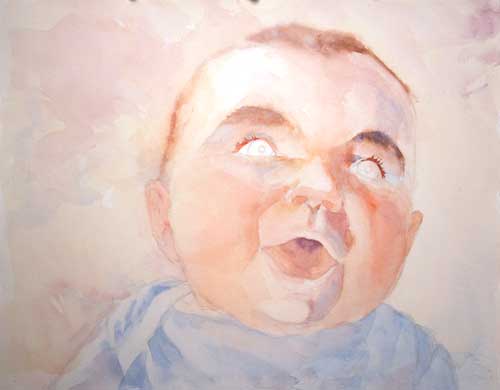
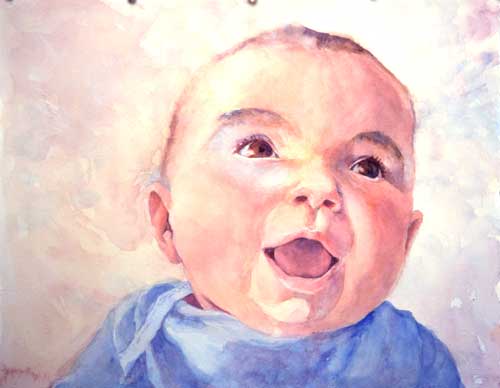
This is the finished version of the happy baby that started out as zombie baby. I don’t know why babies make people so happy, but they do. Anyway, when they’re smiling and laughing, they make me happy. This painting tickles me, and I hope it starts your week off with a smile.
Painting is not all flow and happy splashing. There’s a fair amount of angst as well. Tears. Ranting. Tantrums sometimes ensue.
Especially when, after hours of work, the painting looks like this:
Early photo of baby painting
I start to get a little nervous. Happy Baby now looks like Zombie Baby (my apologies to babies and zombies everywhere.) But as someone once said, painting is an act of controlled panic.
My portrait teacher, Rob Anderson, taught me to put the eyes into a portrait last, or at least later, so that they don’t distract you from the rest of the face. I generally try to abide by that; I find that as I work on the surrounding face, I sometimes have to redraw the eyes a bit. But there comes a point when the lack of eyes is more distracting than not having eyes.
Even after more work and adding eyes, this painting still disturbs. My blood pressure and frustration level are rising.
Beginning of painting, with eyes added
But when I finally put in the eyes, the painting began to lose some of the creep factor. But not all. I’m really getting worried that time, my most precious resource, has been frittered on a loser painting. I’m babbling and ranting at this point.
My fiddler, the best coach I have, said, “be quiet and forge ahead. If it’s ruined now, you’re not going to make it worse.”
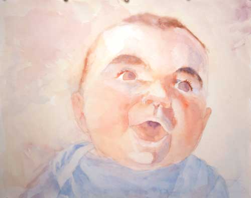
So, after a few more hours of painting and public radio, my blood cortisol level has gone down as the painting begins to take shape.
There are still some things I’m unhappy about, like the yellow I just added to the face (the yellow is exaggerated by the photo, but not by much), but I’m not so worried about that. A cooler color layered transparently over that bright yellow will soften it, and the brightness will glow through the coolness.
Next: Finishing up.
If you think this blog might be of comfort to someone, please share it
I don’t watch tv, so I have only a vague idea of what is going on in the current pop culture, but based on my Facebook feed and my addiction to NPR, I am guessing that three things are uppermost in the churning American zeitgeist: The Winter Olympics, a lot of snow, and ZOMBIES!
If you think this blog might be of comfort to someone, please share it
The holiday bazaar last Saturday was lovely, with beautiful artwork and Irish music provided by my own fiddler and our friends from the Irish music community (if there’s any reason—other than sheer joy—to learn to play Irish music, old time, or any folk music, it would be the wonderful groups of friends you’ll make doing so).
The day started a bit slowly, so I took the opportunity from my seat inside the circle of musicians (in between firing off the tunes I knew on the whistle) to sketch the dulcimer player with the intention of later making a painting solely from my sketch after the dulcimer player left to go to another gig.
Sometimes I can’t take photos for reference. Sometimes I just don’t want a camera intruding on the moment. And I like the practice of trying to find a painting from my initial sketch.
Quick pencil sketch
I payed particular attention to these elements as I gathered information for a painting:
The shapes of the features that made a likeness. She has strong features, making it easier to draw them.
The shapes of the shadow forms. There wasn’t a clear single-light source, so I had to choose the shadows as best I could to show form.
Lost and found edges. Frankly, I was pressed for time, so I didn’t give as much thought to edges as I should have.
Color notes. Okay, in all honesty, I didn’t make any color notes on anything other than her hair and her jacket. But I should have. They would have noted things like skin color in the highlights, midtones, and shadows, room color, light quality. Next time!
I had about half an hour (give or take a tune or two) to make this sketch, so some areas, like the far eye and hairline, were left a bit hazy. These omissions would later bite me in the butt as I tried to recreate this sketch in color.
Then, while the hall bustled around me with holiday shoppers, I painted.
Watercolor painting using pencil sketch as resource
After a day of painting between customers, I ended up with a sort of half sketched painting that was almost a likeness, but not quite.
The prevailing wisdom about watercolor is that you can’t erase it. Nonsense! While you can never get down to the beautiful pristine paper again, you can certainly lift much of the color. I didn’t like the purply-red I’d put in her hair, so when I got home, I scrubbed it off with a toothbrush and a spray of water. Then I let it dry completely and repainted.
The mouth also didn’t match the sketch, and so lost much of her character, so I lifted the paint using an old sable brush (I don’t know why this is, but nothing lifts watercolor as well as sable), let it dry, redrew it, and repainted it. The nose got a little surgery and lost its bottom edge. I adjusted the angle of the far cheek and the perspective of the eyes.
Watercolor from fast sketch
This almost captures the likeness of the dulcimer player, and I’m pretty pleased to have done it without a photo-aid. To be fair, I’ve known her for years, so that when my brush drove past the likeness, I knew I’d arrived.
If you think this blog might be of comfort to someone, please share it
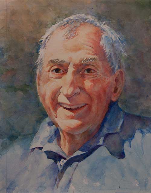
This is the entire portrait—the face that belongs with the teeth in my tutorial. (I’m posting this with permission from the client.)
This was a difficult portrait, but ultimately one that gave me great joy. The subject has been ill, and my job was to see through the illness to the warm, sparkling man underneath. Sometimes a painted portrait can capture something that the best camera can not. I was very pleased to present this to the family.
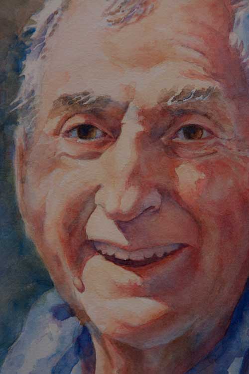
Portrait of Norm detail Click on picture for a larger version
If you think this blog might be of comfort to someone, please share it
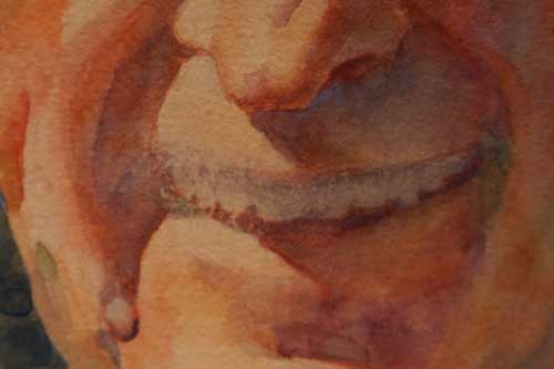
Last week I left this blog in a sort of a cliff hanger, with a painting of teeth that looked like the wicked smile of a television vampire. This week I want to show you how I repaired that purple smile.
Scrub out mistakes
I’ve heard many people say that watercolor is unforgiving. That’s not entirely true; you can scrub out all but the most persistently staining colors. It’s true that you’ll never get the same clarity that pristine paper under pigment will give you, so in some styles of painting (like Charles Ried‘s off-the-cuff splashy style) scrubbing isn’t really an option.
I paint tonally, and I find I can work around the surface of the paper being slightly damaged. It also helps that I use a tough paper like Arches #300 that can, like Timex watches, take a licking and keep on ticking.
Erased mistake on watercolor image
I first tried scrubbing out the purple lips with my trusty ancient Winsor Newton Series 7 . There’s something about sable that will gently get into the paper and loosen the pigment.
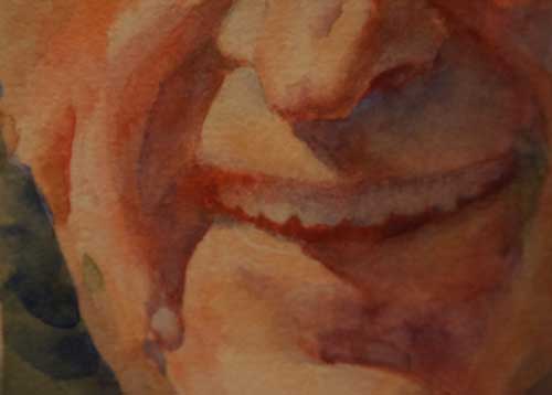
But sometimes the sable can’t do much. That ghastly purple color on his lips was mineral violet, which is obviously a staining color. What to do?
Sandpaper! I used a very fine sandpaper (P800) to rub away the purple smile. I made sure the watercolor paper was absolutely dry to avoid tearing it apart. The sand paper removed the color and made a smooth surface on the paper that will take paint almost as well as the original paper.
Redefine the teeth
Redefining teeth
Using a clean mixture of cadmium red light and quinacridone rose I restated the negative space that defines the shape of the teeth. Getting the shape of the teeth is important for finding a likeness; in this study I made the teeth just a bit too long, so I adjusted the shapes a bit. The brightness of the red is startling, but it’s important to get the right value of the color in the shadows. I lowered the chroma (the brightness and intensity of the color) later.
Why use red in this instance? Because the lips and mouth are areas that are filled with blood. Even if it looks dark, it’s going to be a warm dark. The red gives a base for this warm, bloody darkness; a cool wash will tone this down but still allow the life of the initial red paint to glow through.
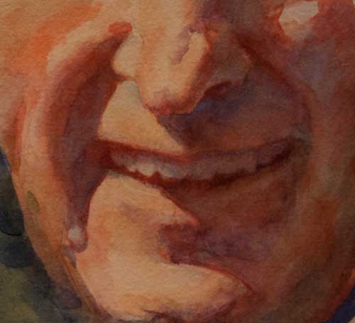
Balance color
More refinement of teeth, and balancing of colors in image
I refined the teeth some more, and used a darker red to give the inside of the mouth a bit more color shift. At this point I also balanced the color on the rest of the face.
Final cool wash
Final watercolor image with blue wash
Once I felt satisfied with the values and shapes, I took the last scary step: a cool blue wash over the shadowed parts of the face. This is a step that’s difficult to recover from, so I really look closely at a painting, sometimes letting it sit for a few days before I make my move.
When everything was the way I wanted it, I mixed up a very clean, light puddle of cobalt blue and glazed over the shadows areas, paying close attention to the lost and found edges of the wash. This is what watercolors do best; the cobalt blue subdues the brightness of the colors, but allows them to glow through the blue pigment.
I normally don’t paint portraits of smiling people. It just doesn’t have the weight of a more sober pose. And it’s darned difficult to pull off. If not well done, teeth tend to get all snaggly in a painting.
But for a recent portrait, I completely agreed with the client that, for a variety of reasons, a smiling portrait was the best possible choice.
I ALWAYS make a study (or two or three) before embarking on a painting. Since the smiling mouth presented the most difficult challenge, I did a small version of that. And for once in my painting/blogging life, I had the presence of mind to have my camera out and take photos of the process to share on this blog. So here we go. How to paint teeth in watercolor.
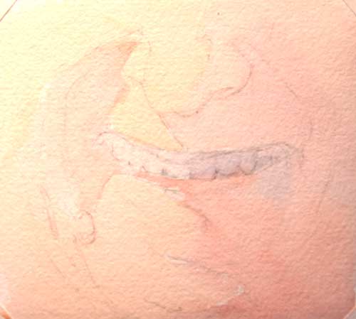
Start with a line drawing
Line drawing
For a portrait, I always start with a detailed line drawing. This is the most time-consuming stage, as this is where I do much of my thinking and planning. Here are some of the things I think about:
Shapes and the rhythms of those shapes (getting the shape of the teeth is most important, but I don’t worry about all the details. I concentrate on the general outline.)
Lost and found edges
Value and color within the shapes
It’s kind of like mapping a journey and getting an overall picture in my head of where I want to go, because I find that in watercolor, if I don’t know where I’m going, I’ll never get anywhere.
Adding the first light wash
On the day I met with the subject, I made some color studies. Using these studies for reference, I lay in the first light wash, keeping the warmest colors and lightest values in the lit areas of the portrait, and the cooler and darker values in the shadows.
I don’t preserve a lot of whites on my paper. They seem too harsh once I get the darkest values down. I like to have a light value tone to begin with, and preserve that through out the process.
To make this first wash soft and flowy, I make sure I have plenty of pure color mixed up with lots of water on my palette, ready to go so there’s no chance for the wash to dry into a hard edge.
First light wash: Computer screens don’t give accurate color. This wash is about 3 steps lighter in value, and not as red.
Ack! It looks like Jabba the Hut! That’s why the next step is so important.
First dark values
The picture below is better, isn’t it? The dark green defines his face and neck. Whew.
Adding dark values
I start adding color to build the forms and I start adding in the first of my darkest values. I use a dark red in the mouth, painting carefully around the teeth to preserve their shape. The red looks terrifically bright (it’s a little frightening at this stage!), but I know that I’m going to tone that down later with a blue or violet wash. A warm color like red or orange is a way to bring glowing light into the shadows.
Building form
Building form
I keep building form, continuing to think of hue, value, and those pesky edges. I love to paint into the shadows. Forms in the mass shadow also have temperature, hue, and value.
Continuing to build form
Building form using darker values
If you deconstruct the face, you’ll find that it’s really a collection of spheres and cylinders. As I’m painting, I’m thinking about those shapes rather than thinking of the painting as a face.
I know this looks rather alarming, but I’ll keep adding light washes, and eventually it will come together.
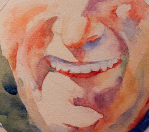
Final image
(Not-so) Final Image
Many layers of transparent paint, and a final light wash of ultramarine blue, it will come together—or not. The use of blue and violet on the lips was a mistake. It looks like Grampa Munster‘s smile. So I’ll leave this tutorial with a bit of a cliff hanger. Can I repair it? Stay tuned for the next episode of The Watercolorist in Fix-it Mode!
Linkage:
Big time portrait painter John Howard Sanden has a good essay on the question of the smile.
How to draw a sphere
If you think this blog might be of comfort to someone, please share it
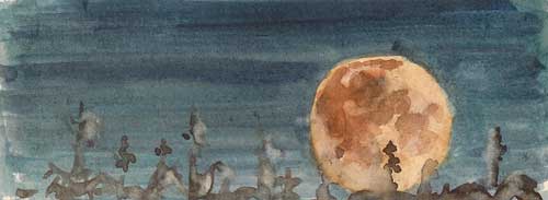
Small watercolor sketch of August moon rising over corn field
The moon that rises tonight is the the red moon, the green corn moon, and the full sturgeon moon. Yesterday I made some watercolor sketches to try to capture the images floating through my mind. Those are often the hardest images to catch.
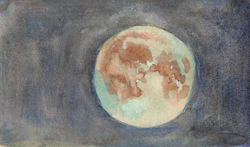
Small watercolor sketch of red moon that is also a blue moon
The moon tonight is also a blue moon, which always sounds awfully romantic. That’s a tough color combination: the unearthly green-blue of a summer moon and the glowing red of an August moon (especially if you live in an area hard hit by wildfire).
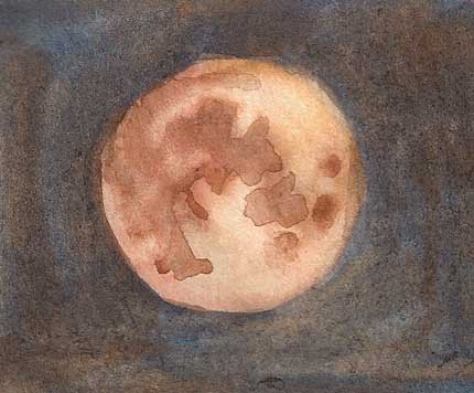
Red moon
But my favorite sketch is of the simple red orb floating over our heads in the blue-black sky. I don’t know why the moon holds such fascination, exacts such devotion, and provides such comfort to earthly denizens. Gravity? Magic? Or simply familiarity with a beautiful companion to our blue earth?
If you think this blog might be of comfort to someone, please share it
I’m planning a large painting—a full sheet of watercolor paper—of a figure. As eager as I am to start slopping paint around on such a large space, I know I”ll be happier if I first paint some smaller studies. I often make lots of studies before beginning a painting; with watercolor, it helps to know where you’re going.
Watercolor sketch of coat 8″ x 10″
The painting is based around an old coat of my mother’s. My grandmother made it in the 50s, and as a testament to my mother’s care and thoughtfulness with her things, the coat is still like new. Getting the right red-orange color is difficult. It’s an unusual shade of red.
Figure sketch in watercolor 10″ x 8″
I got my niece to pose for me in the garden and I sketched, took photos, and made color studies. She’s a lovely young woman and I wish she would be my model always, but sitting still for so long made her feet fall asleep. It’s hard work to be a model.
Watercolor portrait study 7″ x 5″
This is much larger than it will be in the painting, but I couldn’t resist painting a close-up of her face.
If you think this blog might be of comfort to someone, please share it