Sketching Thanksgiving portraits

Graphite sketches
Graphite sketches

We had a house chockablock full of people over the holidays, and I finally unpacked my sketchbooks and had a few moments to scribble a few lines. Babies are hard to draw. Their proportions are unrelated to the proportions of adults, and they squirm and wriggle so much that it’s hard to capture a pose. These were the best I could do, as I could only draw until our li’l bit wanted cuddling.

Blockin-graphite sketch
Block in graphite sketch

A seated adult brother made a much easier target. You can see that I’ve  blocked in the head using straight lines. Even when drawing curves, it’s much easier to begin with straight lines. They are more accurate than a curve. You can always smooth them out later.

Graphite sketch
Graphite sketch

I’ve been trying to draw my brother for years. For some reason, catching his likeness is hard for me to do. Perhaps I know his face too well. Perhaps he won’t sit still long enough (these sketches were done while he was engrossed in a book).

The pencil is some kind of clutch pencil, a thing that’s like a mechanical pencil, only with a fat lead. I like it, but I’d be happier with it if I sharpened it. But since I can’t find any of the multiple sandpaper blocks I’ve bought for this purpose, and I’m unwilling to buy more, I’ll have to use it like it is until I unpack more boxes in the studio.

I’ve got those Lost-in-boxes-and-total-chaos Working Artist Blues.

New studio, haphazard and bewildering.
New studio in a state of haphazard and bewildering mess

I’ve taken a break from the Mockingbirds blog while we move. Moving is a long and disorienting process. We’ve lost many things: computer cables (I’m writing this on my ancient and creaky laptop) and keyboard; beard trimmers (for the fiddler, not me); lamp harps; my favorite jeans; my reading glasses. And most distressingly, my thoughts.

Some artists thrive on change, on chaos, on the new, the different, the outside-of-the-box experiences that change their perspective. I used to love all that too. But now? Not so much. I like my routine. I work better knowing where my coffee cup is, when I’ll have dinner, what time I’ll go to bed.

Now that we’re finally done with the biggest part of the disruption, and now that the new reality is beginning to set a groove in my life, I’m hoping to find my thoughts (and computer cables) packed away in a moving box. Lost objects eventually resurface.

In the mean time, I’m organizing my first ever dedicated studio space. With a door that I can close!

The design center set up but with no cables or keyboard.
The computer center set up but with no cables or keyboard. Perhaps soon they’ll make their appearance.
Mountain lions lurk in our new community, but white tigers (far safer) prowl the new studio.
Mountain lions lurk in our new community, but white tigers (far safer) prowl the studio.

Drawing babies

Sketch of baby
Graphite, red and white chalk, Strathmore 400 Series Toned Sketch Journal, Warm Tan paper

Sunday our power went out for the whole day, so that meant no computers, no internet, none of the electronic time-wasters we’re all so used to. Even my phone lost its charge, so I was cut off from the 4g network I usually live on.

How did we pass the time?! Well, we went with some friends to a local park and had a little picnic. While we were there, I tried to sketch their new-born daughter. Babies are hard to draw, especially newborns. They lack the bone structure that an artist can use as landmarks when drawing. Their faces are all out-of-whack, proportion-wise. And even asleep, babies don’t really want to hold a long pose.

There are a lot of babies in my life right now (being of grandmotherly age—meh—I find that my younger friends are filling up their lives—and mine—with babies). So I hope to study this baby-sketching more closely.

sketch of baby
Graphite, Strathomre 400 Series Toned Sketch Journal, Warm Tan

This is an idea of a baby, not drawn from life but from what I remember and what I suppose a baby should look like. Small face, big head. I never thought I’d want to spend a lot of time with the youngest set!

Recommendation: I’m really liking the Strathmore 400 Series Toned Sketch Journal. The paper has a nice feel, the brown color doesn’t reflect sunlight and blind me when sketching outdoors, and I love the luxurious feeling of the faux-leather binding.

Wednesday WIP: Little Pink Skull

Here’s a little tutorial.

There is a little school near our house where they often have events, complete with performances for the kids. One day they had dancers in full feathered Aztec regalia rattling their cowrie-shelled legs and swirling burning incense over the playground.

So dramatic! And I caught a beautiful image of a woman dancer that I really wanted to paint.

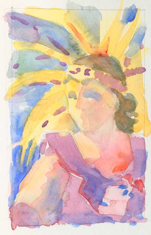
You might remember this was one of my initial color studies:

Study for painting 3" x 5" watercolor painting This study is for a drawing I'm working on. Six hours into the drawing and I feel like it's just starting to emerge from a mush of pencil scratchings. But I dreamed the colors, and couldn't wait to get them onto paper.
Study for painting
3″ x 5″ watercolor painting
This study is for a drawing I’m working on. Six hours into the drawing and I feel like it’s just starting to emerge from a mush of pencil scratchings. But I dreamed the colors, and couldn’t wait to get them onto paper.

This was the finished detailed drawing. How many hours in this drawing? I’m not sure I could tell you. Time folds when I’m concentrating.

pencil drawing
Pencil drawing for watercolor painting

I paint on Arches 300# paper, a stiff, cardboard like stock, so I don’t have to stretch it. I use push pins to hold it to a board. Sometimes it curls while painting, but I can flatten it after I’m done.

pencil drawing
Close up of pencil drawing

As I draw, I’m not only trying to find the likeness, but I’m also thinking about the painting. Watercolor (the way I paint) takes planning, and the underdrawing is my page of notes. Where will I use lost edges? Hard edges? And those difficult in-between edges that can often describe form so beautifully? How will I apply the paint? What brush strokes will I use?

When I finally believe I’m happy with the drawing (I always reach that point too soon. I’ve got to learn to keep working even after I think I’m finished.), I start adding light washes.

beginning painting
Light washes over pencil drawing

The first light washes establish the color temperature of my painting as well as the values. I like a lot of pigment on my paper, so I know that I’m going to cover  much of these beginning strokes with more paint. But these light washes are the  foundation onto which I build ever-deepening color. After this, it’s all about layering.

Painting of Aztec dancer
Little Pink Skull (unfinished)
Watercolor on Arches 300# paper
© Margaret Sloan 2014

I’m sorry that I got caught up in painting and didn’t make more process photos. This is unfinished; I am still working out the feathers in the head dress, and feel like I need to go a little deeper in value on parts of her face. Plus all the fiddly bits of the costume need to be fiddled with.

As careful as I was to get my drawing right, I still ended up glossing over complicated passages like the feathers in her headdress. Small drawing mistakes and fuzzy thinking magnify when you add paint, and I’ve had to scrub out those darn feathers a couple times to get the values and shapes to fall where I want them. I’m still messing with them.

When I’m finished, I’ll have a little dance of my own!


Multiple studies

I’ve been known to paint a single image many times, trying to “get it right.” (The painting “Trim the Velvet” I painted at least 12 times before I was happy with the results.)

I’ve been working an image of a friend’s wife for a year. It’s eluded me, partly because the original photograph was taken with the sun overhead. A no-no; yes, I’m aware of that. But her eyelashes cast a shadow on her cheek, delicate and curved. Her hair was wisping in a light breeze. Her name is Margaret (yes, my name too!), which, according to coffee cup research, means “pearl of the sea.” The photo, although taken on the front steps of a local church, somehow made me think of the ocean, so I decided to place her on a beach.

This first painting was a color sketch, to play around with the palette and composition. The sketch looks fresh, with nice, clear colors (my favorite part is the blue and green in the shadowed side of her face) and easy brush strokes, but it was just a very quick drawing.

watercolor painting
Sketch for “Margaret”
Watercolor on paper


This is the second version, a small painting: only 8.5″ x 11″. Whatever it was that had caught my attention eluded me in this painting, although in retrospect, I like the placement of the horizon the best in this version.

watercolor painting
Margaret 1
8.5″ x 11″ Watercolor on Arches #300
© Margaret Sloan 2014


This is the current painting, larger, with more finish. From the beginning the drawing was off, asI didn’t take a lot of time with it. (I grabbed it off the drawing board to take to Open Studios so I could paint while I hung out in my booth.) That little bit of wonkiness in the drawing magnified to large proportions when I started adding paint, and I had to repaint the eyes—a couple times—before they looked like eyes that belonged together on the same face. (Lots of gentle scrubbing with an ancient Series Seven sable removed the eyes.) Note to self: Nail the drawing before applying paint.

Watercolor Painting
Margaret M.
11″ x 14″ Watercolor on Arches 300#
© Margaret Sloan 2014

I think I’ll let this last one sit in the flat file for a while, then take it out and see what can be done. Or I might repaint it again someday!


I’m interested to know what you think. Let me know in the comments field.

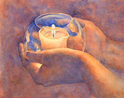
A candle for a teacher

A candle for Rob Watercolor on #300 Arches © 2014 Margaret Sloan
A Candle for Rob
Watercolor on #300 Arches
© 2014 Margaret Sloan

This weekend one of my best and favorite teachers, Rob Anderson, passed away. I can’t begin to describe the sadness I feel for losing his presence to the world.

I met Rob nearly a decade ago, when, starving for the knowledge of how to draw stuff-that-looks-like-stuff, I began a serious study of life drawing at the Atelier School of Classical Realism. For 4 years, every other Saturday except during summer, Rob taught us how to visually describe the human body. I learned, slowly at first, then in leaps and bounds. Those days were long, exhausting, and exhilarating.

I couldn’t have had a better teacher in that time and place. Rob was kind, patient, and careful, yet could kick butt when he thought you were slacking. He showed me how to slow down; look closely; and really observe what I was drawing. He imparted his love of portraits. He taught me that drawing class isn’t a competition; we’re all just where we need to be.

And it wasn’t just drawing skills he gave me. Oddly, I also came away from that period of study with something else: more confidence. An assurance that traveled with me from the easel into other areas of my life. I’m grateful to him for those value-added skills.

I once told him that nearly every time I pick up a pencil or a brush, I hear him behind me, saying, “Did you measure the width of that leg? What about the angle of that arm as it supports the head? Are your proportions accurate? Is that really what you’re seeing, or are you making it up?”  And the weekly exhortation: “Go Darker!”

He arched his eyebrow when I told him that and he said, “Well, do you listen?”

Yes, I do listen. I haven’t seen Rob in a few years, yet I still hear his voice. I wish that I could have studied with him once more, but I think he left me with a lot that I’m only yet beginning to internalize. I’ll miss him, but I’ve got  his lessons in my head and hands.

Dear Readers, if there’s someone you want to connect with, to study with, to learn from, to mentor, be friends with: do it now. You know why.

To see some of Rob’s beautiful work:

www.robandersonstudio.com

www.rattlesnakeinamovingcar.org

How to begin a painting


Study for painting 3" x 5" watercolor painting
Study for painting
 I’ve started the drawing for this painting. Six hours into the drawing and I feel like it’s just beginning to emerge from a mush of pencilscratchings. But I dreamed the colors, and couldn’t wait to get them onto paper. 

Painting is a very slow process for me. I’m not a slap dash painter; I dream, plan, draw, make more drawings, prepare my references, compose the image, draw the image, stew and chew my cuticles, draw some more, then finally start to paint. In a world of instant gratification, I’m a total throwback.

But when, at his workshop last week, Ted Nuttall told me to keep working on my drawing for the whole of the first day, my heart kind of grinched around in my chest. I’d already spent a lot of time on that drawing, but hey, I was paying the man to help me with my life’s work.  I kept at the drawing, all day, and eventually, I really looked at it.  And there was a sorting, as if things were sliding into place. I found a multitude of drawing mistakes that would have plagued me once I began to paint; fixing those mistakes felt really good, like scratching an itch in the deep part of my heart. The painting eventually became Strength. It has a certain clearness, a crispness that I really like. It makes music in my head.

There are days, though,  when I have to simply let go and paint. If you paint, you know what I mean: You need to feel the water love the brush, and the brush kiss the paper with paint . That’s the time for color  studies.

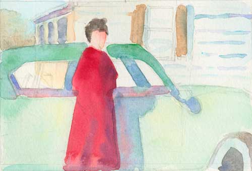
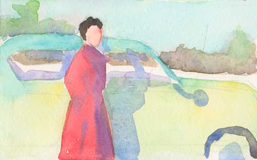
These next two studes are for a painting my Dad has requested. It’s a small black and white photo of my mom he’s had in his wallet for nearly 60 years (can it be that long since they were so young, beautiful, and full of early romance?).

Study for painting 5" x 3" watercolor study
Study for painting
5″ x 3″ watercolor study


It’s interesting how the composition and editing of the background changes the story. What stories do you see?

Study for painting 5" x 3" watercolor study
Study for painting
5″ x 3″ watercolor study

Watercolor portrait: Strength

Strength Watercolor on Arches #300 © 2014 Margaret Sloan
Strength
Watercolor on Arches #300
© 2014 Margaret Sloan


My thought while I painted this portrait at Ted Nuttall’s workshop at Kowana Valley Folk School and Lodge was “strength despite frailty.” This is of my mom. She’s been very ill through out the last year, but she still is strong enough to make dinner, work in the garden, and boss us all around. She’s also quite beautiful, and was pretty nice about posing for about 500 photographs for me.

I’m thinking that I maybe made another breakthrough at the workshop. I hope so. I’m liking what I’m doing. What a delightful week that was!

If you go back to this post, you can see the tiny abstract paintings that I found in this larger work. Can you tell where they were?

But now it’s back to getting ready for Open Studios. The first weekend is May 3 and 4!

Painting against time

clarinet player
Klezmer musician sketch
8.5″ x 12″
Watercolor on Arches #140 cold press
© 2014 Margaret Sloan

I tend to paint slowly. I spend hours getting the drawing right before I move to color. Then I paint deliberately, thinking about each stroke. Sometimes I think too much,  standing in front of the easel, brush in hand, looking and daubing.

Eventually I start feeling trapped, like some old hen pecking away in a chicken coop. I’m afraid to move from my comfort zone because I’ve got too much invested in a particular painting. Yet, with no forays out of the barnyard into the woods, well, where is the exploration? Where is the learning? Where is the joy? All I’m doing is laying eggs.

But I want to fly.

Perversely, sometimes limits can free an artist from gravity. Rather than spend hours on a painting, I decided to give myself some parameters: half hour for the drawing and an hour for the painting. I wanted to see what I could accomplish in a short period of time.

What a great exercise! It forced me to think in terms of big shapes, clear color and correct value. I let go of trying to have a “finished” product and made choices quickly. And I was quite surprised at how instinctive painting has become.

Most valuable tool in this exercise: The kitchen timer.