30-in-30: Painting another egg in watercolor, but with a different color palette

When I finished with my post yesterday, I found my Thomas Aquinas Daly book, Painting Nature’s Quiet Places (it was still packed away from our summertime move). I studied it deep into the night, revisiting his spare words and beautiful paintings. (And I must mention the wonderful smell of this book. I don’t know why it smells so good: like fresh ink, plaster, paper; that odor has become part of the way I perceive his work. I want my paintings to smell like this book.)

Today, while his work was still ricocheting around my brain, I decided to paint another egg, using a limited palette that was more subdued than the bright colors I usually use (a hold over from Ted Nuttall and Steve Curl, two big influences on my watercolor painting).

Again I worked far to long on this painting, using more time than I really have, but I was searching for something.

Egg 2 (First state) Watercolor on Arches #300 hot press
Egg 2 (First state)
Watercolor on Arches #300 hot press

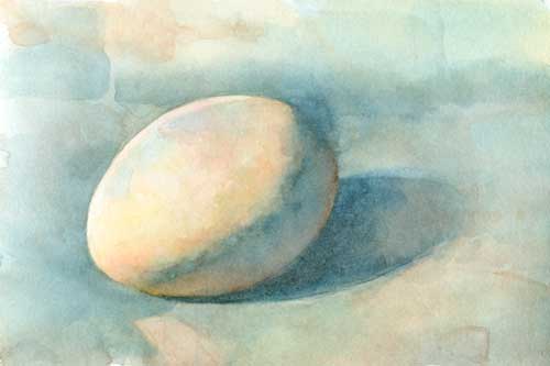
The first time I thought I was “finished” (after two hours) I really wasn’t, but I didn’t realize that until I scanned the painting and saw the thumbnail. Kind of blah.

One of the big strengths of Daly’s paintings is his exquisite sense of composition. I realized that I had just been painting an egg, not a picture. So I tried to find some composition in what I’d started.

Egg 2 (Second state) Watercolor on Arches #300 hot press
Egg 2 (Second state)
Watercolor on Arches #300 hot press

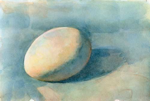
I painted some more, trying to build up values and saturation. I strengthened the composition by adding more value and creating stronger, more interesting shapes, and I increased the value in the darks. It helped, but still, as you can see in the second scan, no cigar.

Egg 2 (Third state) Watercolor on Arches #300 hot press
Egg 2 (Third state)
Watercolor on Arches #300 hot press

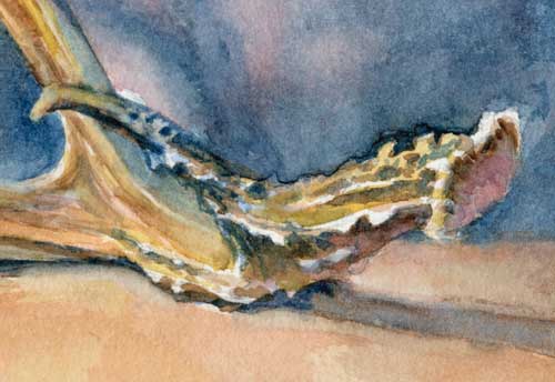
This is the third pass I made at this painting. (Ah, making a pass is such a loaded phrase, isn’t it? So redolent of the kind of heated desire that keeps an artist working in the midst of frustration.) When I started painting this morning, I decided that I would skip my go-to color, ultramarine blue. But in the end I found that I needed that particular shade of reddish blue to push the background behind the egg, as well as help me define the shapes better. I also realized that it needed more saturated colors to bring it out of its monochromatic doldrums, so I added that glow of cerulean blue and a red splotch on the egg itself (remember, warm colors, if they’re the right value, come forward). It’s better, and I’ve learned many lessons.

Daly says, “My purest creative energy comes to fruition in the puddles, flecks, and patches of paint on the paper’s surface rather than in what they represent. The internal dynamics of watercolor as a medium and the rich, sensual surfaces that can be created with it are the very qualities the keep me enthused abut my work.”

Indeed.

30-in-30: Watercolor painting is not a cup of tea

Teapot Watercolor on Arches #300 hot press
Teapot
Watercolor on Arches #300 hot press

Despite my best intentions to control my time, this painting of a little tea pot got away from me. I spent far more than one hour on it and it’s only beginning to be what I want it to be.

I worked hard on the initial drawing. I wanted it to be correct before I began splashing paint around, as pencil is easier to change than watercolor. But I could have worked on it longer; man made objects are hard to draw accurately.

Now the question is, should I work on it a few more hours, or should I give up and start over with a fresh drawing of a better composition? One of my favorite painters, Thomas Aquinas Daly, might simply scrub out parts of the painting. Sometimes I think we give up too soon on paintings, so I’ll keep hacking at this one until it’s destroyed or becomes a better painting.

Plus I’ll start something new tomorrow.

Teapot Close up Watercolor on Arches #300 hot press
Teapot Close up
Watercolor on Arches #300 hot press

Thought it might be interesting to see some of the brush strokes.

30-in30: Painting a quick watercolor portrait

Portrait of Lee Watercolor in 500 Series Mixed Media Hardbound Art Journal
Portrait of Lee
Watercolor in 500 Series Mixed Media Hardbound Art Journal

People often ask if I paint portraits from life. Yes, I do, and I prefer it actually. But no one wants to sit still for that as many hours as it takes me to paint a portrait.

But as part of my 30 in 30 challenge (30 days of painting for at least an hour a day from life only), I persuaded a visiting friend to sit for me for about 2 hours. We were listening to my fiddler and her banjo-player have some major old-time tunes, and she was itching to dance (she’s an avid and talented dancer). Between the wiggles and the occasional clogging break, I managed to get this quick portrait of her.

By the way, if you’re looking for a journal that will take watercolor, I suggest the Strathmore 500 Series Mixed Media Hardbound Art Journal. It will take several sloppy washes and a lot of pigment with only a minimal amount of buckling. And the image doesn’t bleed through to the other side too much, which makes it useful for journaling. And the binding is a sort of fake leathery-looking material, so it feels a bit rich and special, which we all need sometimes.


You can hear the music here:


30 in 30: A shadow-box still life of a deer antler teaches me the value of composition and simplicity

Why, oh why do I always gravitate towards the complex, the difficult, the ornate?

This antler (naturally shed, I’ve been assured) was just given to me. How exciting! I’ve wanted to make some antler images for a long time, but deer aren’t just dropping their horns all over the place in the Bay Area. This antler was actually the reason I finally got myself together to make a shadow box for still lives.

I will admit, this painting took me longer than the hour I’ve allowed for the 30-in-30 challenge; I worked on it for about 2.5 hours. So much for my day. But I love the shadow box!

What’s wrong with this painting

When I complain to the fiddler about my paintings, his question to me is always, what’s wrong with it and how can you fix it? So I thought I’d publicly pick this one apart a little.

Part of the problem is the placement of the antler in the space. The paper is 8″ x 10″. You can see that, while the shape of the antler is interesting, it’s not really filling the space.

The solution

With our friend Photoshop, I cropped the painting.

Antler (cropped) Watercolor on Arches #300 hot press
Antler (cropped)
Watercolor on Arches #300 hot press

That is much better. Now the beautiful spaces between the horns are more noticeable, and the shapes the object makes against the background are more interesting. The antler fills the space, and gives the eye a shorter distance to move to the edges of the paper, which helps lead the viewer around the painting.

Another problem is that I didn’t take time to draw the antler carefully, and pay attention to the form shadows. I’ll be revisiting this subject in charcoal, so seek a better understanding of how it takes up space.

Antler (close up) Watercolor on Arches #300 hot press
Antler (close up)
Watercolor on Arches #300 hot press

Here’s a close up. I tried to simplify the bumpy parts of the horn, while still wrapping my mind around all the patterns of the littler forms.

Next painting? Maybe something simple. An egg?


30 in 30: Painting loose watercolor trees with wet-on-wet and plenty of puddles

Jan9_Trees
Trees outside my window, January 9 Watercolor on Arches #300 hot press

Some days you just want to slop paint on paper. I woke up with a yen to work wet on wet (I normally work wet over dry).

My friend Cynthia Brannvall once said to me that she liked art that suggested rather than described, so that she could make up her own story. I try for that in my work, but my literal mind often wants to control my hand. I love how sometimes watercolor will puddle into suggestions, the less help from me, the better.

Note to self: play more.

This is part of a series exploring one 1-hour painting (nearly) every day in January as part of Leslie Saeta’s series, Thirty Paintings in Thirty Days. To see my experience with the entire series, click on the category, 30 in 30, at right.

30 in 30: There are no mistakes in painting. It’s all just practice.

Landscape in oils of Pescadero Beach. Sometimes we all must fail.
Pescadero Beach, January 6
Landscape sketch in oils. Sometimes we all must fail.

Monday I was fortunate to attend a landscape painting class taught by Halcyon Teed. The weather was balmy, the light exquisite. I was excited to be there.

But painting that day was like trying to run through sand; a slog all morning. It’s been a while since I painted in oil, and I just couldn’t re-friend my colors. My thought at the end of the day? Fail.

I’m showing you this stinker because I think it’s important to fail. And it’s important for those of you, dear readers, who may be knotted up in your own artistic struggle, to see other artists fail. (And if you’re a successful artist, well then, feel free to snigger.)

So often when we look at the work of others, all we see are the successes, the award winners, the masterworks and show pieces. We don’t see the fumbles, the embarrassments, the groaners. The awkward marks and homely scumbles that get rubbed out before anyone can comment.

I think it’s a false picture. It’s an artistic version of the Facebook effect. Everybody is a mo’ bettah painter than I am. And when I’m scrabbling away at frustration, all that perfection from others is demoralizing.

But it shouldn’t be.

Emily Jeffords, over at Hello Beautiful Blog says,

“The first thing you have to do is pick up the brush. Then, make as many mistakes as you wish. Every stroke is just practice.”

That’s a good mantra to paint by. Part of the reason I’m playing the 30 in 30 challenge is because I want to pick up that brush everyday and make as many mistakes as I can. Spending a specified amount of time each day painting thoughtfully is also creating a lot of work, and the more work I make, the less precious it becomes. I’m better able to sort through the clinkers and find the shiny stuff.

It’s kind of like playing scales on an instrument; sometimes they’re just scales, sometimes they’re noise, but occasionally, they’re music.

Once in a while, I may make a painting.

This is part of a series exploring one 1-hour painting (nearly) every day in January as part of Leslie Saeta’s series, Thirty Paintings in Thirty Days. To see my experience with the entire series, click on the category, 30 in 30, at right.

30 in 30: Painting a shell in watercolor

Shell painting
January 4: Shell in window
Watercolor on Arches #300 hot press

I needed a change from cyclamen and orchids, so I chose a conch shell that reminds me of my years living in the tropical seas. During the chilly mountain winter I sometimes miss the torrid tropical heat.

This complicated subject really begs to be a long, painstakingly arduous still life. All the while maintaining the freshness of this hour-long sketch. Super exciting!

The secret to creating the glow of sun through shell is in making your dark values deep enough to contrast with the lights, all the while avoiding the chalkiness that sometimes comes from dark watercolor pigment. This means I had to lay down multiple translucent layers of progressively darker paint. I use Arches #300 paper because it soaks in the moisture and dries faster than the thinner papers. Try it; it’s worth the expense.

This is part of a series exploring one 1-hour painting (nearly) every day in January as part of Leslie Saeta’s series, Thirty Paintings in Thirty Days. To see my experience with the entire series, click on the category, 30 in 30, at right.

30 in 30: January 3

This is part of a series exploring one 1-hour painting (nearly) every day in January as part of Leslie Saeta’s series, Thirty Paintings in Thirty Days. To see my experience with the entire series, click on the category, 30 in 30, at right.

Pencil sketch Arches #300 hot press watercolor paper
Pencil sketch
Arches #300 hot press watercolor paper

I began this painting with a quick drawing, trying to pencil in the  shapes and shadows on the flowers before I started painting. This initial drawing took 30 minutes. I’ve also switched back to Arches #300 hot press watercolor paper, as I prefer the way it takes water and pigment (and it doesn’t buckle and curl like lightweight paper).

Watercolor-30 minutes Arches #300 hot press watercolor paper
Watercolor-30 minutes
Arches #300 hot press watercolor paper

When I started adding paint, the pencil shading did make it a little easier to figure out what I was doing. The image above is what the painting looked like after 30 minutes of painting.

Watercolor-60 minutes Arches #300 hot press watercolor paper
Watercolor-60 minutes
Arches #300 hot press watercolor paper

I couldn’t help myself, and when my hour was up, I went back for 30 more minutes to clean up the painting,  scrubbing out some messy areas and restating the shadows and highlights. I used Windsor Newton Opera Rose for the brilliant pink, although I realize that’s an extremely fugitive color (Handprint, the blessedly exhaustive web catalog of watercolors disagrees with the fugitive rating of this paint, and says, “I see absolutely no reason to avoid this splendid pigment.”) It’s an awfully pretty color, and really helps with the light-struck areas in the painting, but I would not use it on a painting meant for exhibition until I’ve done a lightfastness test.

All of these flower paintings so far have been done from life, with sunlight as the light source. Since my studio window faces southwest, the sun is constantly moving, which is part of my process to force myself to capture an image quickly.