Copying art in the Art Institute

The first place I went in Chicago was the Art Institute. That was the first stop on our trip; I really didn’t care what else I saw in that big city. The art museum was my “it” stop.

People have asked me (rhetorically, of course) how many hours can you stand to be in a museum? I snort. I can stand in front of one painting for at least an hour! Sheesh! How can you stand to leave an art museum!

My family went along with my obsession, but they began to look a bit gray after 4 hours of wandering through illustration, folk art, modern art, and impressionism.

And then I discovered gallery 273, the room that held works by John Singer Sargent. Hearing my squeals of excitement, husband and step-daughter sighed, collapsed on a bench, and whispered to each other until they fell into art-induced comas.  I wallowed in the paintings.

The Chicago Institute of art allows only pencil and paper in the museum, so I copied this painting (after Sargent’s Madame Paul Escudier) in graphite on BFK Rives, making notes about the color and value. That night in our B&B, I sat at one of the fussy little Victorian-style tables and added gouache paints to the drawing. The Rives takes gouache very well.

The design in this painting was so powerful. I love the little shapes of the lighted windows behind the heavy dark curtains and the figure. She seems to be trapped by those curtains. If you squint your eyes, she becomes a part of them, the dark value of her skirts forming another bar against the bright daylight behind her.

We also saw the play Ethan Frome, and the ticket stub as well as the theme of the play seemed to fit nicely on this page of Victoriana.
Can a painter travel lightly across the land?

Painter's travel kit

I haven’t been posting much lately, because I’ve been painting! Painting and traveling.

We took a trip to Chicago in the spring. Despite the Chicagoan’s fanstasies that the weather was springlike, it was a bitterly cold city. (Where I’m from, we complain when we have to put socks on in the winter. Any temperature under 59 degrees F., and I’m done.)

It was also a city where, I was advised, we wouldn’t need a car, since the public transportation is epically transportational.

What? No car? I’m a person who chooses automobiles based on the amount of nooks and crannies on the passenger side. When I travel, I need a rolling art studio. I paint while my husband drives.

The best car I ever used was a Dodge van we rented for a camping trip. Cubbies in the door held paintbrushes, pencils, and pens at the ready; 4 drink holders between the front seats kept steady two cups of water and two cups of coffee; the deep, wide dashboard displayed paintings that were not yet dry; and the open door of the glove box made the perfect mobile easel.

You can imagine how much stuff I brought on that (or any) camping trip. Several sketchbooks, a folder of watercolor paper, a couple of Arches watercolor blocks, and a lined notebook. I even brought the laptop and Wacom tablet.

But in Chicago, traveling by bus and subway, I had to pare down. Way down.

Homemade travel journal

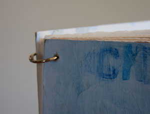
What you see in the photo above is what I came up with.

I’m not a book binder, so I couldn’t stitch together anything fancy; instead I cut to size a variety of papers: Strathmore drawing paper, BFK Rives printing paper (tan colored), and Arches 300-lb cold and hot press papers.

Then I got the local copy shop to drill holes in the paper. They couldn’t—or wouldn’t—move the bits on their drill, so I was lucky my notebook fit in the 8.5-inch slot on the paper-drilling machine.

They wouldn’t drill the covers. They said, what the h*ll is this stuff? It was merely illustration board covered with acrylic gesso, but I guess it looked like some strange building material to them.  I had to drill those with my trusty hand drill (it used to belong to my grandfather. It’s probably 60 years old, and still works like a champ.)

Binder ring journal

The paper was all held together with binder rings.

It was perfect for the trip. I could paint or draw on whatever type paper I wanted that day. I didn’t have to work sequentially, because at the end of the day I could reorder the paper as I liked. And to reduce weight (and protect the already painted pages), I would only bring part of the journal each day as I shivered my way around Chicago.

Painting with the Masters

I’m re-entering regular life after spending three days at Artist’s Magazine’s Weekend with the Masters. It was amazing to spend time learning from some of the top realistic painters in America today. My head is swimming with information—too much to regurgitate here—but I want to share a few tips that were hammered home by the three painters I heard lecture.

  • Concept and composition are the most important things. You can be a good draftsperson, but unless you have a good concept and composition, you’re just a good draftsperson.
  • Get the value and color right, then ask yourself, is it more blue, red, or yellow?
  • You have to really look at your subject, and really see the colors that are there.
  • To be a good painter, it takes time behind the brush. Lots of time. Lots and lots of time. Lots and lots and lots of time. (Having a good teacher doesn’t hurt you either.)
  • You have to flat-out love to paint. Because that’s the only way you’re going to spend the time needed to become a good painter.

It was a brilliant, exhausting weekend, and I wish I could still be there painting!

Color Theory #3

This is one of the llamas at Clove Cottages in New York State. I drew the llama here. She was painted (for a color theory class at the local community college) using a double-split color scheme, which means I used two pairs of complementary colors.  Magenta and green, and blue-violet and yellow.

This is close to the palette I normally use.  But I’m usually pretty disorganized, and choose colors randomly. I’ve never restricted myself to only a few pure tube colors. (I had no tube color for blue-violet, so I mixed up a big puddle of ultramarine blue and  alizarin crimson. The pigments did tend to separate out, but when remixed, they made a familiar blue-violet of which I am very fond.)

Sometimes restrictions upon artwork conversely allow you more freedom. With only four colors available to my paintbrush,  I first spent a lot of time playing around, figuring out how those paints would mix. Then I planned the painting—colors and temperatures of the shadows and the highlights. Only then did I start splashing on paint.

The actual painting took very little time. After so much preparation, making the picture was exhilarating. It felt like skateboarding down a steep hill; there were some bumpy spots, but mostly it was fast and furious. And I didn’t fall off once.

Color theory #2

The Henny Penny in this post  was painted using an analogous color scheme. That is, all the hues came from the same corner of the color wheel. Transparent pyrrol orange, quinacridone red, and perylene maroon (all Daniel Smith watercolors). Not exactly analogous, but pretty close.

The analogous colors are interesting to work with. When mixed, they often increase in intensity. I used the perylene maroon, a dark value, dusky pigment to try to tone things down a bit.

The trouble with the analagous palette in watercolors is that, unless you use black paint, which I don’t, the paints will often not create as dark a value as you might need. They are inherently incapable of making a dark dark. So to make the eye dark enough, I had to mix in a touch of sap green to the violet. It made a nice dark eye. Too dark, I see now. I need to add a little highlight.

Color theory #1

Orange and Blue
Watercolor © 2011 Margaret Sloan

This picture is part one of a three-part final for an online color theory class I took with the local community college.

We were learning about color harmonies. This color scheme is complimentary; I painted this using only two colors across each other on the color wheel. I guess I cheated a little bit, because I used quinacridone orange (my favorite orange right now), and ultramarine blue. Not exactly across from each other (I should have used cyan, but I am never very good at following instructions.)

But, oh! the color combinations from mixing orange and blue! I especially love the good, rich browns, which could then be lightly washed with pure color—orange or blue—to warm  or cool the area.

(This image is a photo I took at the local farm Hidden Villa. I’ve drawn their animals many times, which made the photo simply a placeholder for the shadows forms and values.)

Farm memories

Although I grew up in the city, I come from farming people. I grew up with so many stories of the farm, the family, and the various chickens, goats, and cows, that I sometimes feel I lived alongside my ancestors.

I’ve certainly romaticized their lives, although I know that it was a hard life; subsistence living is never easy. But I’ve heard their stories, told with a slight bitterness towards the privations, but mostly washed by a greater love of their lives. It makes me wonder if today, in our lives of relative ease, are we really happier?

Her Favorite Red Coat
Watercolor © 2011 Margaret Sloan

This is a small painting: 9″ x 12″ on Arches cold press. Yes, it’s from a photo-a black and white photo at that. Right now I’m enjoying working from black and white photos. They give me greater freedom in color choices and combinations. Unchained from the tyranny of the camera’s red-blue-green, I can make my own statements. (Of course, now that the painting has been fed back into the camera and computer, I can see errors that will need fixing, mostly edges that need softening.)

That little girl is all grown up now, and that chicken long emigrated to chicken heaven (grasshoppers and freshly sprouted gardens abound!). Some painters gripe about painters who paint from photos. “Why paint it if you can take a photo of it?” they ask. But without this dusty photo, I could not have made this sweet painting, and this little girl would have been lost.

Are you a painter? What do you think about using photos?

Watercolor breakthrough

Watercolor by Margaret Sloan 2011

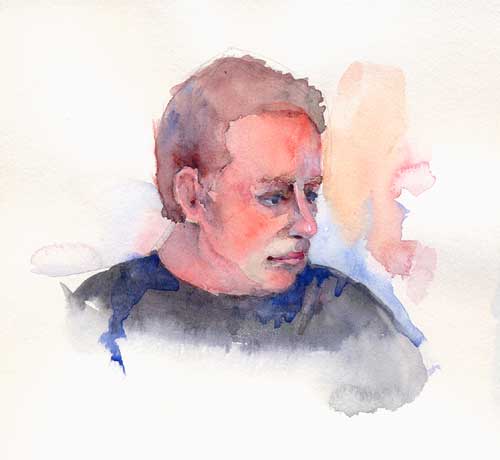
I painted the above piece in my journal after attending a Ted Nuttall demo (and while deep in Felicia Forte‘s portrait drawing workshop). Mr. Nuttall is the watercolor artist du jour, and since he teaches what seems to be an exhausting series of workshops across the country, I’m seeing more and more copies of his style in watercolorlandia.

And with good reason. He paints big, he goes outside of the lines, and his color choices are fabulous. His paintings are deliciously loose and free (although he spends much time planning and controlling his process.)

One of things I haven’t liked about my paintings is that they are overly tight. This thumbnail painting you see above,  was painted when I was fresh from Mr. Nuttall’s demo, I drew this man (I was watching some movie, but I don’t remember who the guy is), and painted it in the style of Mr. Nuttall. It’s not a very big painting, but I really like it.

While I don’t want to be a Ted Nuttall-clone, I do want my paintings to have a more free appearance. Which means I must break all kinds of old habits.

Keeping the vision alive

I just read Sue Smith’s latest post at Ancient Artist. She asks the question: Given that most artists aren’t going to make a lot of money doing art, how do we keep the vision alive?  My comment on her page started to run to three paragraphs, so I thought it would be better to post my response on my own blog.

True, painting will probably never make any money to put towards my retirement (retirement! What?! I’m going to die in my traces, I am). In fact, my addiction to art has cost me money, not just in the river of cash that flows to Daniel Smith, Dick Blick, University Art, and Accent Arts, but  in terms of lost opportunities (taking that life drawing course instead of a tax accounting course, for example).

But the simple fact is,  I can’t not paint and draw. I know, this sounds facile, like something a freshman college student would say, but here it is. It’s like something burns inside of me, compelling me to seize my world and force it onto a piece of paper or canvas (or anything, really. I’ve even drawn with soap on the shower door). That internal blaze is what keeps my vision alive. Because, quite simply, it hurts me when I don’t work. I don’t sleep well, can’t eat, feel weepy. Creating is absolutely necessary.

That said, there are benefits to following this pigmented path. I feel like painting has resonated throughout my public life. I think it makes me better at my day job, makes me better able to communicate with folks, and it keeps me sane in the face of the madness of everyday life. So I’ll keep painting, even as the rest of the world makes tons of money selling insurance, or widgets, or whatever they do that’s so “successful.”

I had a wonderful high school art teacher, Art Adams, who used to say, “If you put a man in a prison cell and give him a piece of rope, most men will just hang themselves with the rope. But an artist will take that rope and make something wonderful.”

Excuse me, I’m going to go play with some colors now.