Today is the last of my 30-in-30 paintings as part of Leslie Saeta’s Thirty Paintings in Thirty Days. I want to thank her for challenging the paint-o-sphere to take up brushes and post their results everyday of January. I also want to thank her for hosting all of us on her blog. It’s been fun; I’ve found some amazing and dedicated artists this way, and met some lovely people.
My goal at the start of January was to make 30 paintings strictly from life. I love the way that it made me see differently; made me see more clearly; and made color even more flavorful than it usually is to me. I’m excited to paint from life more often. I’m curious to see how it will affect my work from photos.
But just because it’s no longer February doesn’t mean that I’ve got to put down my brushes. Onward and upward! More eggs!
If you think this blog might be of comfort to someone, please share it
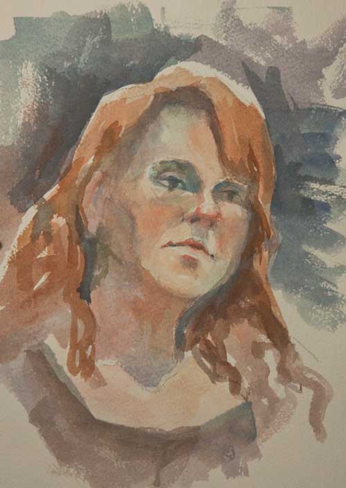
15-minute portrait Watercolor on really terrible paper
I began this painting in the life drawing session on Thursday. But since the models (us!) only posed for 10 to 15 minutes, I didn’t have time to A. Catch a good likeness and B. apply much paint. So I brought it home and played with it in my studio. I admit, I cheated a little bit. I started it on Thursday, but finished it today. (I didn’t have time to start a personal painting today, as commercial work fell in my lap, and you know how freelancing goes: work when you’ve got it and starve when you don’t.)
This is paper that, even though it wasn’t cheap (although not at the top of the food chain either), is even more unsatisfactory than the really cheap stuff. I was sorely disappointed in this paper, and have never really used it for anything much at all. It looks like it should be a wonderful paper, but when you start applying washes, it gets very strange speckles all over it. And you can’t take any of the paint off; scrubbing gets you nowhere. I won’t tell you the brand in public (I don’t like to kiss and tell), but if you really want to know, I can tell you privately.
Maybe I haven’t learned how to coax the best from this paper. Eventually I guess I’ll learn as I still have a whole pad of it.
If you think this blog might be of comfort to someone, please share it
Saturday Studio Time is a new feature I hope appears regularly on this blog. I am fascinated by the rooms where artists, writers, and musicians work; our spaces for creating art can be small or large, indoors or out, but they are intensely personal and private. I’m grateful to the artists who agree to share their creative spaces with us for this blog.
I met Doreen L. Barton when we studied at the Atelier School of Classical Realism in Oakland. Our teacher at the time, Christian Fagerlund, talked a lot about the artist’s mark—the way the artist touches the paper with pencil, chalk, paint. That touch and what it builds is like a piece of the artist’s soul, and gives the work depth, integrity, and substance. Doreen’s marks are so thoughtful, so beautifully sensual and graceful that they infuse her work with deeper meaning than just being pictures on paper. Take some time to visit her website, DoreenLBartonVisualArt.com and you’ll see what I mean. I’m pleased that she agreed to talk about her studio with me.
Where is your studio space and what does it look like?
My studio is in our converted garage. We added insulated walls, windows and adjustable lighting. It doubles as studio/office space and measures approximately 10′ x 12′. I was lucky in that I was able to plan the space and storage. The walls are a dull white/grey, mat finish. I’d advise anyone to try to adjust reflective surfaces. This is important since the light bouncing off different surfaces (including your walls) in a room will affect how you perceive light values in the subject you’re drawing or painting, even when looking at reference photographs.
I also planned the placement of my easel and work surfaces so that I’m able to stand about 12′ plus away from my work on the easel. I have several methods of checking my work. Stepping away and viewing it from at least 10′ is one; at a distance I see the whole piece at once. The first thing I usually see is where the light and shadow values need adjusting. I also see where my measurements are off. If I’m working on a portrait, standing at a distance is for me the best way I can see if the likeness is coming together.
How does being in your studio make you feel?
There is a certain amount of serenity. I think that putting time and thought into my space has helped me feel committed. I wanted a space where I could get away from outside distractions, so it is an inner sanctum of sorts. I think we experience so many different feelings as we work on our art. It’s important for me to be able to acknowledge my impulses and choices, where ever they may come from. There are many days I am not “in bliss” in my studio; it’s a place where I can push on through the misstep, the conundrum, and try the initially grueling technique or concept again and again. It’s where I decide to take a certain path, set a goal. At times I don’t realize I’m doing so until later.
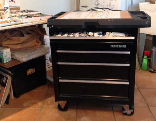
This Craftsman tool chest doubles as storage and a tabouret.
Describe your set up.
My easel, drawing board, tool chest and table are set up on one side of the room. The majority of my studio furniture and equipment can be collapsed and stored when I’m not using it.
I’m organized in that I can find my materials quickly. Keeping up with clutter is another issue altogether. The stuff in my storage shelves spills out like some kind of living organism. Reference materials, class notes, business records and the like are filed. My systems have evolved and I’ve improved at keeping up with them, particularly after I got a business license. Art books, (catalogs and technical reference) are also in the studio. I know some folks keep their art books away from potential spills and splatters. Not me. I want to be able to just grab and search as I need.
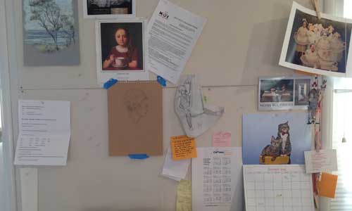
Homasote bulletin board covered with muslin.
What do you use for lighting?
I use daylight spectrum lighting, bulbs and track lighting.
What’s a favorite piece of furniture in your studio?
Some favorite items are my homasote tackboards. These are large, about 3′ x 4′ each. I got them from the local lumber store. I covered them with muslin (I think you could just paint them if you prefer) and mounted them on two walls from about 3′ off the floor to near the ceiling line. I like to be able to pin up images, work-in-progress, references, you name it. I love big post-able areas.
A sturdy easel is essential. The table next to the easel is a height adjustable hospital bed-table purchased online.
What’s the coolest, most helpful thing in your studio?
My easel. It’s the wood frame type. Very solid (doesn’t shimmy or rock), very sturdy and it can hold large boards. I know they’re not cheap, but I they’re worth the investment. I often work with my surface almost directly horizontal to the floor to minimize any tendency to distortion the image as I sketch it out. I love that my easel can hold my work securely in that position or at any angle. It’s very adjustable and steady.
Another valuable item for me is a level to use for determining the vertical and horizontal position of the subject. Especially helpful in live model drawing.
Give us a studio tip. What one thing you use in your studio helps you to make the art you see in your head?
My best tip takes practice: Setting time to work exclusively in the studio. I try for three to four 5-hour-days a week. This is a target, frequently not obtainable. But I find the more time I shoot for, the more time I give myself. Secondly, I keep a notebook/journal in my studio. Mine’s in book form. On one side of the book I write down project or artistic ideas, and on the other business or logistic notes, action items that I need to complete in conjunction with my art, or to help execute. Writing down ideas frees my mind to concentrate on my work
This is about half the collection of pastels that Doreen uses in her work
If you think this blog might be of comfort to someone, please share it
Dear Reader, I originally thought to warn you about using crappy watercolor paper. If you’ve been studying watercolor for long, then I’m sure you’ve heard advice to use quality watercolor paper.
Before I got so snobbish about paper, I actually bought a pad of the cheap stuff. And people have given me pads over the years. So I’ve got quite a bit of it. I’ve never used much of it because I got all highbrow early on in my watercolor journey. And it is hard to work with; badly sized, this paper sucks in the paint and leaves dull, lifeless washes that look sort of speckley. It buckles as soon as you add water, fights with me like mad racoon, and generally leaves me feeling like this pose.
But I’ve been using this cheap stuff for quick life-drawing warm ups, because then I don’t feel like I’m using up the precious resource of my luscious #300 Arches. And while the buckling, the disappearing paint, and the overall junkiness of this paper really frustrates me, in the end, I put in a lot of brush time on it, and work out a lot of solutions that I remember when I paint using the “good stuff”. So if you limit your painting experience because you’re afraid to use up your fancy-schmancy, double-sized, extra-heavy oo-la-la papier, grab something cheap at your local art and craft store and get some mileage on your brush.
(Brushes, however? Get the best you can afford.)
If you think this blog might be of comfort to someone, please share it
Today I went to the figure drawing session at Town Hall Arts Galerie Copper in Copperopolis. Unfortunately, the model didn’t show up, so we took turns posing (clothed) for the group. It was fun to have so many different figures changing it up. But unfortunately, it’s really hard for non-models to hold poses even as short at 15 minutes. Readers, a good model who can hold a long pose over and over again? They are worth every penny they earn, and I hope that you always tip your models accordingly.
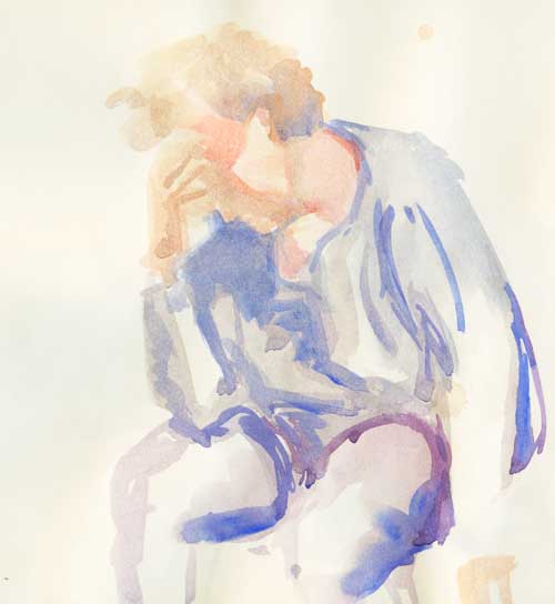
5-minute poses on cheap watercolor paper
Since the poses had to be really short, I had to develop a kind of shorthand quick-stroke, using very simple shapes that were separated with white space so the paint didn’t all run together into a big wet blob.
The time went so fast that I couldn’t draw with pencil and finish with watercolor. The work below was all I could muster in 10 minutes. I might play around with this a bit in the studio, but I really wish this woman would pose for me (for longer than 10 minutes). She has a beautiful face and elegant demeanor. If she reads this, I hope she’ll agree.
10-minute poses on cheap watercolor paper
Drawing with the paint brush (wait, that’s really painting, right?) forces my brain to judge shapes, angles, and proportion without the help of guidelines, angle marks, extra marks, and erasing. So it’s a great exercise. And it leaves me longing for a good, four-hour pose.
.
If you think this blog might be of comfort to someone, please share it
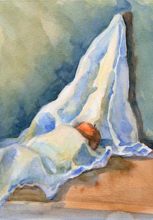
Dishcloth with orange Watercolor on #140 Arches cold press
I really want to title this, “It’s a dishcloth, fella. Orange you glad you asked?” But I thought I’d be kind.
Here are the thoughts I had about painting drapery in the aftermath of a frustrating morning:
Take time setting up the subject. You want an interesting composition, with large shapes that are easy to see.
Plan the color scheme carefully. Remember what Jeanne Dobie says about “mouse power.” Those rodent-grays will make the saturated color glow.
Before you start slopping paint around, plan the highlight patterns. They will lead the eye and give shape to the drapery.
Draw the shapes of the darkest shadows, and figure out how you can simplify them and connect them. This helps keep the painting from looking splotchy.
Then figure out your large shapes. Think of them as zones. Which zone will you use as the focal part of the painting? That should have the most contrast, the brightest colors. Which zone is closest to the light? Furthest? Paint accordingly.
Don’t get too dark too fast. It doesn’t give you any room to play.
Think more about the edges. For instance, figure out which side of a fold has soft edges (and maybe both sides of the fold have soft edges).
When painting the soft edges, don’t get all blendy. It looks mushy. If you look closely, there are some hard and soft edges in the rounded folds. They might be low contrast, but they are there.
Think more about reflected light.
Remember what Ted Nuttall says about shapes. Each shape should be it’s own tiny abstract painting.
It’s important to learn how to paint draped cloth for many reasons (like if you want to put clothing on your live model!). But as I was painting this, I realized how similar the folds in cloth are to the folds of hills and valleys in the landscape.
Drapery. More interesting but not as hard as eggs.
If you think this blog might be of comfort to someone, please share it
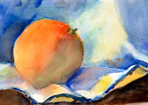
White dishcloth with orange Watercolor on #140 Canson cold press
I swore that I’d give myself only one hour for this little painting. Honestly, I did.
But after about three brush strokes into this piece I knew that the kind of detailed work I love to do wasn’t going to be possible. I tried to tackle too much information in a short period of time and a small space.
The best thing to do in that situation is to work on just the large masses, so I concentrated on the dark and light patterns to strengthen the composition. And I tried to limit my time on it, in order to make big decisions rapidly.
It’s been a long time since I drew value studies of drapery. As you well know, drawing is the foundation of painting. I see a month of drawing in my future.
If you think this blog might be of comfort to someone, please share it
Orange with cloth 5″ x 7″ watercolor on #140 Canson cold press
I’ve been working hard on the CandledEgg painting, and I’m almost finished with it. After working on it for the last 4 mornings, I was tired of painting in such a restricted fashion (choosing colors carefully, debating about shapes and brush strokes, trying for realism), so today I gave myself an hour to paint this cheeky little orange on a dish cloth.
I’ll post about the Candled Egg soon, but that might be a series of very long posts, and I need to attend to business offline.
Happy Monday, everybody!
If you think this blog might be of comfort to someone, please share it
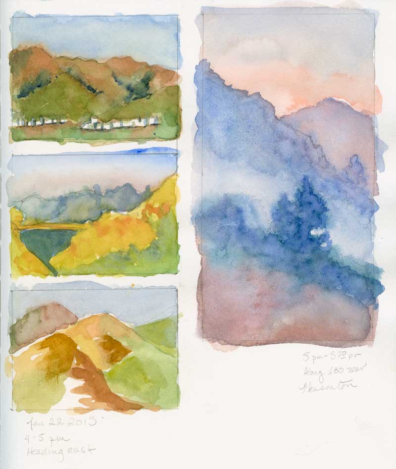
These are what my car-journal pages look like. The smaller rectangles are 2.5 inches by 3.5 inches, and the vertical rectangles are whatever size my little heart desires.
We don’t travel much, so I don’t always remember what colors are in my little travel palette. It helps to make a little swatch palette before I begin (that’s why there are twelve color swatches all in a row on the page at top).
Interstate 680 through Pleasanton at dusk
If you think this blog might be of comfort to someone, please share it