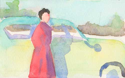
Watercolor on Arches #300 hot press
After the complexity of painting an antler in my new shadowbox, I thought that it might be easier to so something simpler, less complex.
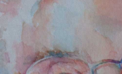
It turns out that painting an egg is harder than you’d think. Yes, I’ll try painting an egg another day (maybe not tomorrow). Really seeing that blanquillo—that little white one—is a challenge. Really seeing the colors and values and figuring out how to portray them in paint flummoxed me.
Despair. I should just study accounting (actually, I am).
While I was slopping away at this egg painting, getting more and more frustrated, I was listening to NPR’s new podcast, Inivisibilia. The story of Martin Pistorius, locked in his mind and unable to communicate at all, sort of slammed my psyche up against the wall. If you haven’t listened to this show, go straight there, right now, and listen to Locked-in Man (click here) Then come back and let’s talk.
Sometimes living the artist life is frightening and frustrating, and full of mistakes, wrong turns, and dissatisfaction. My mind is constantly scolding me for choices I’ve made, big and little, and telling me horror stories about the past, present, and future. Sometimes I get locked in to my own fears, and they’re all I can hear. It gets in the way.
The story of Martin was a little like a thunderbolt in my brain. Imagine living so locked in, so completely out of your own control, with the sound in your head of your mother’s words: “I wish you’d die.” Not just living with those words, but unable to talk back, to cry, to fight. Then imagine coming to the realization that those words came from a place of deep compassion from your momma’s heart, and forgiving her for those hard harsh words. Good heavens.
Martin let his thoughts float by, examined them without getting torn up by them, and built his own inner life. Very Zen, and very hard to do. But it seems like it would be so worth it to be able to do that. I see the necessity. Now I need to figure out the methods.
I’d love to hear from you. Reader, if you’ve figured out how to “let it go,” share it with us in the comment section.