This morning I woke up full of things to post on this blog. I had it all: advice, musings, even a joke or two. I was a regular genius.
Then came the dreaded login snafu. Forgot my password; reset it; failed to log in. Wash. Rinse. Repeat. 3 times.
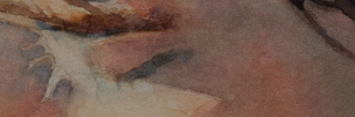
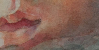
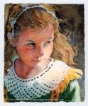
Clearly the password gods finally smiled with benevolence and opened the gates to my blog, but now I’m all sweaty and worn out and I have to move on to other deeds of the day. So I’m posting just a few crops of a painting I’m working on recently, with a small bit of advice.
I like to think of all the bits of my paintings as small abstracts that work together to make a whole portrait. I like the interest that it gives to the surface. Rather than making a smooth, flat wash for a large plane, I try to create texture within that plane by using edges, lost and found, and subtle value changes.
Kisses!
If you think this blog might be of comfort to someone, please share it
This Wednesday, May 6, I’m giving a watercolor demonstration at the Burlingame Art Society. If you live in the Bay Area, I hope you’ll join me as I discuss my process of painting portraits in watercolor. You’ll see three new portraits that I’m currently creating, and I’ll talk about where I’m at with each portrait. Hope to see you there!
7 p.m. to 9 p.m.
Lions Hall
990 Burlingame Ave., Burlingame
If you think this blog might be of comfort to someone, please share it
We create rooms from our dreams. This is an image from an old post. To see the whole post, click here.
I often dream of plein air-painting trips to exotic lands. Tracing the curve of the Amur River through Mongolia. Filling the pages of a worn watercolor journal with sketches of women in cerulean blue saris or rippling grass-green áo dàis. Painting the song of a skylark as it ripples across blue Irish skies and the howl of a monkey crashing through deep Guatemalan jungles.
Those are my dreams. I would have gladly traveled like that when I was young, a happy vagabond artist sleeping in hostels and riding on trains (and I did, some, but without the artistic skill and drive—or money—of middle age).
But would I do it these days? I am not so sure, especially when the sun warms my studio, or I curl up in our den with a book. Andrew Loomis’ Creative Illustration would be awfully heavy to carry in a back pack.
But sometimes ultramarine blue and viridian green precipitates onto the paper and glimmers like the ocean. Those are days I long to be on a cargo ship headed to Greece.
This post is in response to a prompt from WordPress University Writing 101: A Room with a View
If you think this blog might be of comfort to someone, please share it
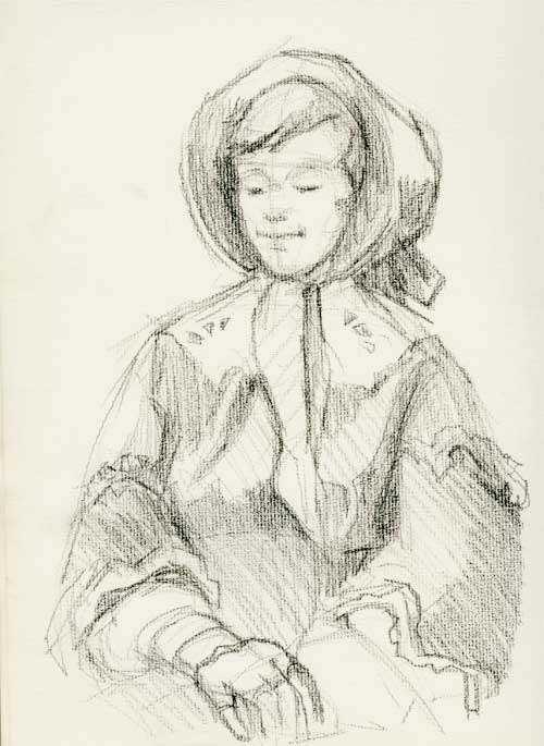
I’ve long been a fan of historical reenactments. I love costumes—hats, hoops, bonnets, boots, holsters, buttons, bows, and frippery from another age—and a park full of people wearing them makes my pencil hand itch to draw.
Columbia State Historic Park in the Sierra foothills offers all of those things when the volunteer docents are out in full force. Since I’ve been longing to sketch people in costumes, I dragged an artist friend along for company, fun, and moral support, and we went drawing for a day during their big birthday celebration. (They had speeches! They served cake!)
The two ladies at the top of this post sat and knitted gracefully while we drew. I went full-on artiste-geekazoid mode and set my easel up in the gutter (I need the canvas to be vertical as my new-fangled specs distort my drawings if I don’t look at the paper head on. Wish I could see without the blasted things.) I even dragged out long neglected pastel pencils.
According to a friend who volunteers at the park, everything they wear is as accurate as possible. “We’re dressed from the skin out,” she says. Scandalous to tell me, but when I ask to see her petticoat, she proudly showed off her corded underskirt. “They didn’t have hoops in 1850, so they used strips of cords around their petticoats.” (Make a corded petticoat here: http://www.historicallydressed.com/research/cordedpetticoats.html)
Clothes from the 19th century are so flattering, and best of all, they need curvy girls who can adequately fill out corsets and stays. (Ladies, when an artist tells you that you are beautiful, don’t tell us you’re not. Smile and nod graciously. We’re artists. We know what’s beautiful.)
The docents at Columbia often have characters to go with their costumes. Isaac Dinwiddie posed for us a good long time. When you look like this, you really need to have your portrait drawn.
All the charcoal drawings were done on an ancient pad of Strathmore Charcoal paper, Pad. No. 460-1. It’s fabulous paper, with a rough laid pattern that the charcoal loves, but it’s turning buff colored from age. I haven’t played with the sketches in the studio, and I’ve left the scans the way they are because I like the color of the paper.
If you think this blog might be of comfort to someone, please share it
Three Springs Watercolor, gouache, and graphite on #140 Arches hot press
We’re in the middle of spring in the Sierra (at least, I think we are. This is my first season here, so I’m still observing). The daphne stopped perfuming the neighborhood a month ago, and the last forsythia flower fell last week. The pink and white bells of the manzanita are nearly all gone, but black oak pollen from dangling catkins dusts cars, decks, roofs with yellow powder. While some dogwoods are blooming, mine seems to be a late-to-the-party Nellie, only just now sprouting leaves. Wildflowers like lupine, California poppies, and paintbrush are in the middle of a jumble of color, and weedy poverty grass is greening up the hills.
It made me think that while we celebrate the 4 seasons of spring, summer, autumn, and winter, we don’t often mark the degrees of each season. But seasons mature, don’t they? Think of spring, going from tender buds, to full flower, to the beginning of fruit. Perhaps when Persephone returns from the underworld, she is reborn as a baby and matures into a woman as spring progresses into summer. Anyway, that’s my fancy.
Here are my three springs.
Early Spring
Crocus, daffodils, forsythia, almonds, pears.
Mid Spring
Flowering cherries, plums, and apples. Magnolia, Arctostaphylos, coyote bush.
Late Spring
Oaks, pines….? I don’t know, we’re not there yet!
What’s flowering where you live? What age is your spring right now?
If you think this blog might be of comfort to someone, please share it
Sketch of Beppe Gambetta while he played lightning fast flat-pick guitar licks.
Yesterday I had the pleasure of seeing flat-pick guitar player Beppe Gambetta in concert. It was a small venue, and I was fortunate to sit right up front, thanks to friends who arrived early. I was so stunned by Mr. Gambetta’s playing that I couldn’t even think of drawing for the first half of the concert. But of course I had a sketch book (It was the 11″ x 14″ Cachet, far too large for unobtrusive concert drawing. Reminder to self: bring something smaller to concerts.). I swallowed my sketching-in-public shame during the second half of the concert and drew (still amazed and enchanted) while Gambetta played.
You can’t draw musicians without drawing their hands, yet hands are so difficult to draw. And the hands of a musician are always moving (Gambetta’s left hand sometimes blurs against the neck of the guitar). But I’ve found that even a mass of lines can lead me to a better understanding of the subject. And when I draw something I have a better understanding of the whole thing, music included.
First sketch of guitar player’s left hand
The first time I drew Gambetta’s hand, I tried to record the position of the fingers and knuckles, and the angle of his hand as it wrapped around the neck of the guitar. I imagined the fingers as little boxes, with tops, bottoms, and sides, to help me figure out the planes of each digit.
But it’s not easy; since his hands are always moving, I had to devise a way to make a gesture drawing that was accurate. First, I listened a bit to understand the structure of the tune. Then I chose a chord that he made often. Since I could anticipate when he’d return to that chord, I was ready to draw when he got there, and I quickly sketched as he played with his hand in that position.
Second sketch of guitar player’s left hand
In my second attempt, I wanted to smooth out the lines and make the drawing less about boxes and more about fingers. I was also trying to figure out the position of his hand and how the fingers attached to it.
Final sketch of guitar player’s left hand
Later, I studied my sketches and made the drawing above. It’s neater, and shows each finger and the hand position as it wraps around the guitar. It doesn’t show the passion that Gambetta puts into his chord hand; the initial scribble at the top of the post does a better job at that. But this is work that needs to be done; it will eventually make my initial sketches better.
The more an artist learns about a subject, the more force they can bring to even little things like a quick sketch. It’s all about observing, paying close attention, and then attempting to show what you’re feeling with pen and paper, brush and paint. What better way to live a life?
And here are some YouTube videos of Beppe Gambetta.
If you think this blog might be of comfort to someone, please share it
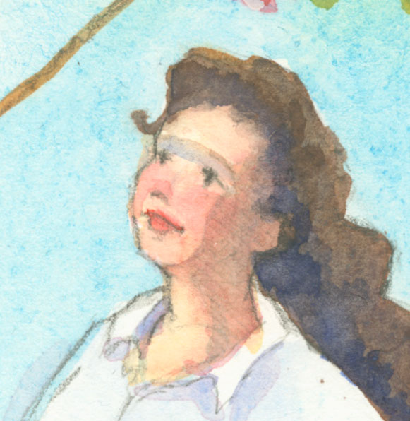
Watercolor portrait from 15-minute life pose at a life drawing session
The painting above was the result of a 15-minute pose at the local life drawing session. 15 minutes isn’t long time. Fruit flies live longer. All I could manage was a quick pencil sketch to capture the model’s likeness and a few brush strokes to remind myself of his overall skin tone (his local color). And one of those brushstrokes—the red stripe on the shadowed side of his cheek—was as awkward as a quarterback in toeshoes.
Oh well. Ted Nuttall once said in a class that sometimes he makes big mistakes just so he has a problem to solve. It keeps him from getting bored.
Watercolor portrait after working on it at home for another 45-minutes.
I haven’t been painting much the last week. I’ve been busy with a few illustration commissions which I was doing in digital space, and haven’t been real-world painting. But Friday morning the call of the paintbox was too strong, that desire to sling pigment and water an unbearable pain in my heart. What could I do? I gave myself an hour behind the brush to play with this painting, setting the alarm for 45 minutes, which would give me 15 minutes to wrap it all up.
During that 45 minutes, the painting began to take shape. But even 45 minutes is not long enough for me to make thoughtful decisions about a painting. More bad brush strokes. Questionable color choices. And unstretched watercolor paper that warps under washes until it’s like painting on a wrinkled wet towel.
Watercolor portrait with dark gouache background and ultramarine blue shadows
When the alarm went off, it was time to dry the wrinkly paper with a blast of air from the blow dryer (I’ve heard some folks use a blow dryer to dry their hair. Curious, isn’t it?) and make a couple of large decisions that would finish (or ruin) the portrait.
A dark background of gouache helped ease the brilliance of the colors in the face, and a light wash of ultramarine watercolor over the shadowed side of the face helped unify the shapes and blur the weird red brush stroke that had stumbled across the cheek in the initial 15 minute painting. I had to restate the eye, which wandered a bit. Oh well, we all have a bit of a wandering eye at some point in our lives.
If you think this blog might be of comfort to someone, please share it
15-minute portrait Watercolor on really terrible paper
I began this painting in the life drawing session on Thursday. But since the models (us!) only posed for 10 to 15 minutes, I didn’t have time to A. Catch a good likeness and B. apply much paint. So I brought it home and played with it in my studio. I admit, I cheated a little bit. I started it on Thursday, but finished it today. (I didn’t have time to start a personal painting today, as commercial work fell in my lap, and you know how freelancing goes: work when you’ve got it and starve when you don’t.)
This is paper that, even though it wasn’t cheap (although not at the top of the food chain either), is even more unsatisfactory than the really cheap stuff. I was sorely disappointed in this paper, and have never really used it for anything much at all. It looks like it should be a wonderful paper, but when you start applying washes, it gets very strange speckles all over it. And you can’t take any of the paint off; scrubbing gets you nowhere. I won’t tell you the brand in public (I don’t like to kiss and tell), but if you really want to know, I can tell you privately.
Maybe I haven’t learned how to coax the best from this paper. Eventually I guess I’ll learn as I still have a whole pad of it.
If you think this blog might be of comfort to someone, please share it
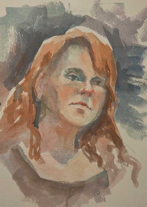
People often ask if I paint portraits from life. Yes, I do, and I prefer it actually. But no one wants to sit still for that as many hours as it takes me to paint a portrait.
But as part of my 30 in 30 challenge (30 days of painting for at least an hour a day from life only), I persuaded a visiting friend to sit for me for about 2 hours. We were listening to my fiddler and her banjo-player have some major old-time tunes, and she was itching to dance (she’s an avid and talented dancer). Between the wiggles and the occasional clogging break, I managed to get this quick portrait of her.
By the way, if you’re looking for a journal that will take watercolor, I suggest the Strathmore 500 Series Mixed Media Hardbound Art Journal. It will take several sloppy washes and a lot of pigment with only a minimal amount of buckling. And the image doesn’t bleed through to the other side too much, which makes it useful for journaling. And the binding is a sort of fake leathery-looking material, so it feels a bit rich and special, which we all need sometimes.
You can hear the music here:
If you think this blog might be of comfort to someone, please share it