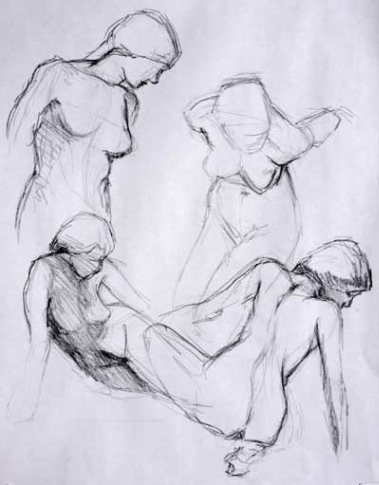
Life drawing: freedom within structure


This is one of my favorite drawings from last week—a series of 2-minute poses—simply because I was able to control placement of the figures on the page. I was able to do it in a somewhat organized and pleasing fashion. And I was able to do get this information down fast. 2 minutes a sketch.

I could not have done this four years ago. In fact, a year ago I could not have controlled my drawing this much. Over the last year I’ve taken another leap in abilities.

I’ve been studying life drawing at the atelier for nearly four years. I’ve been focusing very hard on proportions, angles, measurements, and it’s only recently that I’ve been able to exert some kind of discipline over my errant and mindless drawing arm. (Sometimes I wonder, does this left hand even belong to me? My brain tells it to do something and like a spoiled puppy, my hand widdles charcoal all over the drawing even while my brain is chasing after it with a rolled up newspaper yelling NO! NO! NO!)

In open drawing classes (not at the atelier, because there we strive for proportion) I see a lot of people who just draw as they feel. It’s an experiential gig for them; they’re drawing to feel good, because, let’s face it, drawing feels good.

I’ve noticed that some folks have the kind of brain that allows them to see the model clearly and they are able to naturally get the information down on paper in proportion. But others struggle to see and don’t know what they are doing wrong. They often quit drawing in frustration. I was like that four years ago. My drawings were floundering attempts at something I could barely visualize, let alone realize. So I found the atelier and have been working hard ever since.

Rïce Freeman-Zachary, at Notes from the Voodoo Café has an interesting but maddening post (although with Rïce it could more correctly be called a rant) on being the thing you want to be. Among other things, she says:

“If you want to be it, you do it. And if you want to do it—if you really love it, and it’s what you want to do with your one single life—then you do it the best you can. You study, and you practice.

And, I want to add, practice with a purpose. Because here’s the thing. After four years of obsessively measuring angles, proportions, and anatomy, these days, when I do let myself go and draw as I feel, the feelings have some way to be expressed. I’ve got a vocabulary now, and my drawings can shout or whisper, laugh or cry. The errant drawing arm is beginning to behave like a well-trained appendage. My brain is happy.

A better wren, a better rider

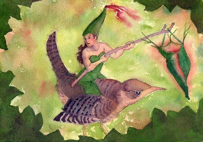
I worked on the image from my St. Stephen’s day post, and made another, more solid watercolor sketch. I don’t have a real wren to draw, so I had to cobble together an imaginary wren from an identification book and several online photographs.

When I lived in Mexico, a little wren lived in the trees next to my house. Every day at about 2:30 she would come in through the always-open kitchen door, make a circuit of the living room (she loved the indoor garden), and after about 30 minutes she would exit through the living room door. She was quite unafraid of me and the dog, and after I caught her killing a scorpion by beating it to death on the metal window bar, I always graciously bade her welcome into my house.

Unfortunately I didn’t draw so much then, so I lost my chance to sketch that little bird. I shall have to figure out how to invite a wren to my home in California.

Debbi Kaspari, at Drawing the Motmot, has several blogs on drawing birds. Two of my favorite pages: 5 Steps to Better Bird Drawing and How to Sneak Up on Your Subject. Now if I can just get a little wren to move into my backyard…

Into Pergamon with Rob Anderson

OH_AEGINA2444sm
Drawing by Rob Anderson

Last Saturday we went to see the show Into Pergamon by Rob Anderson (my teacher at the atelier). The show centers around a collection of drawings he did of the Great Frieze of the Pergamon altar that’s now in Berlin.

This is great stuff! His work is subtle, seemingly delicate at first, the charcoal like feather marks on the paper. But the longer you look at it, the more you see the strength and internal integrity of it. It comes into focus suddenly and forcefully, and simple charcoal and chalk drawings on brown handmade paper come alive with the clash of giants and gods at battle.

In his bio, it says, “He [Rob] did not in a moment of inspiration walk into his studio to spill out these skillful drawings in a fit of artistic passion. It didn’t take him a day to complete these works, nor did it take several days, or even weeks, but months of tedious and arduous work.”

It struck me that the time he took to make these drawings is almost as powerful as the drawings themselves. In our instant-society, where we expect everything to get done in less time than it takes to cook Uncle Ben’s minute rice, this kind of focus and dedication is rare.

And it makes me wonder if the new direction fine art will take will be back towards craftsmanship, back towards thought, and planning, and effort.

There is a movement, to be sure, of artists who want to study realism, but the big guns, the critics and columnists, the editors and galleries, don’t seem to value this, calling it a “populist movement.”

“Sheer draftsmanship,” they sneer.

But draftsmanship coupled with artistic vision…doesn’t that put a drawing or painting squarely back in to the realm of fine art? It becomes something that is valued not just for the thing itself, but the thought, dreams, and desires, and the time that went into the making.

Into Pergamon is at Ohlone College in Fremont until February 6, 2010. Give yourself plenty of time to see it.

Fear of sketching

Sketch from Good Old Fashioned Bluegrass festival. While I was sketching, the woman sitting next to me struck up a conversation, and told me how much she enjoyed watching me draw!

WordPress somehow keeps track of search terms folks used to get to my blog. One of the most frequently searched terms is fear of sketching in public.

I’ve written about being afraid to sketch in public before. I am constantly trying to overcome this fear, and apparently, I’m not the only person shy about public sketching.

I’ve been working on solving this problem, because one of the things I really want to be able to do before I die is sketch freely in public, with no shame. If that’s your goal too, here are some suggestions that have helped me.

  • Take some classes to improve your skills. This is top of the list. I’ve studied figure drawing with Rob Anderson at the Atelier School of Classical Realism for 3 years. It’s improved my skill level to the point where I can sketch people and have them look like people. That has allayed my fears incredibly.
  • Plan your sketch trip as if it were an expedition to an exotic country. Expeditions are hard. They are arduous. They can be dangerous. They are adventure that takes a lot of effort, so think ahead. Select your materials with care. Decide where you’re going (make a map if it helps you). Know how you’ll provide for your basic needs (what you’ll eat, where you’ll be able to go to the bathroom.) Once you’re on your expedition, be curious, look around you, document the expedition with sketches to describe the customs of the natives.
  • Choose places where you can sketch in obscurity. At first, it helped me to sketch in large public places like parks, where I could sit on a hillside with my back against some bushes (so no one could creep behind me and look over my shoulder at my drawing). I drew people who were far away, so they didn’t get self conscious that I was drawing them. I could have been drawing them, the view, anything. And I did draw them, the view, anything.
  • Pretend you’ve got no choice. When I went to the Good Old Fashioned Bluegrass festival, I pretended that I was on assignment for a brutal editor and had to come away with ten sketches. I just didn’t have any choice. I had to do it. The sketches didn’t have to be particularly good, but there had to be 10. That worked for me, as I’m used to deadlines and assignments.
  • BassplayerKeep it simple. Don’t try to create a masterpiece. That’s way too much pressure. Draw stick figures if you must. Anyone can draw a stick figure. Try just to get the action or composition down using stick men as shorthand. Stick figures are amusing, and a low commitment for the artist. Later you can hang skin and clothes on the little figures in a place where no one can look over your shoulder and criticize. Same with a landscape. Just try to get the bones of the landscape. Don’t worry about drawing every bush, tree, or leaf.
  • Remember that people don’t see your work the way you do. We artists tend to be our worst critics. We see flaws; others see beauty, or effort, or the coolness factor that you’re an artist.  They may even be thinking, “gee, I wish I had the courage to do that.”

The long pose in a fast world

SeatedLongPose
Pastel pencils, charcoal, chalk on toned paper

This pose, drawn at the Atelier School of Classical Realism in Oakland, took about 10 hours. I still have a few hours left (without the model) to “finish” the picture.

It’s very difficult to find a long-pose life drawing session that I’m able to attend the Bay Area. Most evening life drawing session poses max out at 20 minutes; a pose that lasts many hours, like the pose I drew here, seems to interest few evening artists. In our hyper-cyberspaced out world, even artists rush around like roadrunners on amphetamines.

And this style of drawing is unpopular these days. In my head I hear an art teacher I know saying, “your drawing is too fussy, too lifeless.” And on some levels I would have to agree with him. But during the course of this long pose I learned so much about color, form, proportion. It gives me a foundation for the next long pose, and hopefully that one will look  more free and less precious, because of the long pose, and not despite it.

Quick color temperature

Pastel and chalk on toned paper

This year at the atelier I learned modeling using color temperature—we used a limited palette of 4 earth-toned pastel pencils, charcoal and white chalk, and toned paper to create form and shadow.

This method is about intellectualizing your drawing. It’s about making a conscious plan rather than just grabbing a color and hoping it will work. We drew value scales in color to denote the color temperature of highlight, strong light, midtones and shadows, paying close attention to warm and cool color temperature and where it was placed in the scale. This is agony for me. I don’t do it well. Scales suck.

Since I am also a musician, I know the value of scales. I think of them as athletic training, like the drills that prepare the football player for that winning 100-yard dash. Playing scales prepare the musician for a blindingly brilliant set. Playing the actual notes become muscle memory, the body goes on automatic pilot and the musician’s  intuitive brain is free to choose the music she hears in her head.

I figure it must be the same for the style of painting I’m yearning to do. Once I’ve internalized color temperature theory, I’ll be more able to make intuitive choices that are based on logic.  That’s when I think true creativity can emerge.

Value chart for warm light

So I drew value scales religiously for each of my drawings this year. They helped. It’s surprising how far astray you can go from your original values over the course of a long pose. I leaned heavily on those value scales to re-orient myself and to overcome frustration. I know I frequently muttered things like, “strong light is cool. Cool, dammit!”

But on the last day of class this year I decided to whip out a drawing using the color temperature principles without agonizing over a value scale. The drawings at the top of the post were of ten minute poses each on toned paper. I did have to write the color temperatures down so I could remember which shadow was cool, which highlight was warm, but I didn’t need to draw a value scale. I was pleased that the concept is beginning to integrate into the way I choose color.

The question of perfection

Fluteplayer <br />  <br>© 2009 Margaret Sloan<br /> <i>Graphite </i>
Flute player © 2009 Margaret Sloan

I’ve been working on this painting for something like a month now, doing color roughs and composition studies. Of course, I don’t work on it every day (the day job, much as I love it, cuts considerably into time for painting and drawing), so I have some (lame) excuses for my slow pace.

This is the drawing for the for the final painting.  It’s given me quite a lot of trouble, because I have been picky about it. Teacher Steve has said, “you’re splitting hairs. I know that’s your working method, but you need to get on with painting!” I know he’s got a point: the piece can get too precious. But I know also that I need to get the base drawing right in order to convey what I have to say in this painting.

First of all, I needed to get the tilt of the flute player’s head as she bends forward to meet her flute. The head is down, the chin tilted to the left, and the body curls around the instrument. (This  flute posture is actually a position I’m trying to modify in my Alexander Technique classes, as playing the flute tends to give me terrible stiff necks and headaches.)

I struggled until I was ready to bite the pencil; the drawing kept looking like a profile, until Steve pointed out that when you look down on a persons face, there are certain cues that tell us the tilt of the head. The brow line curves down  and covers the top of the eye. You can see more of the inside of the bottom eye lid. And you can see more of the top of the head. Yeah, I know that already, but sometimes we’re blinded to the simplest mistakes while drawing. I made those changes, and—shazaam!—the tilt was there.

I also want to convey her age (young) which means her features are rounded, slightly blunt, and soft (I’ll use color also as a symbol of her age, when I do finally start painting). I had to measure the drawing carefully, because her chin and nose kept growing in the drawing, giving her that kind of solid jaw-bone look of grown ups.

But the most important thing I want to convey is the way she’s  listening hard to the tune in her head and reaching into her flute to pull out the music and send it into the world. That’s going to be the magical thing that makes this painting work.

This is to to be a larger size painting than I usually work in, on 12 x 16 Arches watercolor block—blocks being the easiest thing to schlepp back and forth to the Pacific Art League watercolor class, where I do most of my watercolor painting.

Late at night we dream of mice

Symbols in the wee small hours
Dreaming of mice
© 2009 Margaret Sloan
Graphite

I watched a lot of b-grade horror flicks when I was a kid. My dad loved Creature Features, and he and I would stay up late together watching the old movies. We didn’t agree on much else in those days, but we both loved Dracula.

The thing the mouse is pulling is a symbol. It appeared in a dream that woke me very early one morning. I’m well acquainted with the small hours of the morning; I’ve never slept soundly, and I wake often. Not because I want to, but because anxiety drives me from the mattress  to the drawing table. It’s a perfect setting for a monster movie scene.

I imagine this frantic mouse is bringing light to a corner of an old stone kitchen. Christopher Lee has just commanded, “Light, quickly! She’s fainted.” The beautiful ingenue is slumped gracefully into a carved wooden chair. The mouse sits up,  chittering in worry while dreadful shadows leap across the kitchen walls. They assume shapes we can only just recognize. She wakes, screams, then faints again. A window bangs open. The candle is extinguished by a damp wind.

Cut to a commercial.

Drawing in three colors

Neck study  Charcoal, chalk, sanguine on toned paper
Neck study
Charcoal, chalk, sanguine on toned paper

At the Atelier  School of Classical Realism, we’ve graduated from using only charcoal and white chalk. We’ve added a third chalk: red-hued sanguine. Boy, what a difference! With charcoal, white chalk, sanguine, and the toned paper, we’re actually working with four colors, and it’s amazing how many variations in value and hue we can mix.

At the bottom left of the drawing above, you can see my value chart. Working out your values before you start adding tone is absolutely the way to go. It doesn’t pay to be lazy in this regard; you’ll end up either working harder in the end, or just giving up on the drawing.

This drawing was done in about 3.5 hours, and with this limited amount of time (we do lo-o-o-ng poses in this class. I’ve worked on drawings up to 15-20 hours, so 3.5 hours was brief for me) I chose to do a study of a neck because Rob had just given us a terrific lecture on how to stick the head on the torso (always an important thing!) and I wanted to try out his ideas.

The key to getting the head on right is placing the neck properly. And the key to placing the neck is to think of it as a column emerging from top of the torso.

Sounds simple, but it’s not.