
Elyse Dunnahoo designed her 150-square feet of painting space as thoughtfully as she creates each of her realistic paintings. As a result, her studio provides a backdrop for the calmness and beauty she creates on canvas.
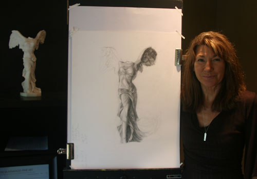
Elyse Dunnahoo
It has taken me years of fine tuning my studio space, organizing through trial and error which paints, brushes, mediums, and all other fundamentals —elbow room included— are quintessential for me to focus on my work without distractions. In my studio I am safe to make mistakes, to problem solve over, and over, and over again, and again, and again…and very happy to do so.

Organized with the color wheel in mind
I have many shelves. One shelf holds fabrics and wallpapers, and another holds the numerous props I utilize in my still life set-ups. In the past, the various fabrics and wallpapers were tucked away in closed bins, but I prefer to have the fabrics and props organized by color on a shelf. This allows for me to actually see the colors and textures while I work, which facilitates envisioning future still life setups.

I have a counter space where brushes and tubs of my oil paint tubes are located. The paints are organized by color group and in order of where they are located on the color wheel. The tubs are stacked in twos, such that one color is stacked on top of its complement.
This make is easy for me to go to the right bin and find that particular color quickly.
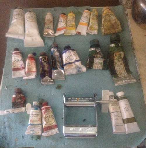
I prefer to stand at my easel. Directly behind me is a small shelf. On this shelf the paint tubes I use consistently are organized by their order on the color wheel and as they appear on my palette.

Lighting
I use natural north light on my set-up, easel, and palette. One window in my studio is north facing. This is where I operate. All other windows are completely covered with black theater curtains, allowing no additional light into my space.
I have dark brown flooring and the walls are dark, too, to minimize the amount of light bouncing onto the set-up and interfering with the beautiful north light.
Most helpful thing
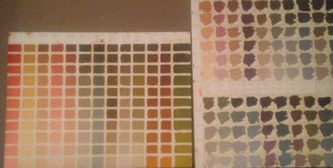
I make my own color cards of paint mixtures using all the colors in my palette, and other colors as well. I have 16 color cards which are accessible from my easel. Each card is unique from the other, representing one color from my palette that’s mixed with all other colors on my palette. I also have studies in neutrals (warm and cold) and a dead palette card. The cards are 16” x 20” illustration board and the squares are fashioned with 1/4″ tape. While I’m painting, I ask myself “what is THAT color?” My color cards assist me to understand the color recipe. This has been an exceptional resource to understand color mixing.
Studio Tip
A blue plastic film can be placed over a light bulb to mimic the blue colored north light if natural north facing light is not available. I learned this at workshop by artist Qiang Huang. He uses the transparent blue filter as a standard set-up for his lighting. He sells the blue transparent film online at http://www.qh-art.com/north-light-filter.html
Sources
Shelving purchased at IKEA.
Theater Curtains purchased at Target.
Wall color: Benjamin Moore, color: Sparrow-Matte (AF-720)
Flooring: Flor Tiles
You can see select paintings from Elyse in the “Women’s View 2015 Art Show” at the Caldwell Gallery at the San Mateo Courthouse, March 3-April 29, and at Silicon Valley Open Studios, May 2-3, 2015. See more of Elyse’s work at www.elysedunnahoo.com

Elyse Dunnahoo
24″ x 20″ oil on board

Thank-you Maggie- Your work is so lovely…keep up the great work!