Portrait on the clock

Pastel sketch 8.5" x 11"

I started this painting when I was all buzzed from a video by Alicia Sotherland, a portrait artist I quite like. Likeness eluded me for this drawing from a photo. I find it much easier to get a likeness from life. But, after all, I wasn’t trying for likeness.

I had budgeted one hour (which expanded to two) to get as far as I could, and as close as I could to a likeness. But my main goal was to  force my hand and brain to believe that it is okay to have light values in the lit area of the face and dark values  in the shadowed area of the face (I’m always surprised that this is such a difficult concept for my brain to believe). And I was to  use color values for those lights and shadows rather than monochromatic values. You can’t see it in the scan, but the highlight on the nose is cool—a light blue.


Study of a flute player

Girl playing flute Graphite value study
Girl playing flute
© 2009 Margaret Sloan
Graphite value study

I met this lovely young woman at Friday Harbor Irish Music Camp. She had a boxwood flute that had bent as it aged, but it sounded lovely.

One day while we were in class, the rain and snow stopped, the sky cleared, and the sun streamed through the windows. Sitting in a shaft of sunlight, the young woman glowed as she practiced her tune. I snapped a photo quickly. There was no time to fool around if I wanted to capture the naturalness in her posture. Youth is a time of great beauty, but also great self consciousness.

I’ve come to understand the importance of doing value studies before beginning a painting. Steve Curl, my watercolor teacher, told me that when I was designing the value study I shouldn’t focus on the details. Instead, he said, look for the large shapes of light and dark; I did, and it made all the difference.

I’ve already practiced painting hands playing the flute, so I should be in good shape for her hands.

Prud’hon method

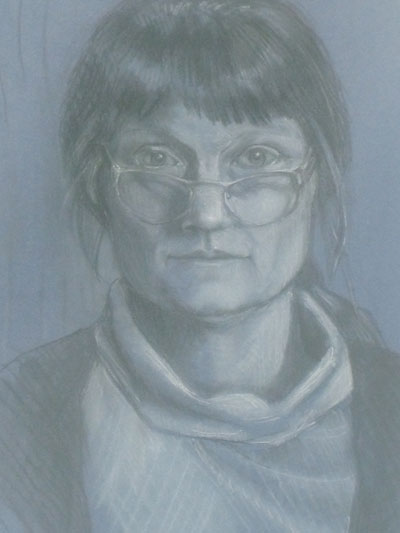
Self-portrait in charcoal and white chalk

In the third year at the atelier, Rob started teaching us different techniques which will eventually lead to color temperature theory. Leaping into technique was a little daunting, as I was still (am still!) struggling to get an accurate rendition of the figure on my paper. Rob has an exacting eye, and with his help, I’m slowly learning to see where I go wrong in the initial stages of a drawing. These days, when I’m working on a drawing, I don’t just accept the first marks that go on my paper; instead, I try to use a more critical approach.  And measure, measure, measure.

After we started working on colored paper, Rob introduced the Prud’hon method. Prud’hon was a French Romantic painter who produced some amazing drawings using toned paper, charcoal, and white chalk. A brilliant Bay Area teacher, Rebecca Alzofon (who, unfortunately is no longer teaching) has a tutorial on the Prud’hon method. I rarely follow tutorials, but I did follow some of this, and found it helpful to build on what I’d learned in Rob’s class.)

There’s a lot of smudging going on with this method. Tone is put down by a series of hatch marks, which are then smudged and blended. Charcoal and chalk can be blended, or not. After you’ve built the volume and form, to accent areas, you use line—not contour line, which would go across the form, but rather, line that follows the direction of the form.

The fiddler

Art on Fiddle

This is a painting of my husband in his costume for his old time band Harmon’s Peak. He was practicing before a gig and I snapped a few shots of him.

For the past 3 years I’ve studied watercolor with Steve Curl at the Pacific Art League in Palo Alto, California. I’ve learned a great deal from him, particularly how to plan a watercolor, and then not be afraid of the paint. We work primarily from photos, which some artists think is cheating, but I always make my own drawing rather than projecting or tracing. And Steve always cautions us  to not slavishly copy the photo, but to make a painting out of it. That may mean altering the photo a bit, leaving out the background, adding a tree, or rearranging the elements in the picture. In this painting I had to make up the light source, as I had used a flash for the photo and it washed out the nice home lighting that made me take the photo.

Gloves

glovedladyThis summer I attended a costume party where one of the guests wore elbow length opera gloves. I don’t recall the rest of her outfit, but the image of the gloves stuck in my mind. I don’t think they were expensive leather gloves, but it didn’t matter. They still gave her fascinating aura; in gloves, her hands spoke more eloquently, more elegantly than the rest of her body.  It was like her hands were wearing masks.

I’m in the habit of drawing every evening right before going to sleep. It’s my way of processing the day and working through things that have bobbled around in my noggin for the last 24 hours. After the party that night, I drew a picture from memory of the woman and her gloves. It’ one of my favorite drawings.

Amazingly enough, gloves are some of the few things you can still buy that are made in America! Sullivan Glove Company makes work gloves, including riding gloves that look lovely. Linda Lorraine Gloves is based in San Francisco. La Crasia gloves are supposedly made in New York; they’re fabulously expensive, but really beautiful.

I say, let’s go back to wearing gloves!