Hoops, and hats, and bonnets, oh my! Public sketching in Columbia State Park

Pastel drawing
Pastel and charcoal on Canson paper

I’ve long been a fan of historical reenactments. I love costumes—hats, hoops, bonnets, boots, holsters, buttons, bows, and frippery from another age—and a park full of people wearing them makes my pencil hand itch to draw.

Columbia State Historic Park in the Sierra foothills offers all of those things when the volunteer docents are out in full force. Since I’ve been longing to sketch people in costumes, I dragged an artist friend along for company, fun, and moral support, and we went drawing for a day during their big birthday celebration. (They had speeches! They served cake!)

Charcoal drawing of speechifying

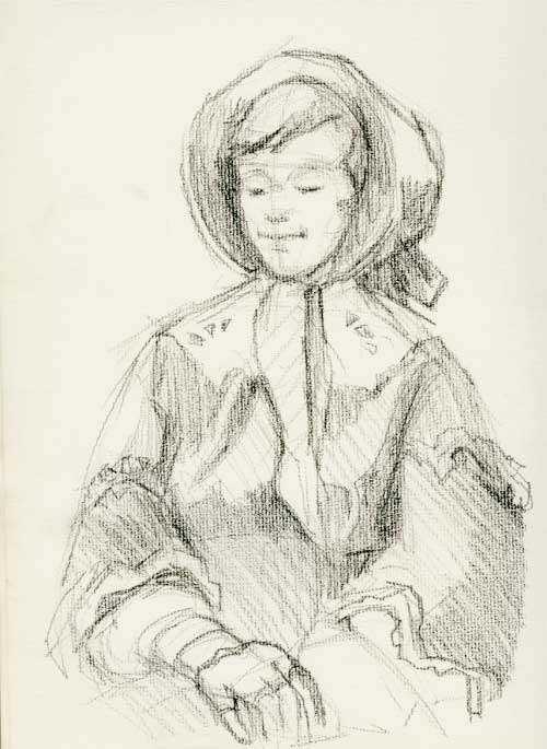
The two ladies at the top of this post sat and knitted gracefully while we drew. I went full-on artiste-geekazoid mode and set my easel up in the gutter (I need the canvas to be vertical as my new-fangled specs distort my drawings if I don’t look at the paper head on. Wish I could see without the blasted things.) I even dragged out long neglected pastel pencils.

According to a friend who volunteers at the park, everything they wear is as accurate as possible. “We’re dressed from the skin out,” she says. Scandalous to tell me, but when I ask to see her petticoat, she proudly showed off her corded underskirt. “They didn’t have hoops in 1850, so they used strips of cords around their petticoats.” (Make a corded petticoat here: http://www.historicallydressed.com/research/cordedpetticoats.html)

Sleeves

Clothes from the 19th century are so flattering, and best of all, they need curvy girls who can adequately fill out corsets and stays. (Ladies, when an artist tells you that you are beautiful, don’t tell us you’re not. Smile and nod graciously. We’re artists. We know what’s beautiful.)

Hat

The docents at Columbia often have characters to go with their costumes. Isaac Dinwiddie posed for us a good long time. When you look like this, you really need to have your portrait drawn.

Isaac

All the charcoal drawings were done on an ancient pad of Strathmore Charcoal paper, Pad. No. 460-1. It’s fabulous paper, with a rough laid pattern that the charcoal loves, but it’s turning buff colored from age. I haven’t played with the sketches in the studio, and I’ve left the scans the way they are because I like the color of the paper.


Return of the prodigal blogger

Joe Pastel on Canson Mi-Tientes paper. I'm not yet finished with this. I have pages and pages of notes from Christian and Rob. Corrections like: make the background distinct from the foreground, dull down the "heavenly light" in the background, get rid of Joe's "mohawk." And lots more things to work on. Whew!

I’ve been letting this blog slide the last couple months, as I’ve been busy with other projects, plus a camping trip to Nevada.

I’ve been trying to finish up my projects from my fourth year at the Atelier (At the top of this post, you can see the last portrait I made in June), and then, just when the school year was finishing and I thought I’d have some time to rest, Christian Fagerlund (the teacher who’d taken over the last few classes at the Atelier while the usual teacher, Rob Anderson was away), offered a portrait painting workshop—6 people, 8 classes, twice a week—during the month of July.

Christian is a wonderful painter, and a brilliant teacher (I’ve been so lucky to have such wonderful teachers: Rob, David, and now Christian). Taking his class has been worth the exhaustion of driving to the East Bay twice a week during rush hour traffic. I’ve learned so much; I can feel my brain fizzing and buzzing like it’s full of 7-Up.

Now I’m taking a much-needed break from classes, and will practice what I’ve learned. That means discipline to work at home the same number of hours that I worked in classes (plus those two extra hours I spent driving to Oakland!).

I also want to get back into the swing of blogging again. I wish someone would give me a push, but alas, in the blogging world, you really have to learn to swing yourself.

Portrait on the clock

Pastel sketch 8.5" x 11"

I started this painting when I was all buzzed from a video by Alicia Sotherland, a portrait artist I quite like. Likeness eluded me for this drawing from a photo. I find it much easier to get a likeness from life. But, after all, I wasn’t trying for likeness.

I had budgeted one hour (which expanded to two) to get as far as I could, and as close as I could to a likeness. But my main goal was to  force my hand and brain to believe that it is okay to have light values in the lit area of the face and dark values  in the shadowed area of the face (I’m always surprised that this is such a difficult concept for my brain to believe). And I was to  use color values for those lights and shadows rather than monochromatic values. You can’t see it in the scan, but the highlight on the nose is cool—a light blue.