Of into the wild blue yonder

This week I’m off to a Ted Nuttall workshop at Kowana Valley Folk School. The last time I attended one of his workshops, it was a sea change for me. I know I shouldn’t apply expectations, but I’m hoping for another big jump during this workshop. We shall see.

I like to have goals, though. They focus me and keep me from straying off along a thousand different paths. I’ve been thinking a lot about my goals for this workshop.

  1. There is tightness—a constriction—about my work that I’d like to loosen. It’s the seeming freedom in Ted’s work that I admire, although he told us at the last workshop that every dib and daub of paint is placed carefully and deliberately. But I think it must be a freedom in his way of thinking that allows for those spot-on “sloppy dots.”
  2. I also admire his color sensibility, and although I’m not sure how someone can teach that in a week, I’m hoping to gain some insights.

I know that I need to keep myself open to whatever knowledge blows my way. Sometimes it’s the errant zephyrs of knowledge that make the most impact. But I’m going to try to follow my path as best I can.


Drawing the portrait: week one and two

The portrait class (I told you about it last week) taught by Felicia Forte has been going well. Felicia is a lovely teacher; her classes are low key and she encourages students gently, without condescension or brittleness. Felicia does wonderful charcoal work; her drawings have the most beautiful soft but strong marks. They have an integrity that I’m striving to create in my own work. They hold together, you know?

Here are some things I’ve learned:

  • Make fewer lines and make them well. No scritchy-scratchy searching lines. Observe correctly and make confident, correct marks.
  • Draw the big shadow shapes first. Don’t go for detail right away. (And why, oh why, do I have to relearn this repeatedly? Will this ever become something I do automatically? Or will it always be my weak point, my charcoal smudged Achilles’ heel?)
  • Keep the shading simple. Use strokes that all flow in one direction so that blocked in masses don’t become confusing and distracting.
  • Think about design as you work. This is especially true for short poses during which we make four 5-minute drawings, all on the same page. This is probably the hardest lesson for me to learn; it requires not just observation and motor skills, but also really thinking and planning ahead.
  • Draw! The biggest, most important lesson of them all. Draw all the time. Then draw some more. Always  with an active, curious mind.

Life drawing: freedom within structure


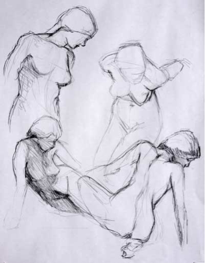
This is one of my favorite drawings from last week—a series of 2-minute poses—simply because I was able to control placement of the figures on the page. I was able to do it in a somewhat organized and pleasing fashion. And I was able to do get this information down fast. 2 minutes a sketch.

I could not have done this four years ago. In fact, a year ago I could not have controlled my drawing this much. Over the last year I’ve taken another leap in abilities.

I’ve been studying life drawing at the atelier for nearly four years. I’ve been focusing very hard on proportions, angles, measurements, and it’s only recently that I’ve been able to exert some kind of discipline over my errant and mindless drawing arm. (Sometimes I wonder, does this left hand even belong to me? My brain tells it to do something and like a spoiled puppy, my hand widdles charcoal all over the drawing even while my brain is chasing after it with a rolled up newspaper yelling NO! NO! NO!)

In open drawing classes (not at the atelier, because there we strive for proportion) I see a lot of people who just draw as they feel. It’s an experiential gig for them; they’re drawing to feel good, because, let’s face it, drawing feels good.

I’ve noticed that some folks have the kind of brain that allows them to see the model clearly and they are able to naturally get the information down on paper in proportion. But others struggle to see and don’t know what they are doing wrong. They often quit drawing in frustration. I was like that four years ago. My drawings were floundering attempts at something I could barely visualize, let alone realize. So I found the atelier and have been working hard ever since.

Rïce Freeman-Zachary, at Notes from the Voodoo Café has an interesting but maddening post (although with Rïce it could more correctly be called a rant) on being the thing you want to be. Among other things, she says:

“If you want to be it, you do it. And if you want to do it—if you really love it, and it’s what you want to do with your one single life—then you do it the best you can. You study, and you practice.

And, I want to add, practice with a purpose. Because here’s the thing. After four years of obsessively measuring angles, proportions, and anatomy, these days, when I do let myself go and draw as I feel, the feelings have some way to be expressed. I’ve got a vocabulary now, and my drawings can shout or whisper, laugh or cry. The errant drawing arm is beginning to behave like a well-trained appendage. My brain is happy.


Thesis plans

I’m finished with my third year at the Atelier in Oakland. Next year will be my fourth, and after learning anatomy (year 1), technique (year 2), and color temperature (year 3), I am faced with the “thesis” project.

We don’t get official grades at this school, because it’s 1. not accredited and 2. largely populated by students who have day jobs and so are self-propelled in their artwork. But that doesn’t mean we don’t grade ourselves, and indulge in a tiny bit of good natured rivalry with fellow students. But Rob doesn’t run his Saturday classes as an academic grinding mill, and that’s what I like about it. We learn from other students’ work, and find joy when they make a huge leap forward (and there are students—yours truly being one of them—who poke along for months, then suddenly break through whatever mental block they have and leap up to the next level of competence and sensitivity).

So, the thesis project is a big deal to me. If—no, when—I complete it, I’ll have a portfolio of pieces that are a “body of work.” Expect to hear more of this.

The long pose in a fast world

SeatedLongPose
Pastel pencils, charcoal, chalk on toned paper

This pose, drawn at the Atelier School of Classical Realism in Oakland, took about 10 hours. I still have a few hours left (without the model) to “finish” the picture.

It’s very difficult to find a long-pose life drawing session that I’m able to attend the Bay Area. Most evening life drawing session poses max out at 20 minutes; a pose that lasts many hours, like the pose I drew here, seems to interest few evening artists. In our hyper-cyberspaced out world, even artists rush around like roadrunners on amphetamines.

And this style of drawing is unpopular these days. In my head I hear an art teacher I know saying, “your drawing is too fussy, too lifeless.” And on some levels I would have to agree with him. But during the course of this long pose I learned so much about color, form, proportion. It gives me a foundation for the next long pose, and hopefully that one will look  more free and less precious, because of the long pose, and not despite it.

Quick color temperature

Pastel and chalk on toned paper

This year at the atelier I learned modeling using color temperature—we used a limited palette of 4 earth-toned pastel pencils, charcoal and white chalk, and toned paper to create form and shadow.

This method is about intellectualizing your drawing. It’s about making a conscious plan rather than just grabbing a color and hoping it will work. We drew value scales in color to denote the color temperature of highlight, strong light, midtones and shadows, paying close attention to warm and cool color temperature and where it was placed in the scale. This is agony for me. I don’t do it well. Scales suck.

Since I am also a musician, I know the value of scales. I think of them as athletic training, like the drills that prepare the football player for that winning 100-yard dash. Playing scales prepare the musician for a blindingly brilliant set. Playing the actual notes become muscle memory, the body goes on automatic pilot and the musician’s  intuitive brain is free to choose the music she hears in her head.

I figure it must be the same for the style of painting I’m yearning to do. Once I’ve internalized color temperature theory, I’ll be more able to make intuitive choices that are based on logic.  That’s when I think true creativity can emerge.

Value chart for warm light

So I drew value scales religiously for each of my drawings this year. They helped. It’s surprising how far astray you can go from your original values over the course of a long pose. I leaned heavily on those value scales to re-orient myself and to overcome frustration. I know I frequently muttered things like, “strong light is cool. Cool, dammit!”

But on the last day of class this year I decided to whip out a drawing using the color temperature principles without agonizing over a value scale. The drawings at the top of the post were of ten minute poses each on toned paper. I did have to write the color temperatures down so I could remember which shadow was cool, which highlight was warm, but I didn’t need to draw a value scale. I was pleased that the concept is beginning to integrate into the way I choose color.

Vermeer with a limited color palette

VermeerCopyWarm
Vermeer copy Charcoal and pastel chalk on toned paper

This is the results of the first 5 hours into my homework (copy a part of an old master, once as if under warm light and once as if under cool light)  for the Atelier. Vermeer’s guitar player  looks spooky with no eyes, but they’ll go in last, to keep me from focusing on them and nothing else. Her nose is not long enough and her mouth is too high; I’ll fix that later as well.

ValueChartWarmMaestro Rob has allowed us to use a limited color palette—charcoal, white chalk, gray chalk, and 5 earth-toned chalks. We’re working with color temperature and value to build form. At left you can see my value chart. This drawing is imagined to be under warm light, which, according to the way David and Rob teach color temperature theory, makes cool highlights and shadow, alternating cool and warm in all the steps in between.

This drawing will have to go on the back burner for now, as I still have to attempt the other part of the assignment in two evenings, that of the same drawing as if under cool light. That will mean warm highlights, warm shadows.

It’s a lot of work, to be sure, learning to draw and see effectively, but it’s been worth it. 3 years ago I couldn’t even imagine doing this kind of work. I still have trouble imagining that I can do it, and still am never satisfied.

Vermeer
Vermeer cropped original

Drawing in three colors

Neck study  Charcoal, chalk, sanguine on toned paper
Neck study
Charcoal, chalk, sanguine on toned paper

At the Atelier  School of Classical Realism, we’ve graduated from using only charcoal and white chalk. We’ve added a third chalk: red-hued sanguine. Boy, what a difference! With charcoal, white chalk, sanguine, and the toned paper, we’re actually working with four colors, and it’s amazing how many variations in value and hue we can mix.

At the bottom left of the drawing above, you can see my value chart. Working out your values before you start adding tone is absolutely the way to go. It doesn’t pay to be lazy in this regard; you’ll end up either working harder in the end, or just giving up on the drawing.

This drawing was done in about 3.5 hours, and with this limited amount of time (we do lo-o-o-ng poses in this class. I’ve worked on drawings up to 15-20 hours, so 3.5 hours was brief for me) I chose to do a study of a neck because Rob had just given us a terrific lecture on how to stick the head on the torso (always an important thing!) and I wanted to try out his ideas.

The key to getting the head on right is placing the neck properly. And the key to placing the neck is to think of it as a column emerging from top of the torso.

Sounds simple, but it’s not.

Prud’hon method

Self-portrait in charcoal and white chalk

In the third year at the atelier, Rob started teaching us different techniques which will eventually lead to color temperature theory. Leaping into technique was a little daunting, as I was still (am still!) struggling to get an accurate rendition of the figure on my paper. Rob has an exacting eye, and with his help, I’m slowly learning to see where I go wrong in the initial stages of a drawing. These days, when I’m working on a drawing, I don’t just accept the first marks that go on my paper; instead, I try to use a more critical approach.  And measure, measure, measure.

After we started working on colored paper, Rob introduced the Prud’hon method. Prud’hon was a French Romantic painter who produced some amazing drawings using toned paper, charcoal, and white chalk. A brilliant Bay Area teacher, Rebecca Alzofon (who, unfortunately is no longer teaching) has a tutorial on the Prud’hon method. I rarely follow tutorials, but I did follow some of this, and found it helpful to build on what I’d learned in Rob’s class.)

There’s a lot of smudging going on with this method. Tone is put down by a series of hatch marks, which are then smudged and blended. Charcoal and chalk can be blended, or not. After you’ve built the volume and form, to accent areas, you use line—not contour line, which would go across the form, but rather, line that follows the direction of the form.